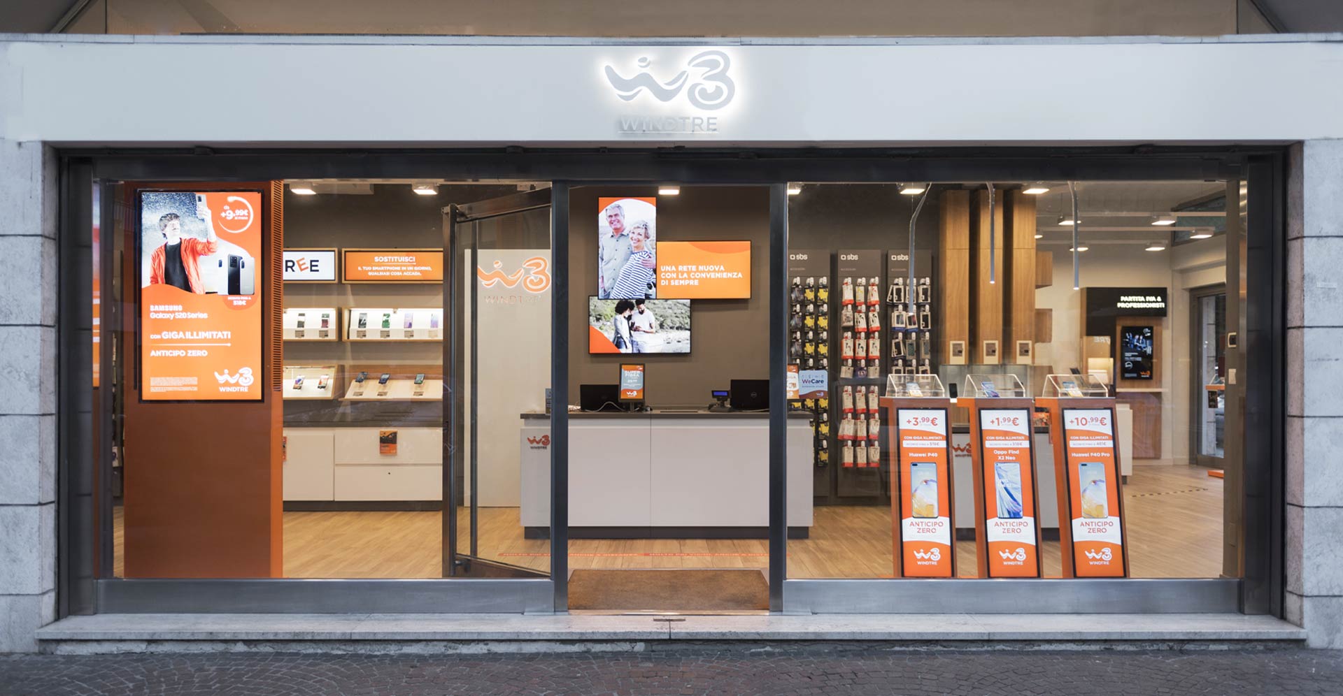
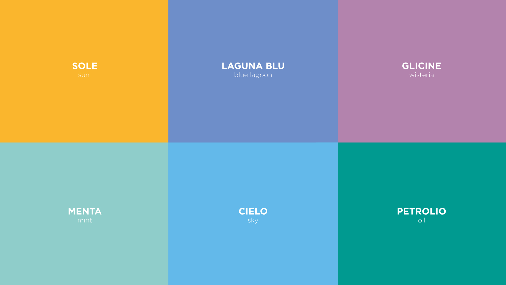
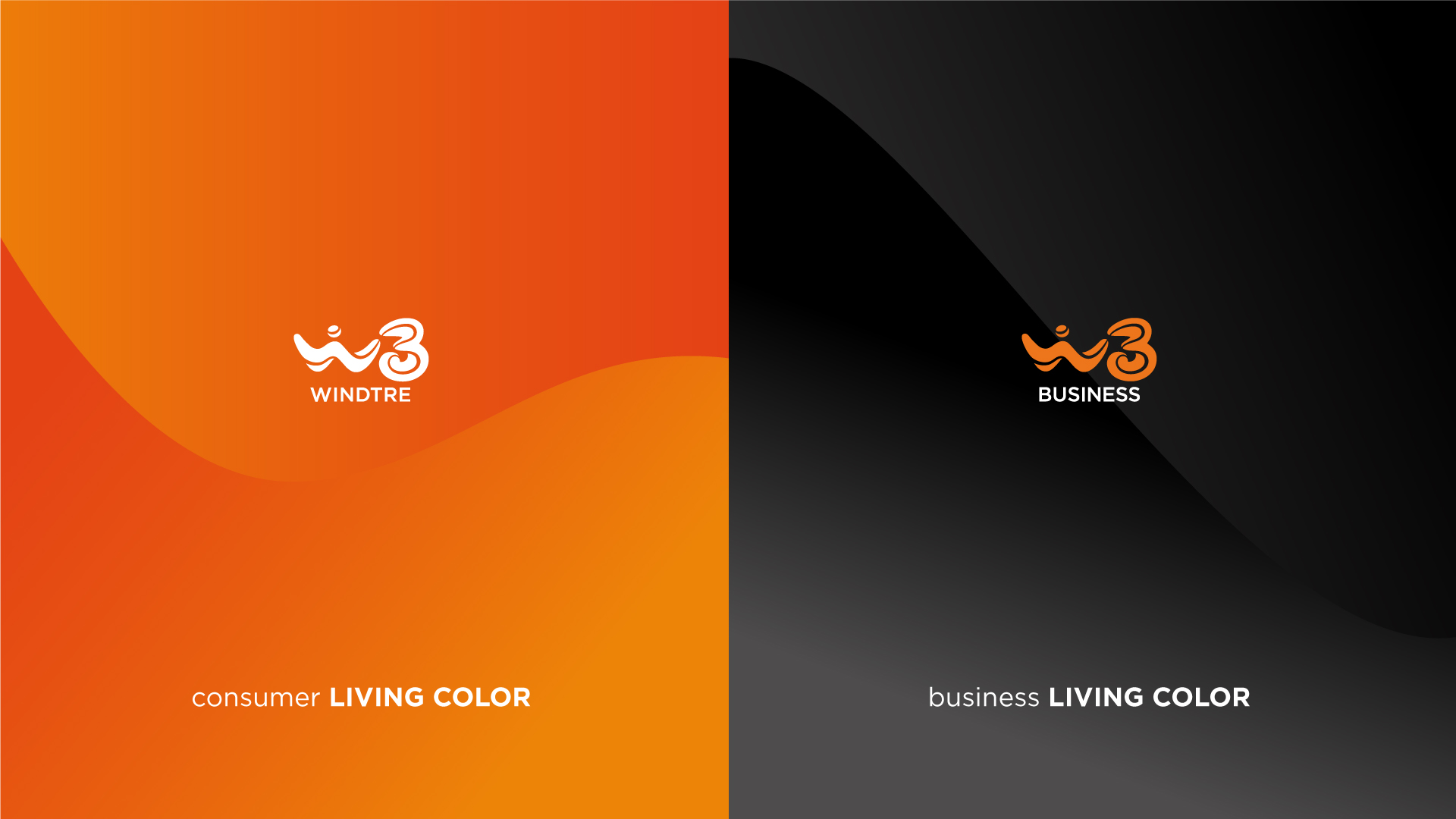
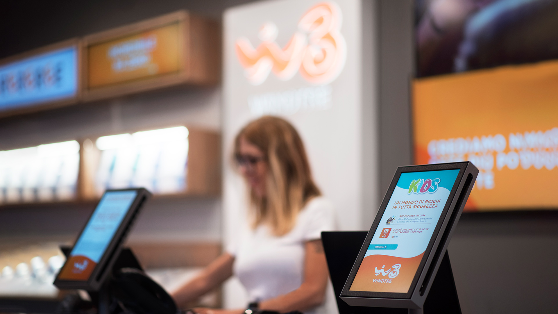
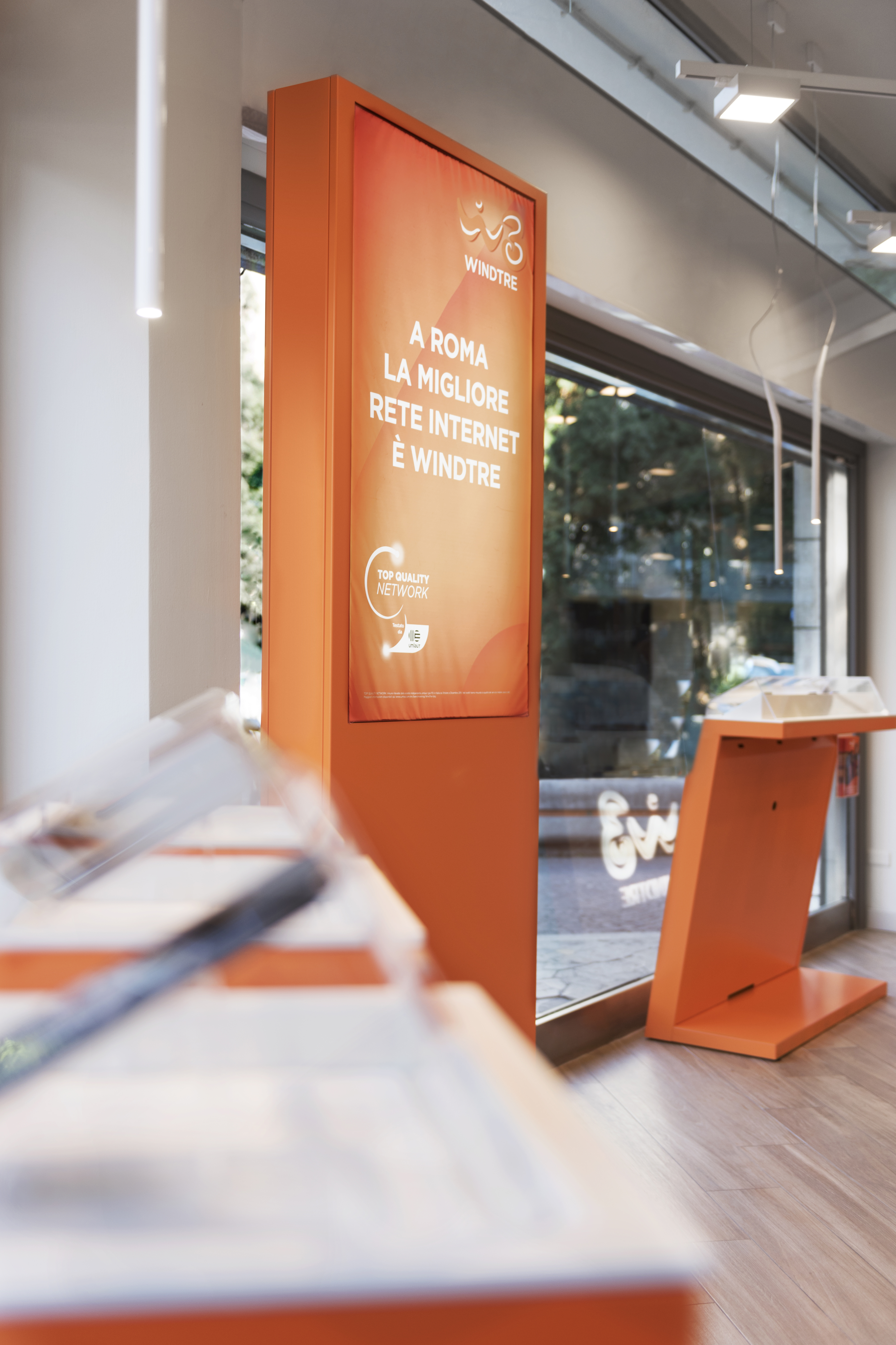
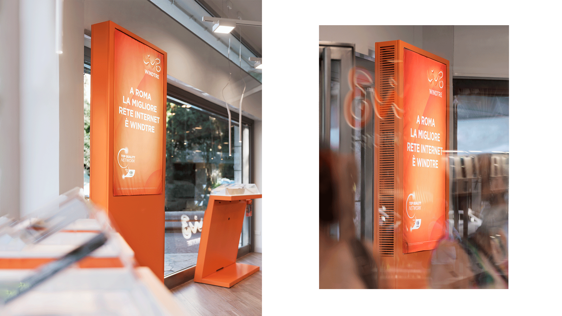
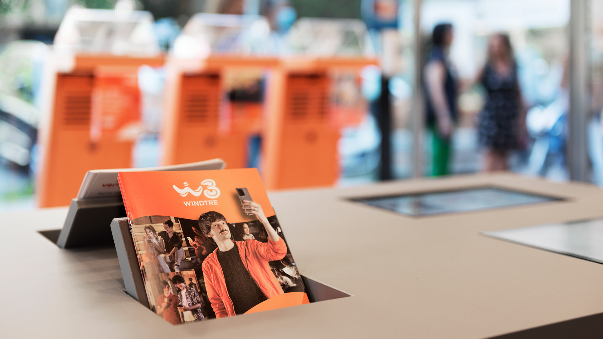
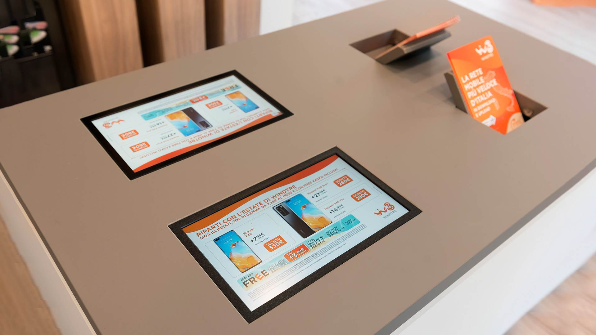
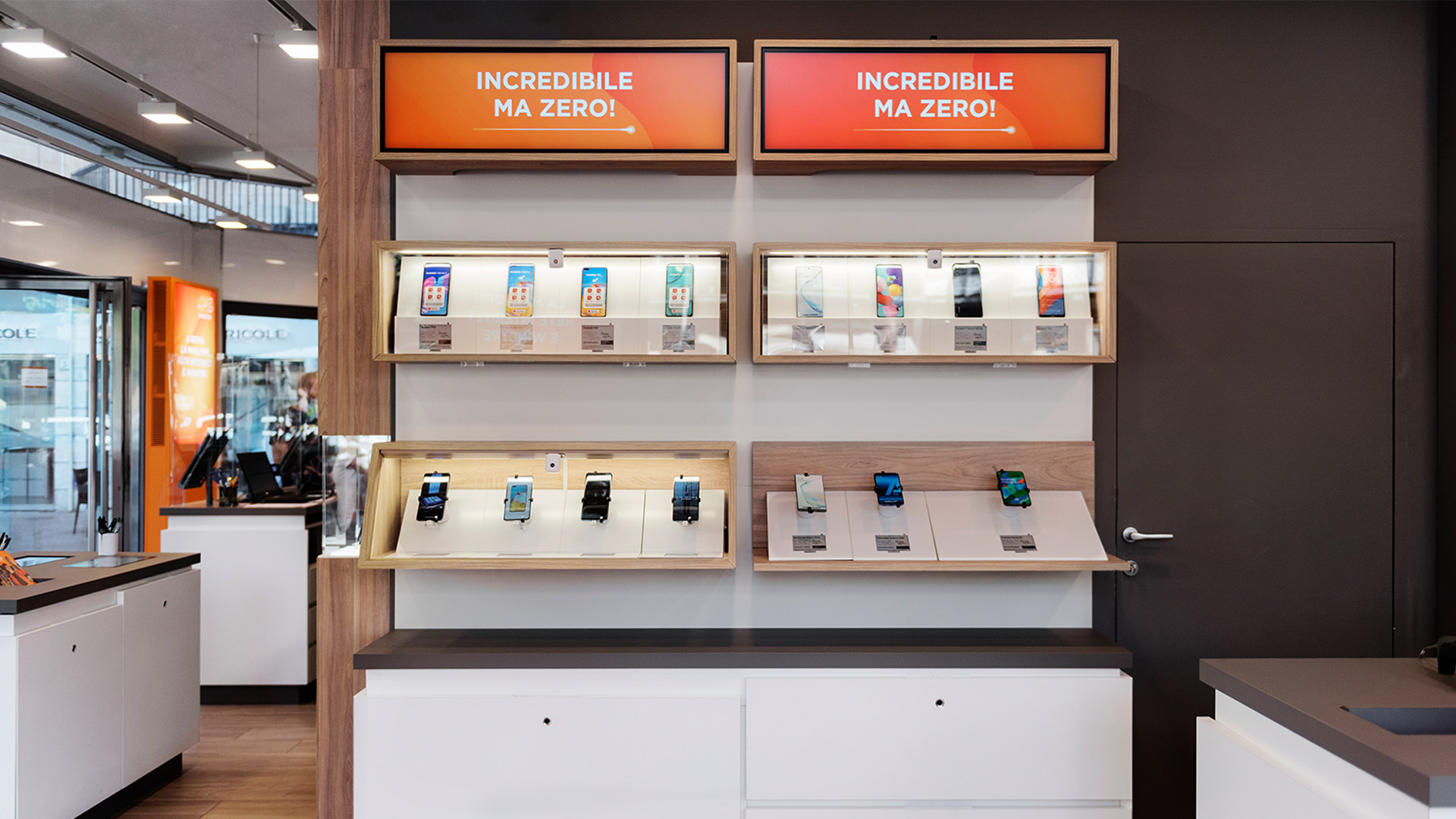
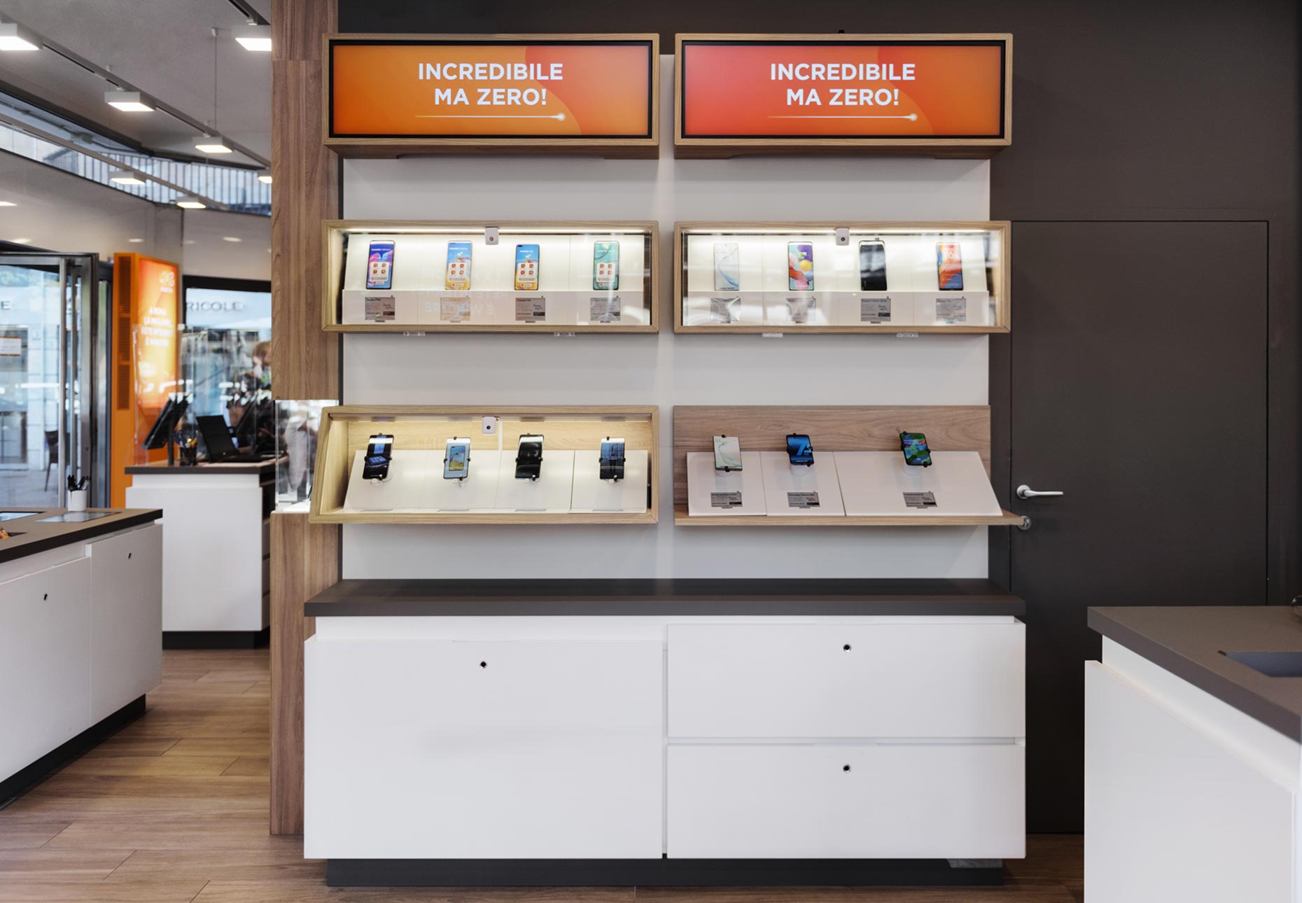
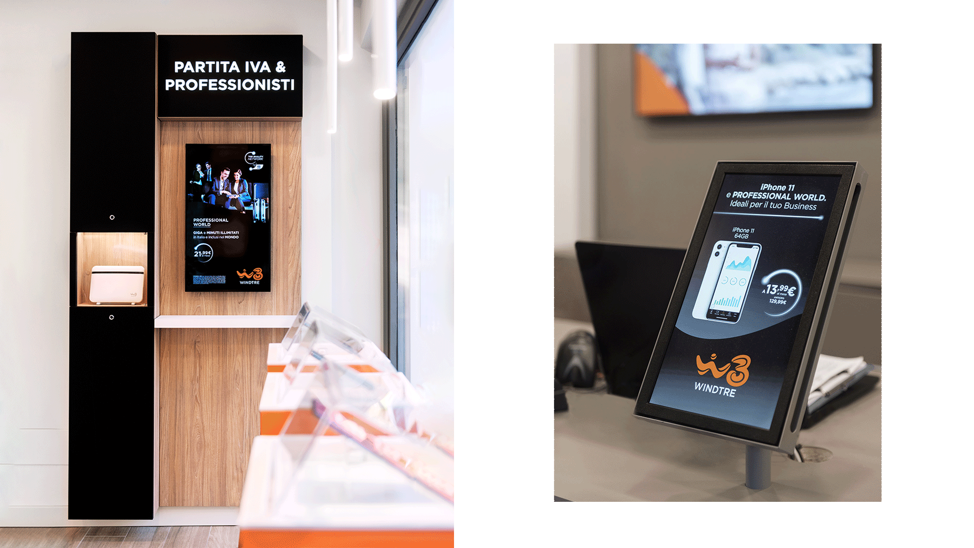
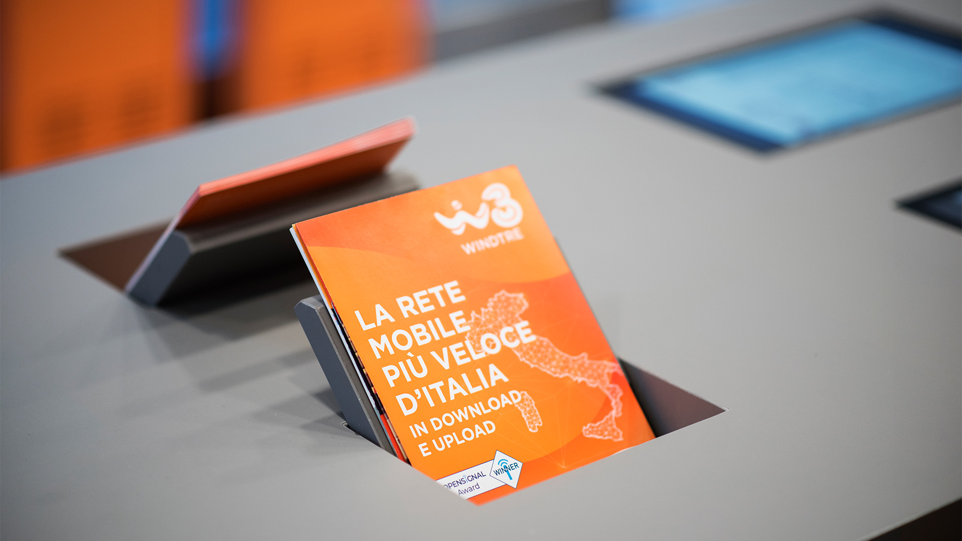
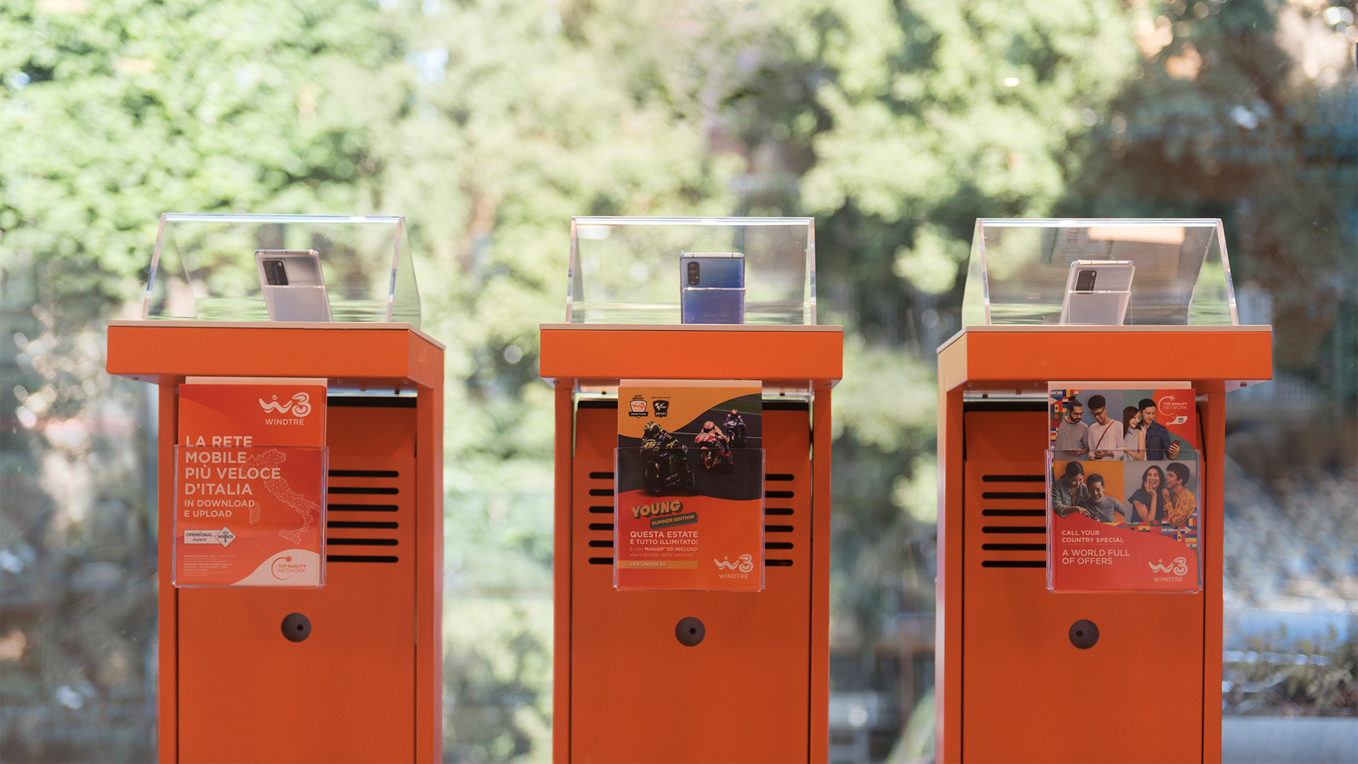
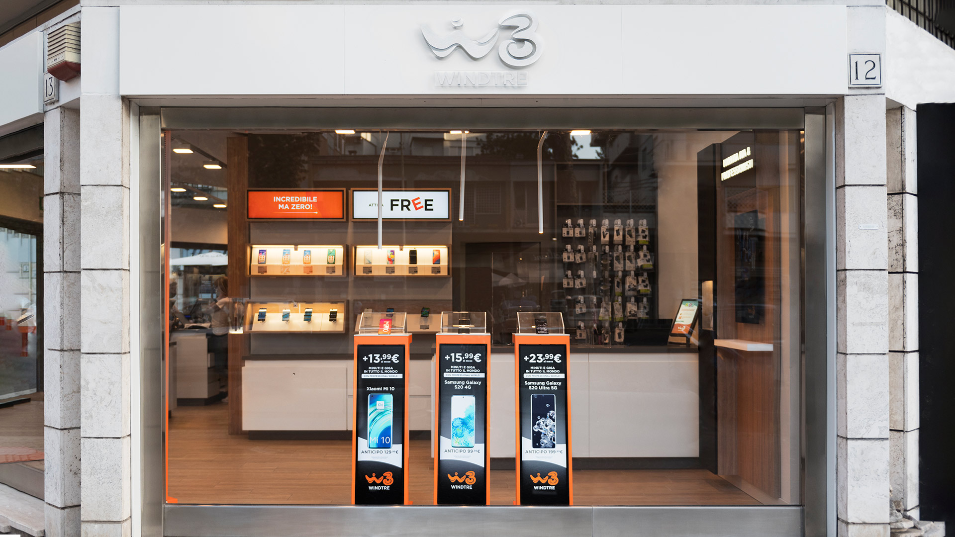
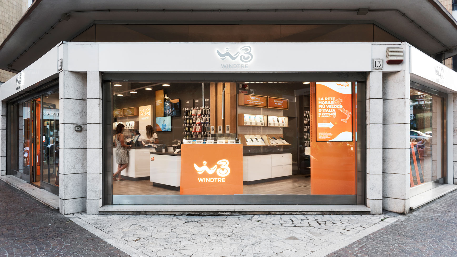
WindTre is convinced the most important network will always be the one between people. This concept inspired a new people-oriented format with positive, bright colors and soft, enveloping shapes. Orange has been Wind’s signature hue since its launch, but now has turned into a dynamic, living color, with a gradient that extends to warm magenta. With lines that echo the style of the new logo – which is full of movement and energetic features – the format is ready to boost the brand and adapt to a future in constant evolution.
Twenty years on the phone with Wind Tre
20 years on the phone with WindTre
After 20 years of collaboration – starting in 1999, when Wind launched in Italy – Angelini Design welcomes the new WindTre brand by creating its new graphic format. “Molto più vicini” (“Much closer”) is the perfect slogan to convey the company’s renewal and new positioning: clients are at the very center of WindTre’s communication, which reflects the goal of breaking down any barrier between people. A mission that is more relevant than ever and has a special social value, in the difficult times Italy is experiencing since the beginning of 2020.
more
less
