SACE is Italy’s insurance-financial organization offering support to companies in Italy and in the world.
With a new Governance, a new Industrial Plan and the expansion of the business model increasingly focused on PMI and national market to support the green transition, a “cultural rebranding” was required to redefine its mission, vision and brand identity, within the context of a complex market scenario in search of certainties, stability, ethics and courage.
Angelini Design supported the client leveraging a proprietary methodology that puts “people” at the center: conversations and workshops aimed at creating a shared, strategic project having the strength to look to the future with hope and the capability to innovate.
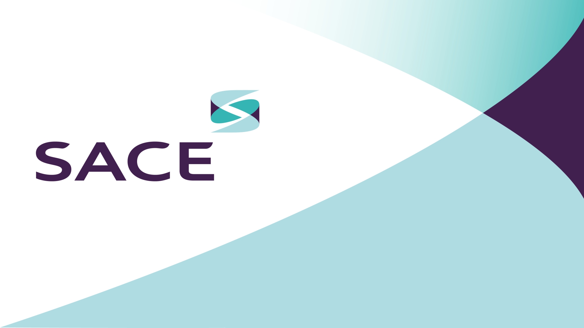
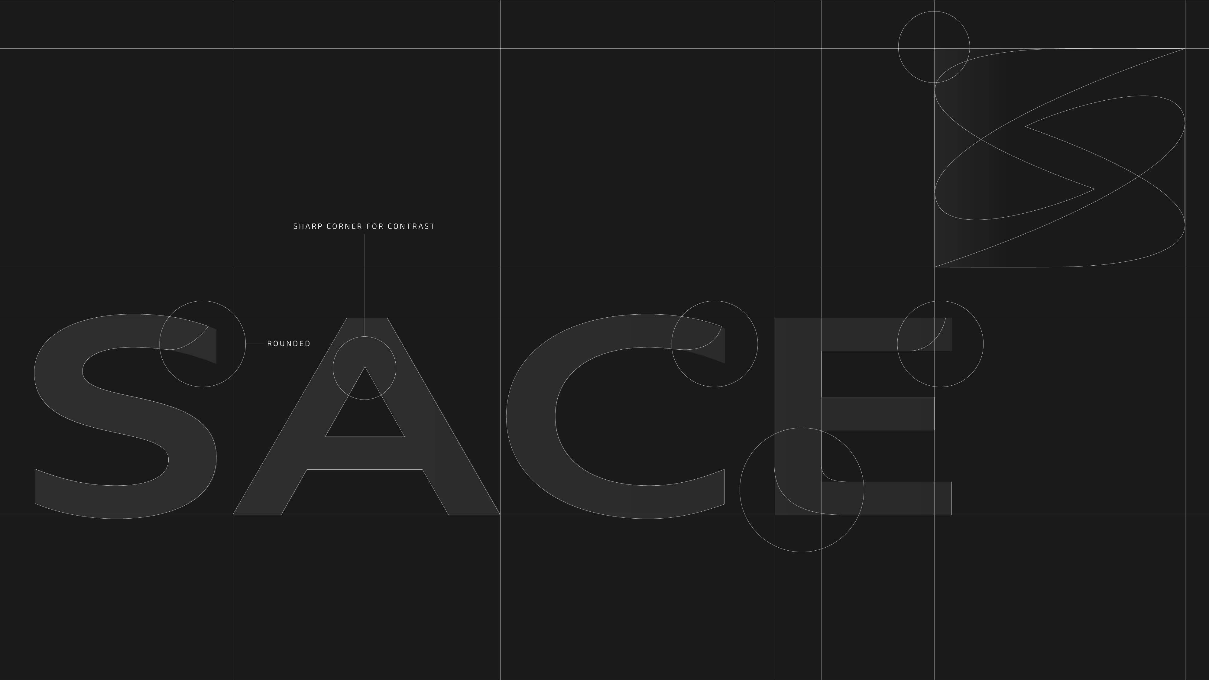
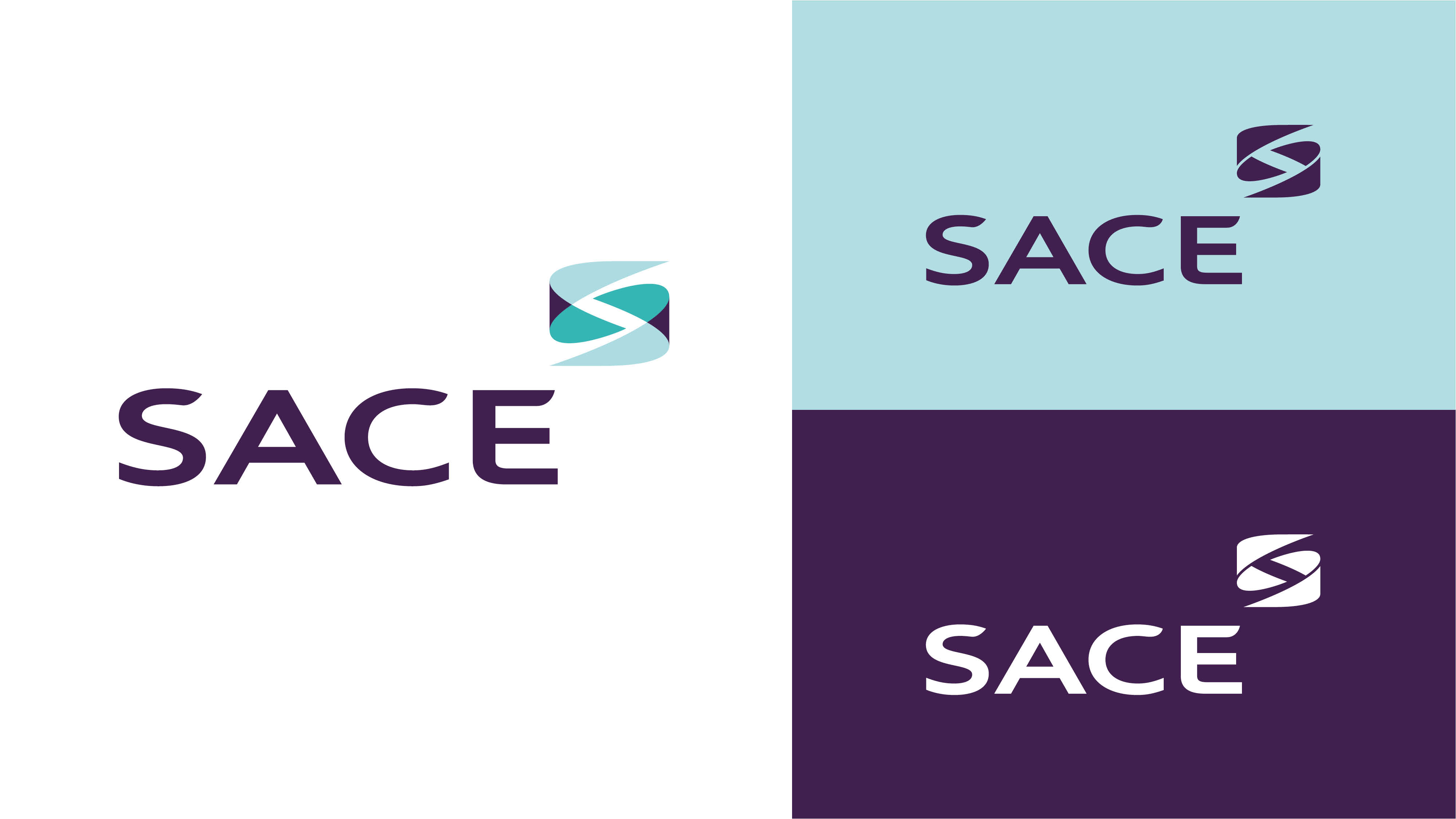
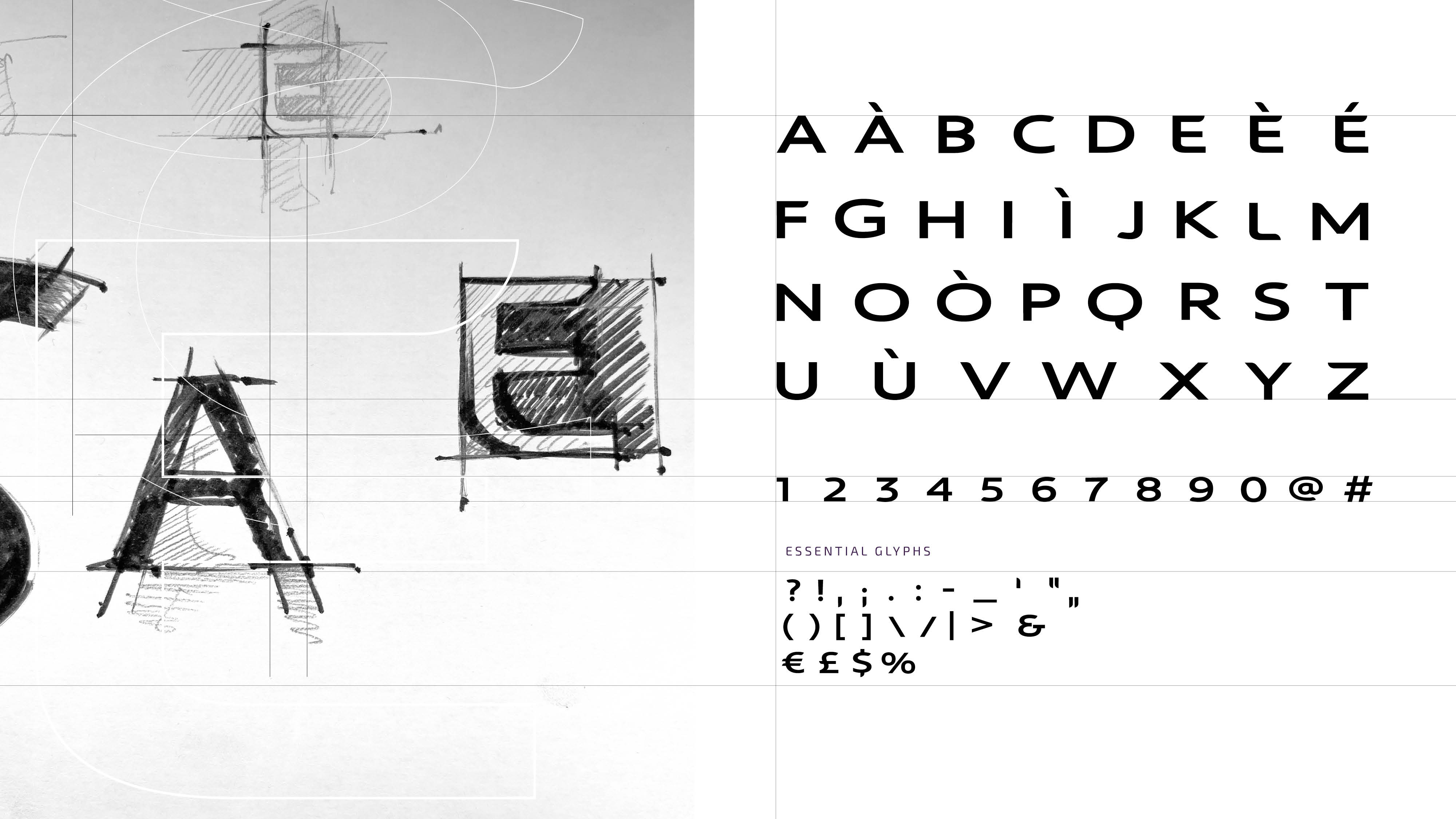
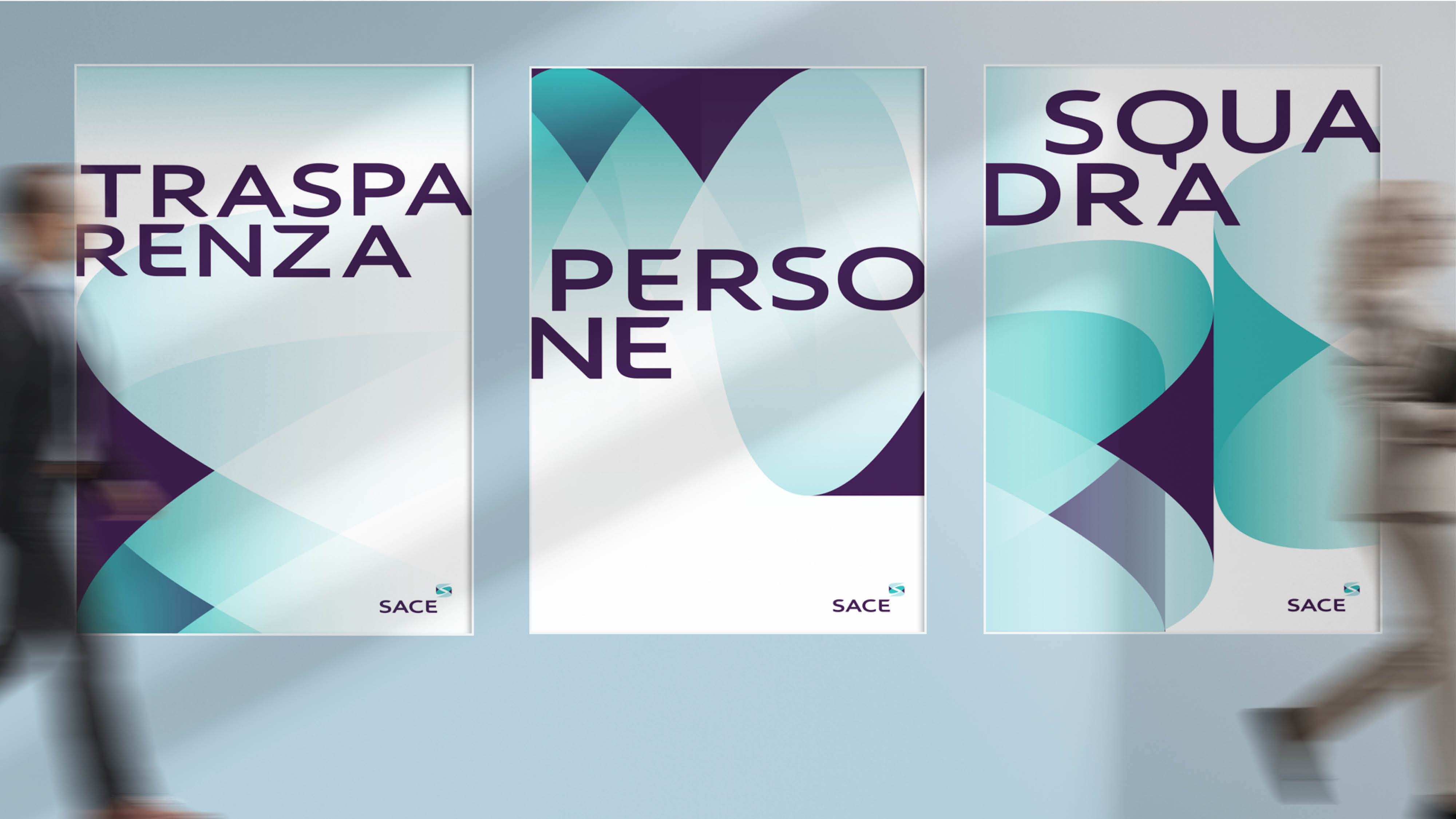
This was the inspiration behind SACE’s new logo: two curved shapes that merge as if in an embrace, forming the S in the name SACE, to embody the organization’s values of Courage, Flexibility, Transparency, Teamwork, and Closeness. The Blue-Purple dominant hue, complemented by light blue and green tones, conveys passion, reliability and innovation with a touch of tech and digital vibe. The typeface was custom designed, and stands out for its contemporary look also thanks to the blend of straight and curved lines.
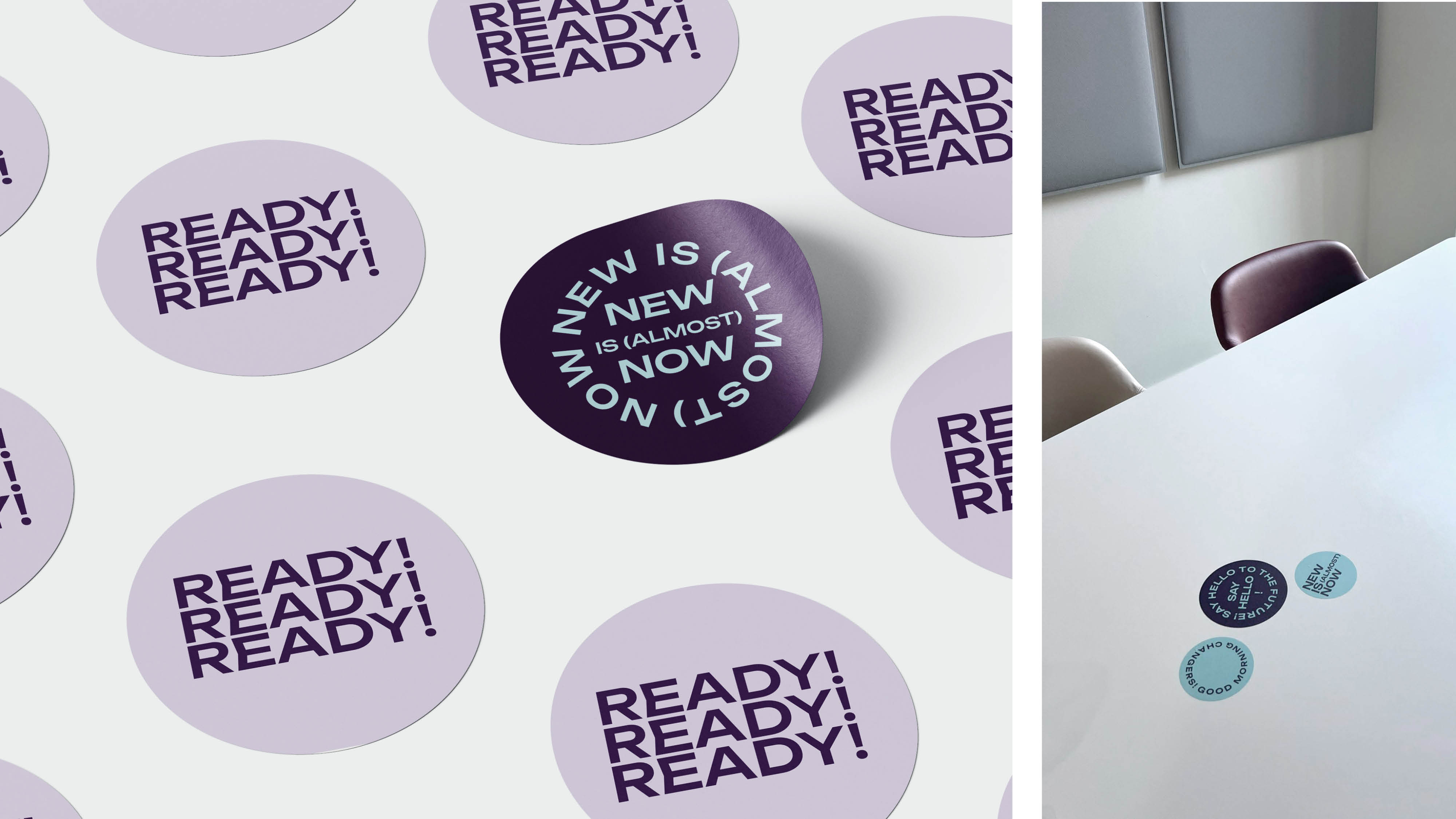
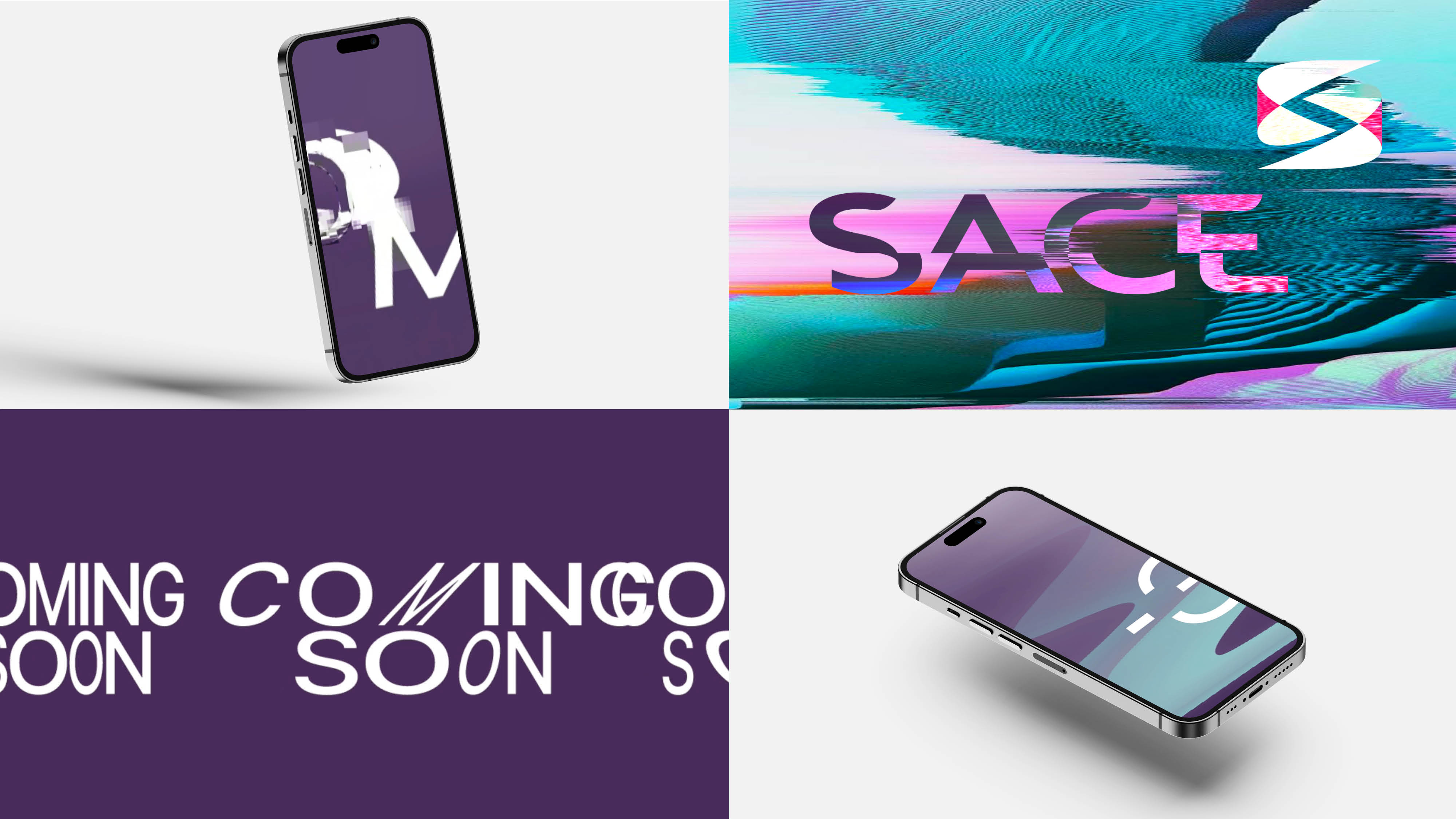
The launch plan for SACE’s new identity considered internal communications first of all. A teaser phase revolved around a dedicated communication format and language to engage, spark curiosity, and make all employees feel like part of the change. With an ironic approach and the help of physical and digital touchpoints, for 3 weeks SACE’s offices featured original and engaging content – leading to the unveiling of the new brand, with a live performance by street artist Niko Skolp.
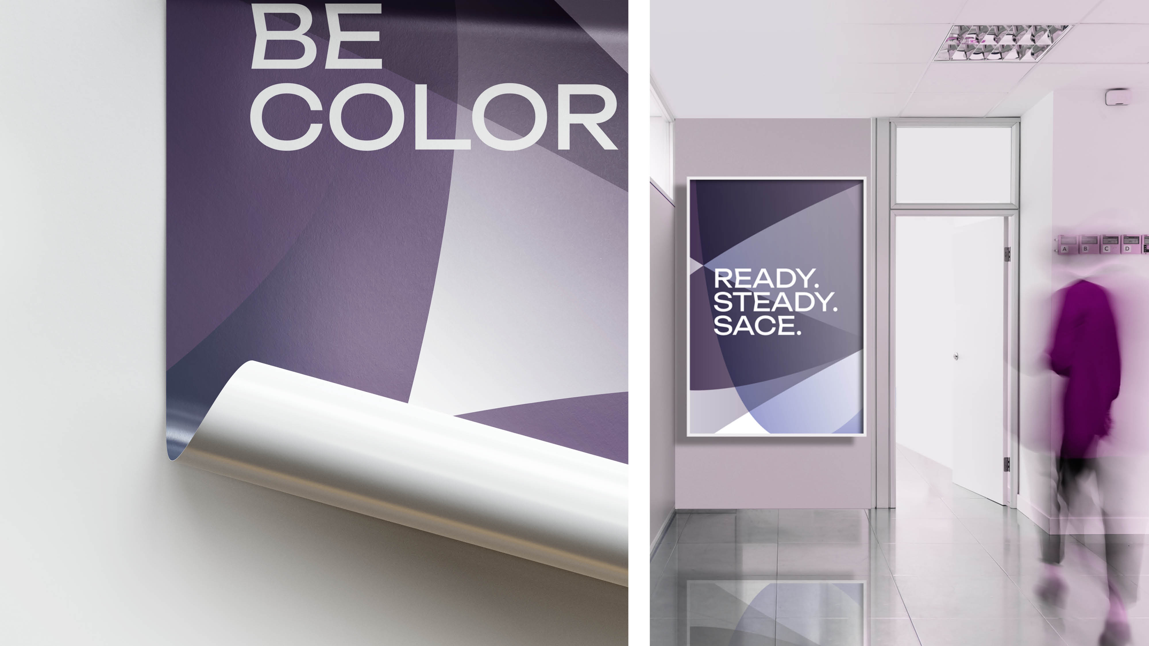
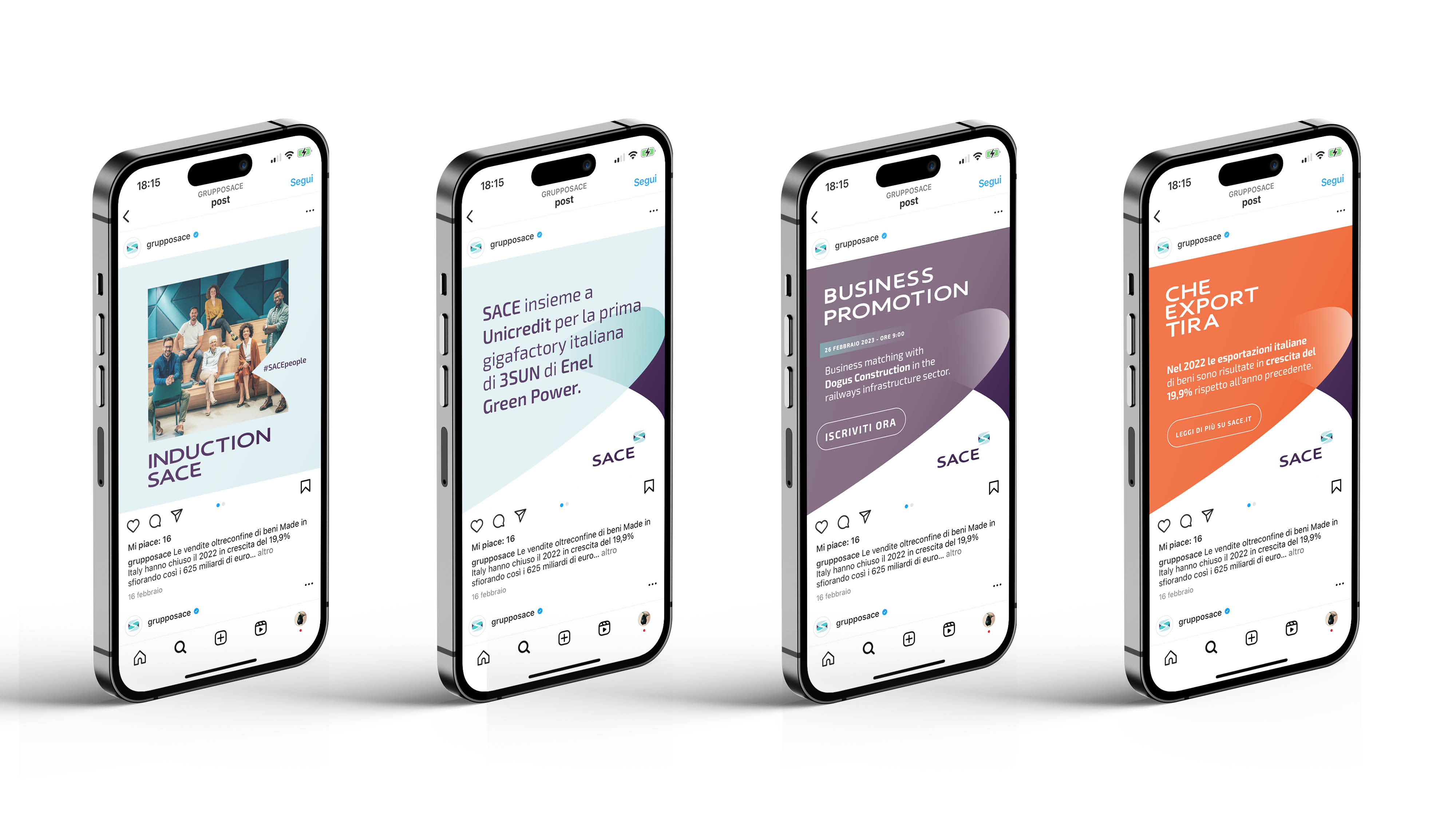
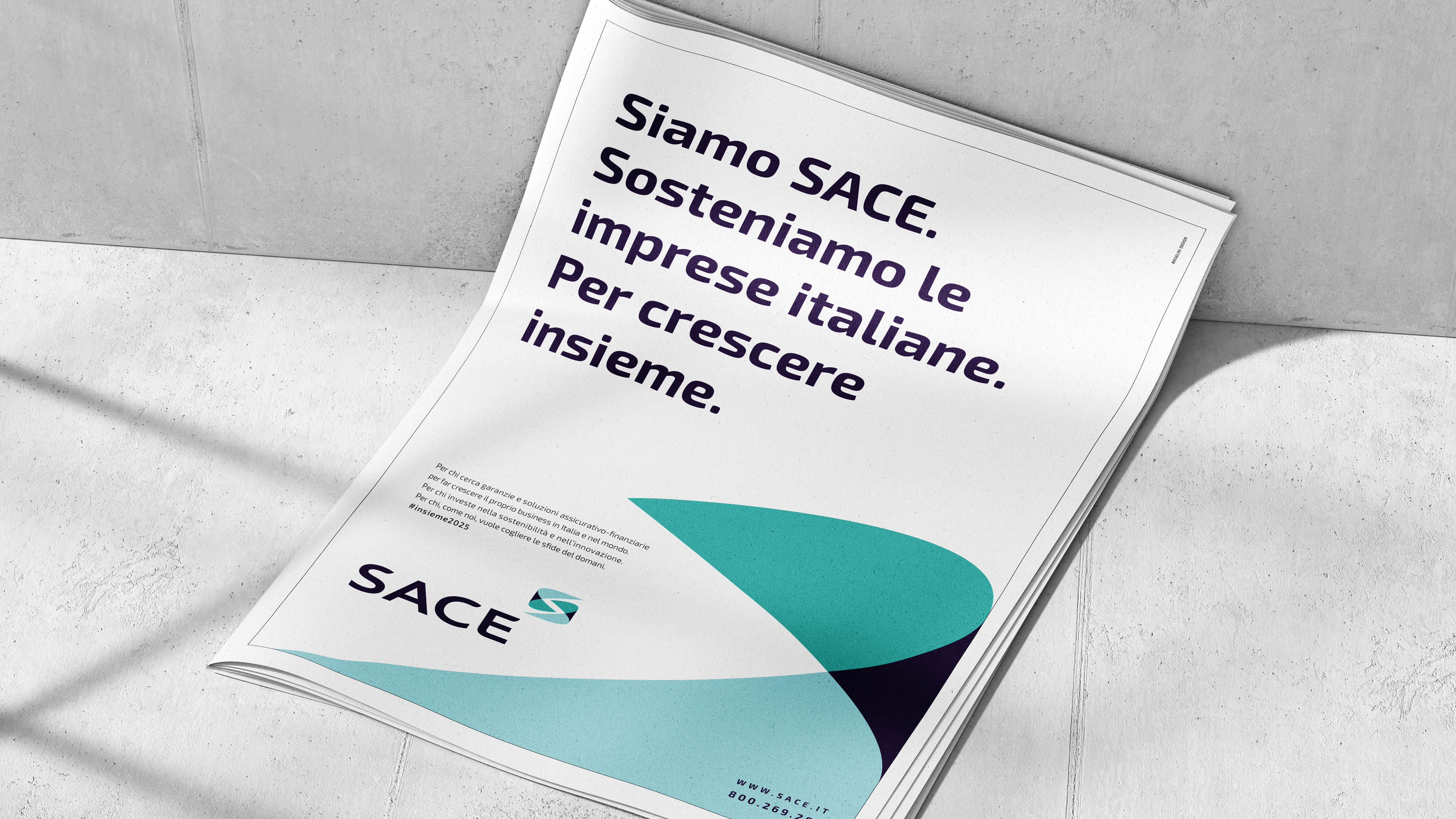
As regards external communication, the plan includes print, digital and social campaigns, as well as the creation of all new communication assets.

