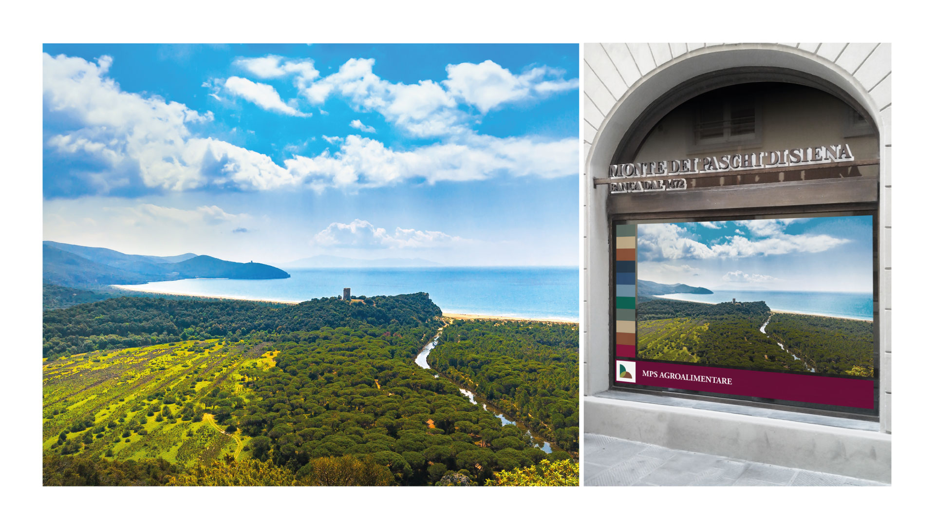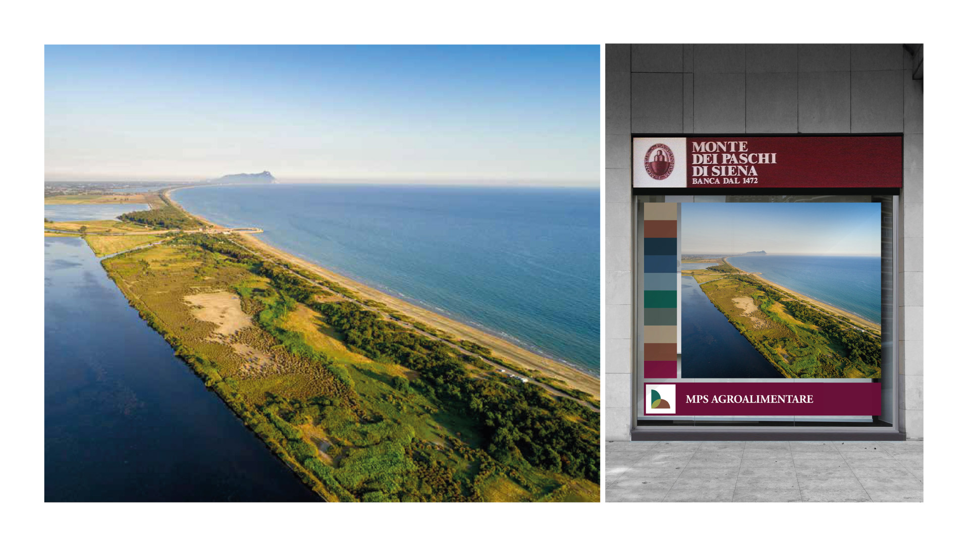
The agency worked on three main deliverables: logo, brand identity and communication format, which was then implemented to customize the branches that took part in the project. In addition to the outdoor setup, environmental graphics helped create an efficient customer experience inside the offices – and also decorated the space with images that evoke the company’s values.
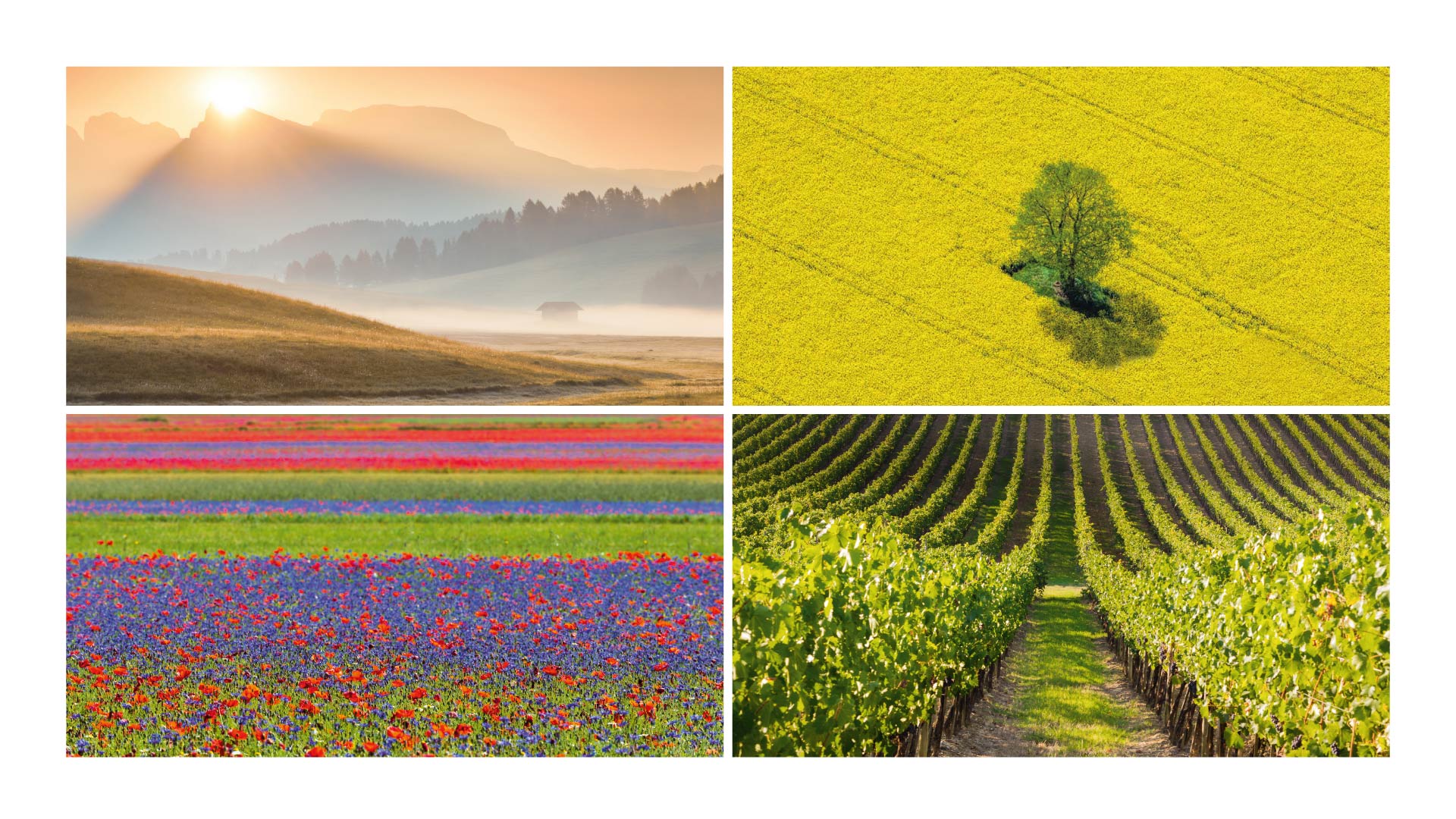
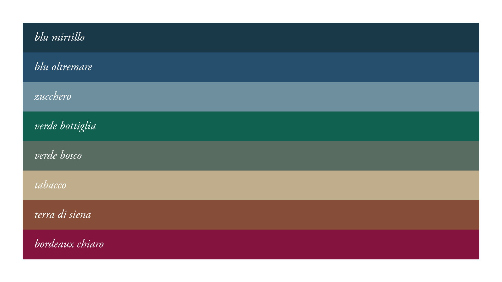
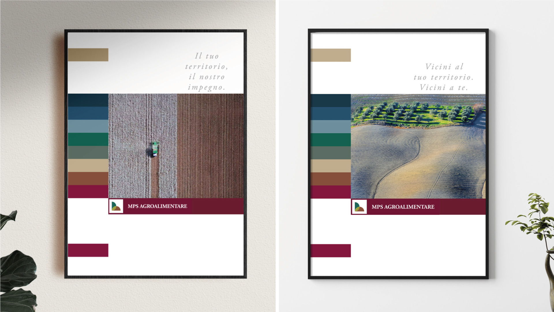
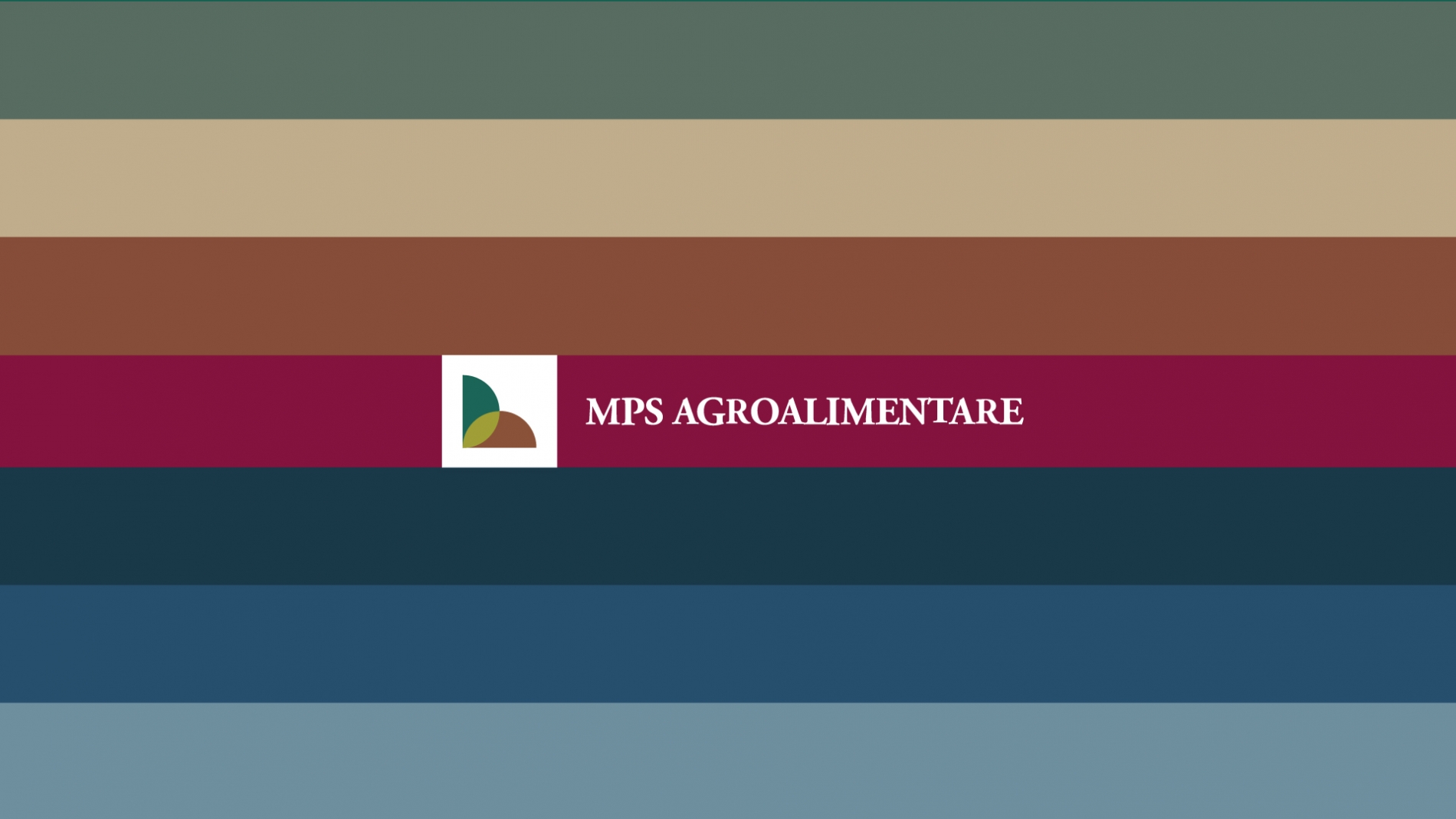
Angelini Design researched imagery with the specific goal of representing different territories through a series of landscapes, selecting photographs inspired by great Italian authors, with sharp contrasts and color juxtapositions. Their linearity translates into a clear graphic code, starting from the MPS institutional ribbon that is synthetized and repeated on the side throughout all communication tools. The photographs were carefully selected so they would not merely represent agri-food products, but rather showcase the territory as if it were the subject of a postcard or painting, with almost dream-like visuals. The format’s color palette was derived from the images themselves.
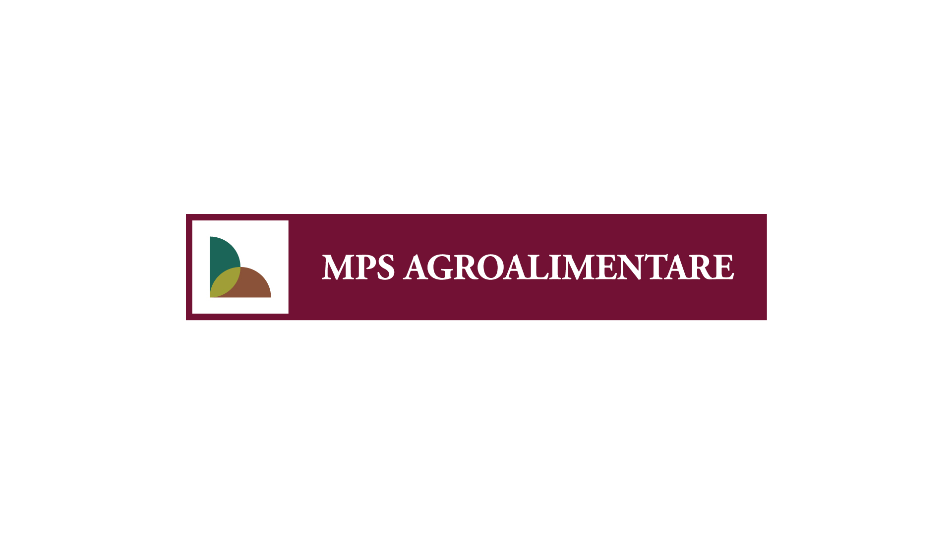
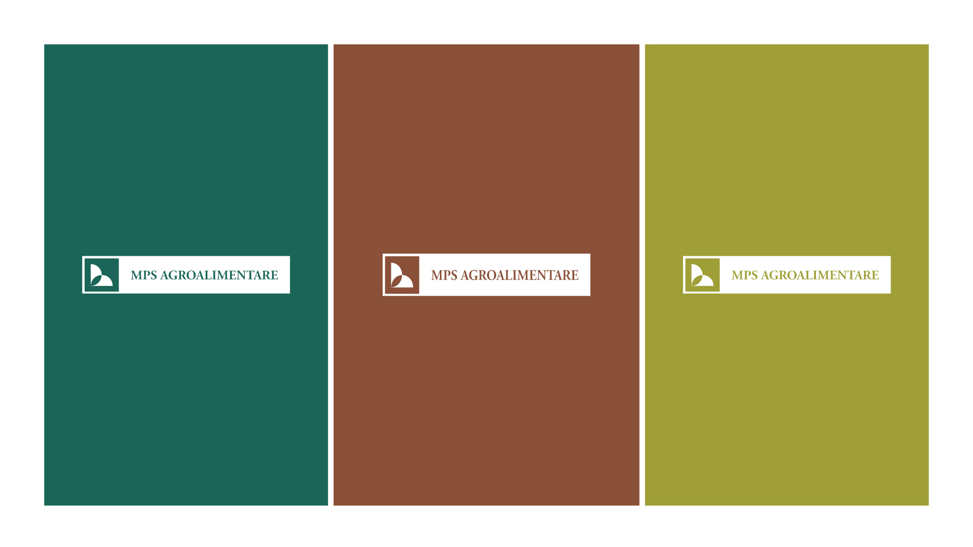
The MPS Agricoltura trademark was built with two elements – the icon and the logotype –wrapped into a label. The design visually references the Italian landscapes tied to agriculture, with hues such as Leaf Green and Sienna framed by MPS’s classic Claret, declaring the relationship with bank. Soft, warm colors are also used in the communication format, conveying the care and passion that lead MPS Agroalimentare in this new endeavor.