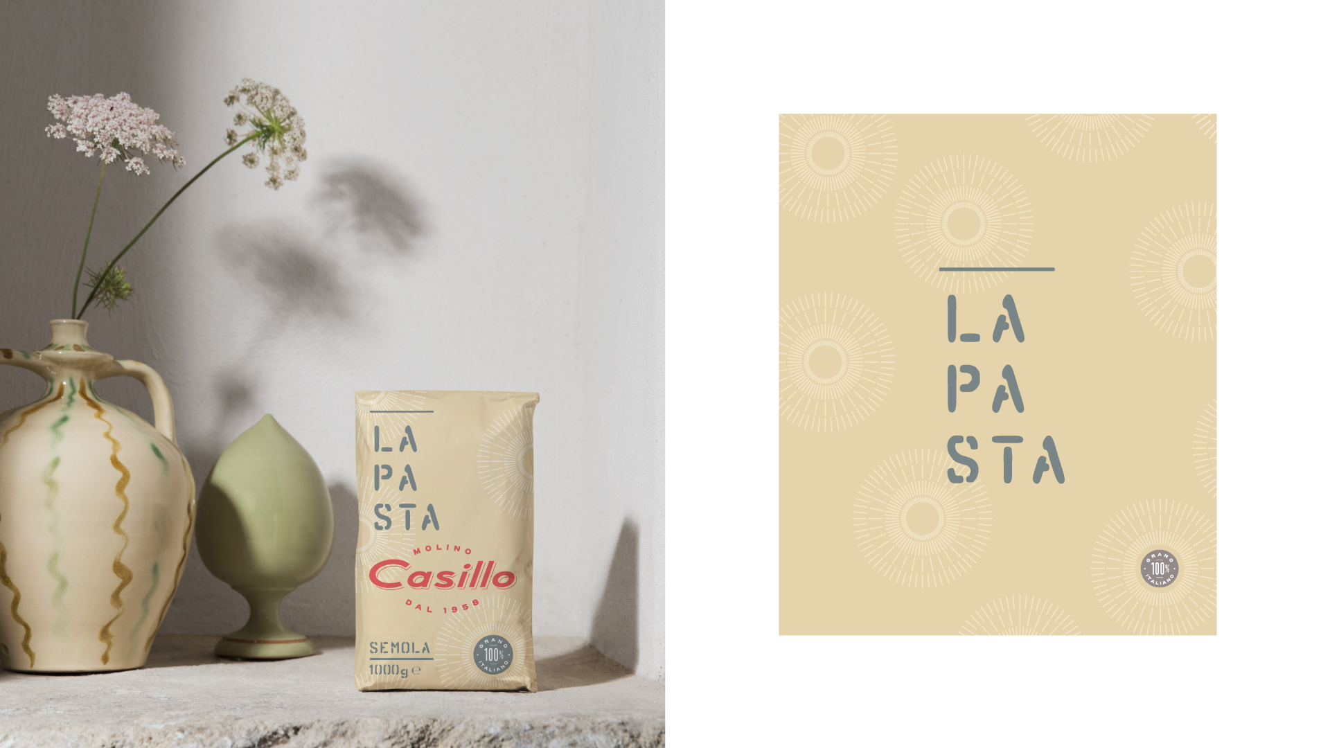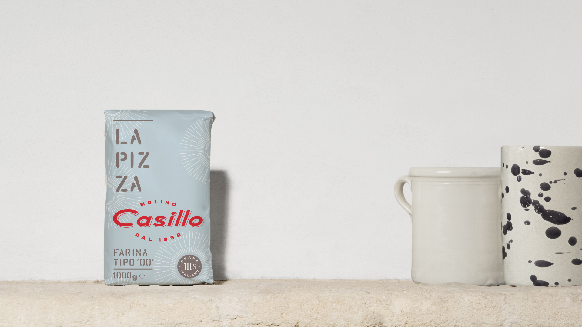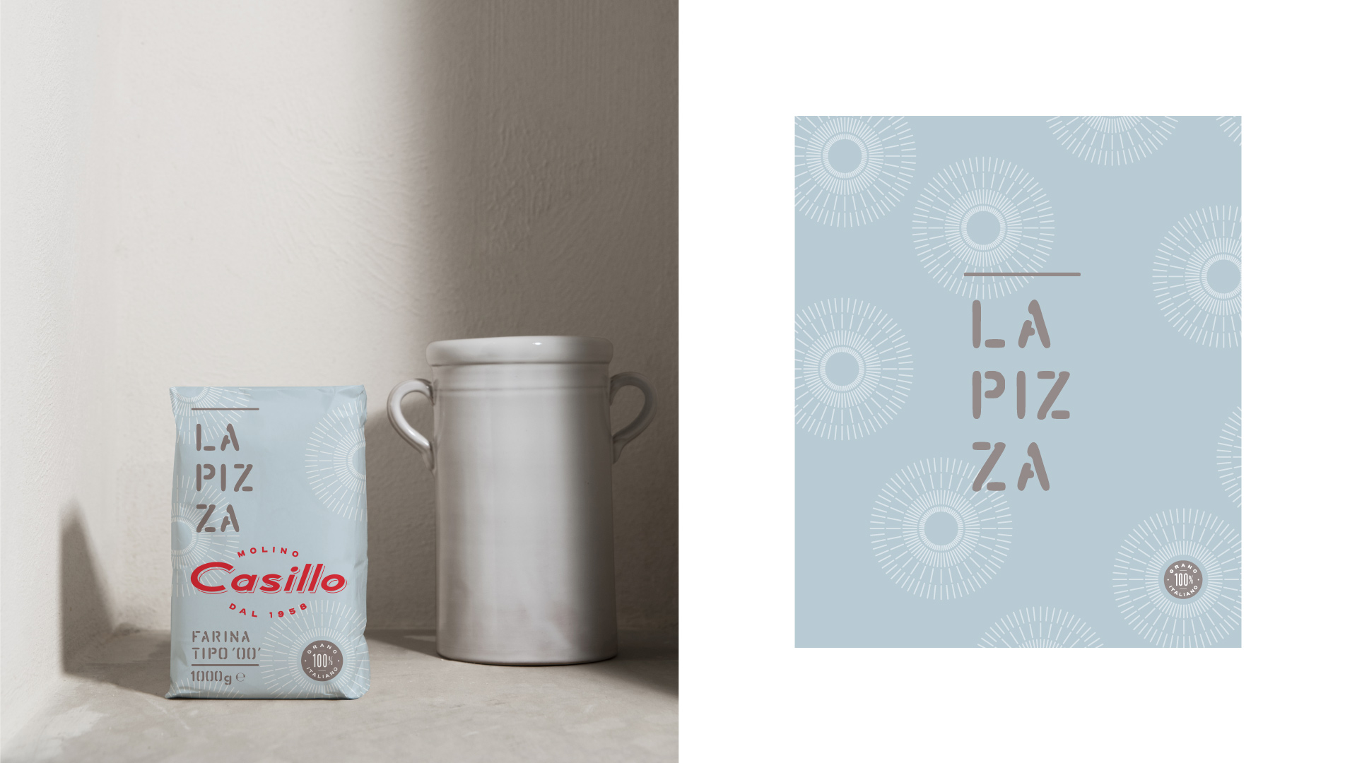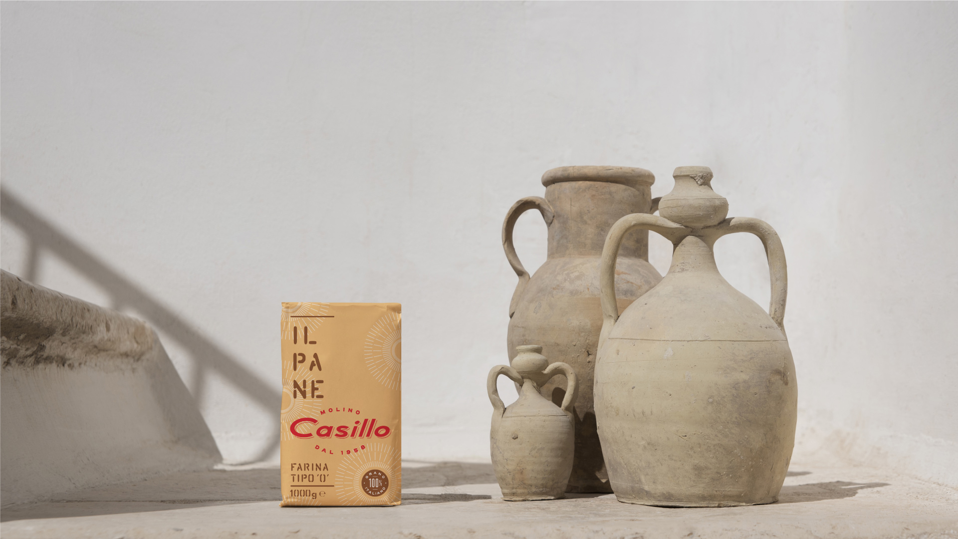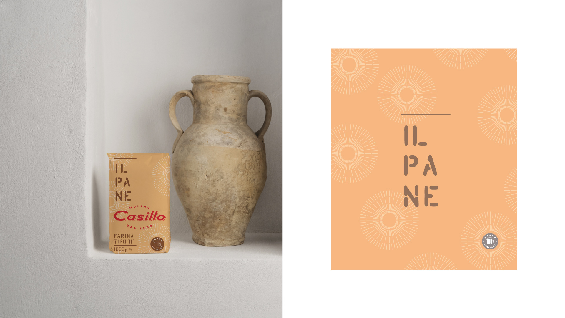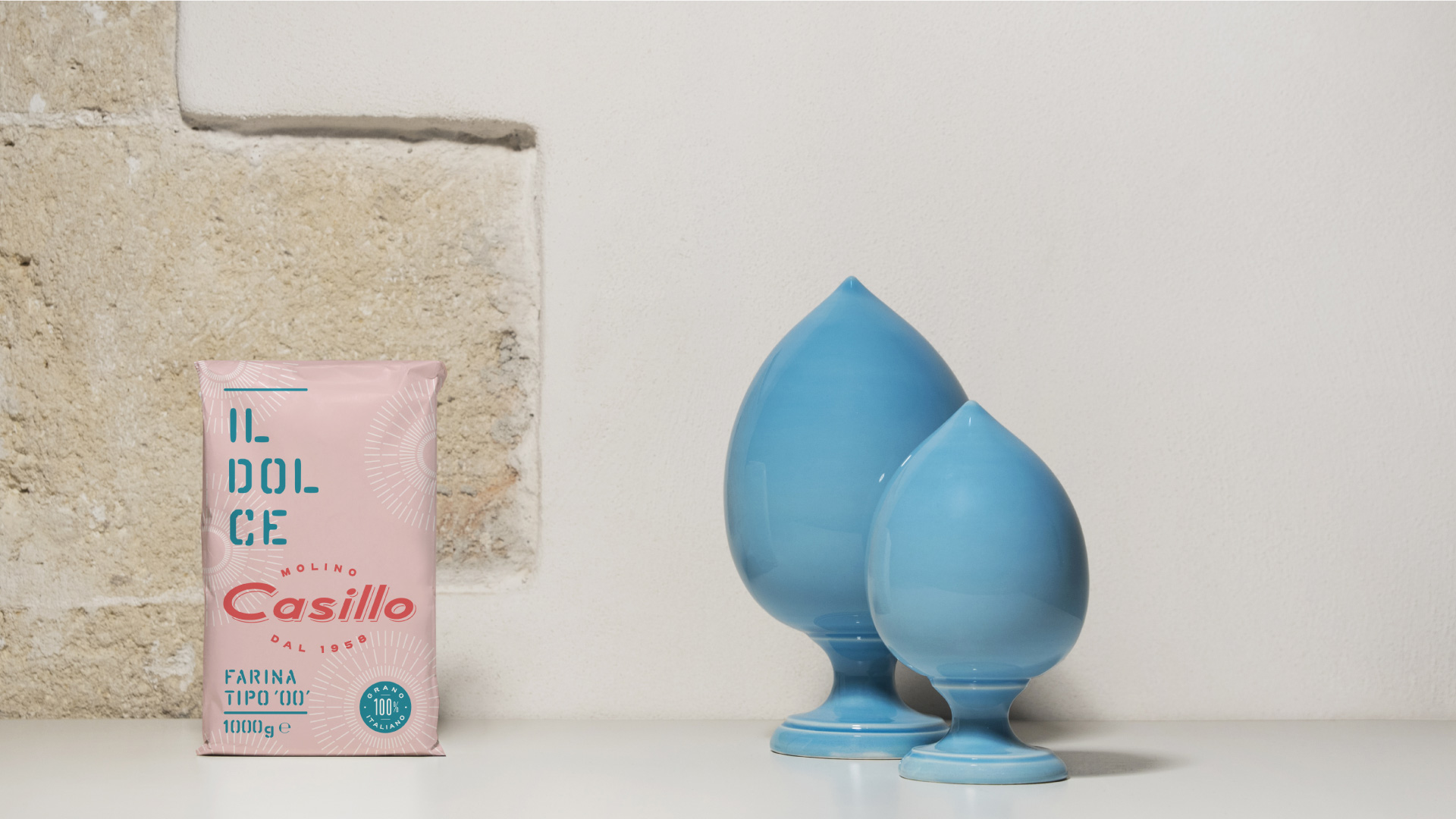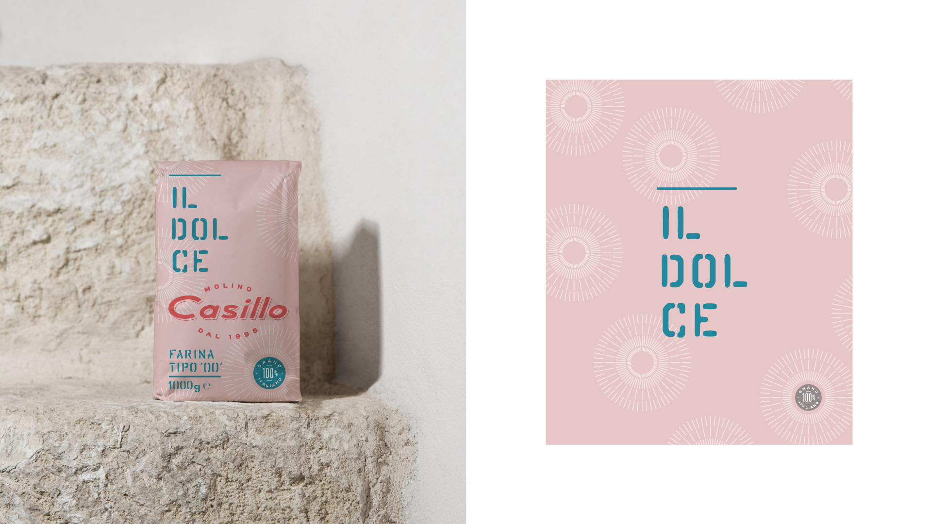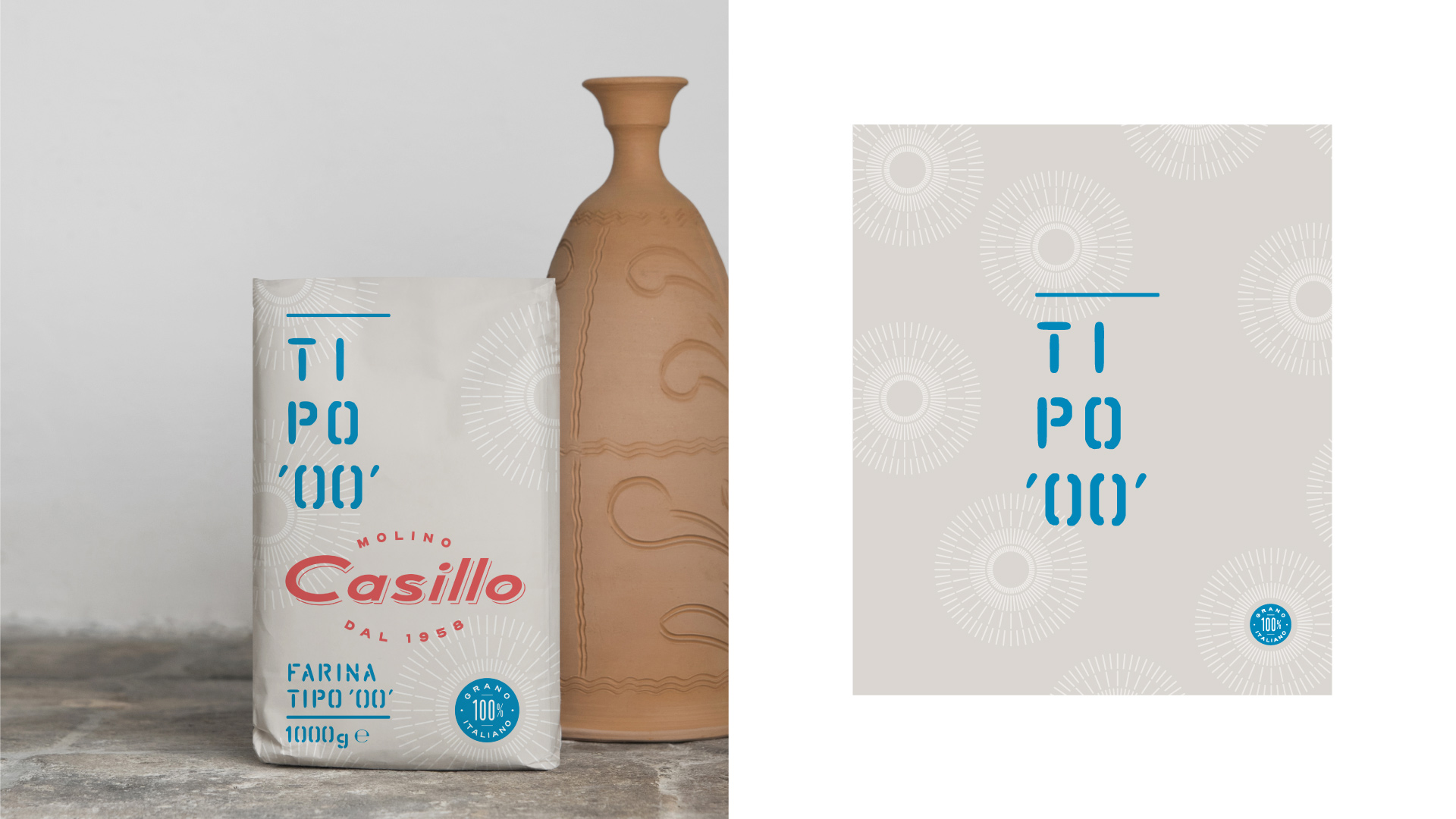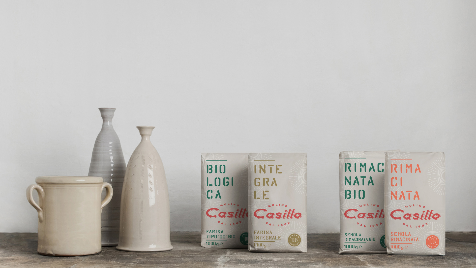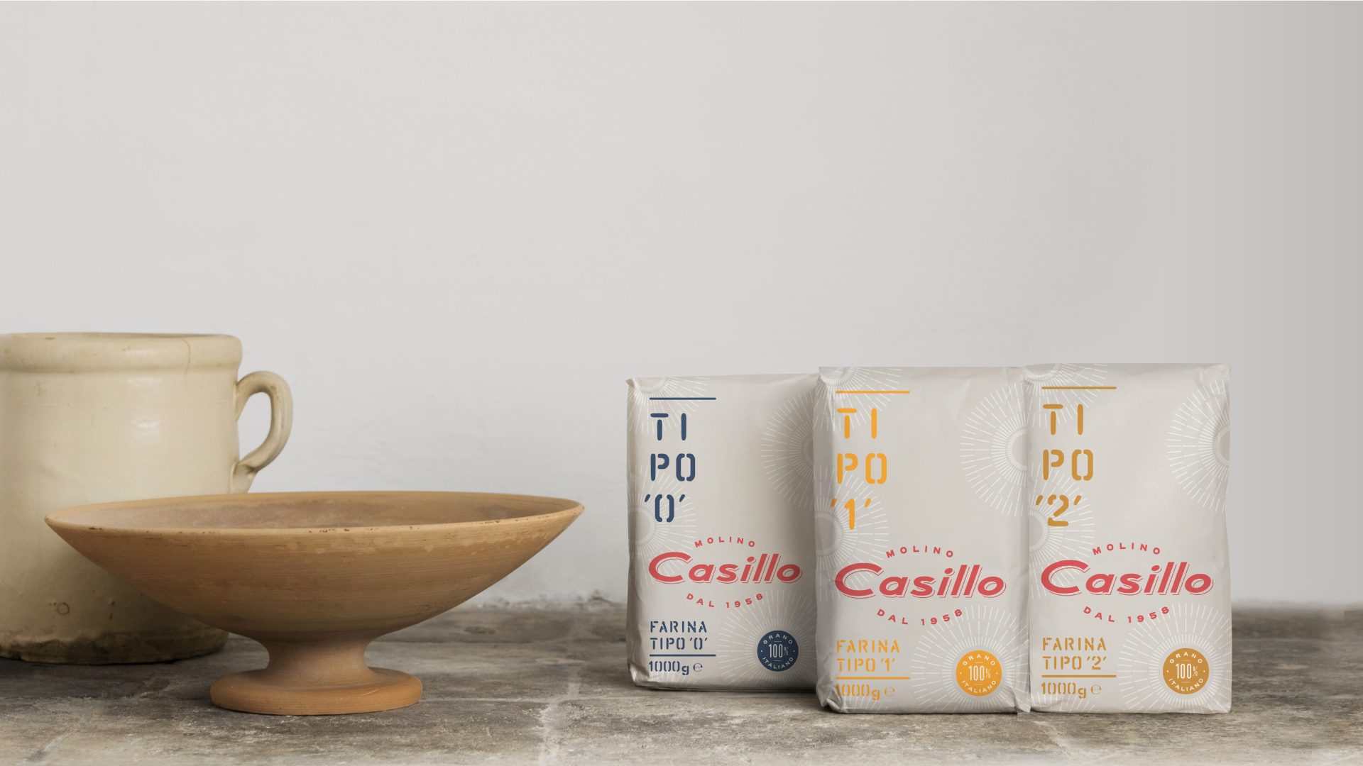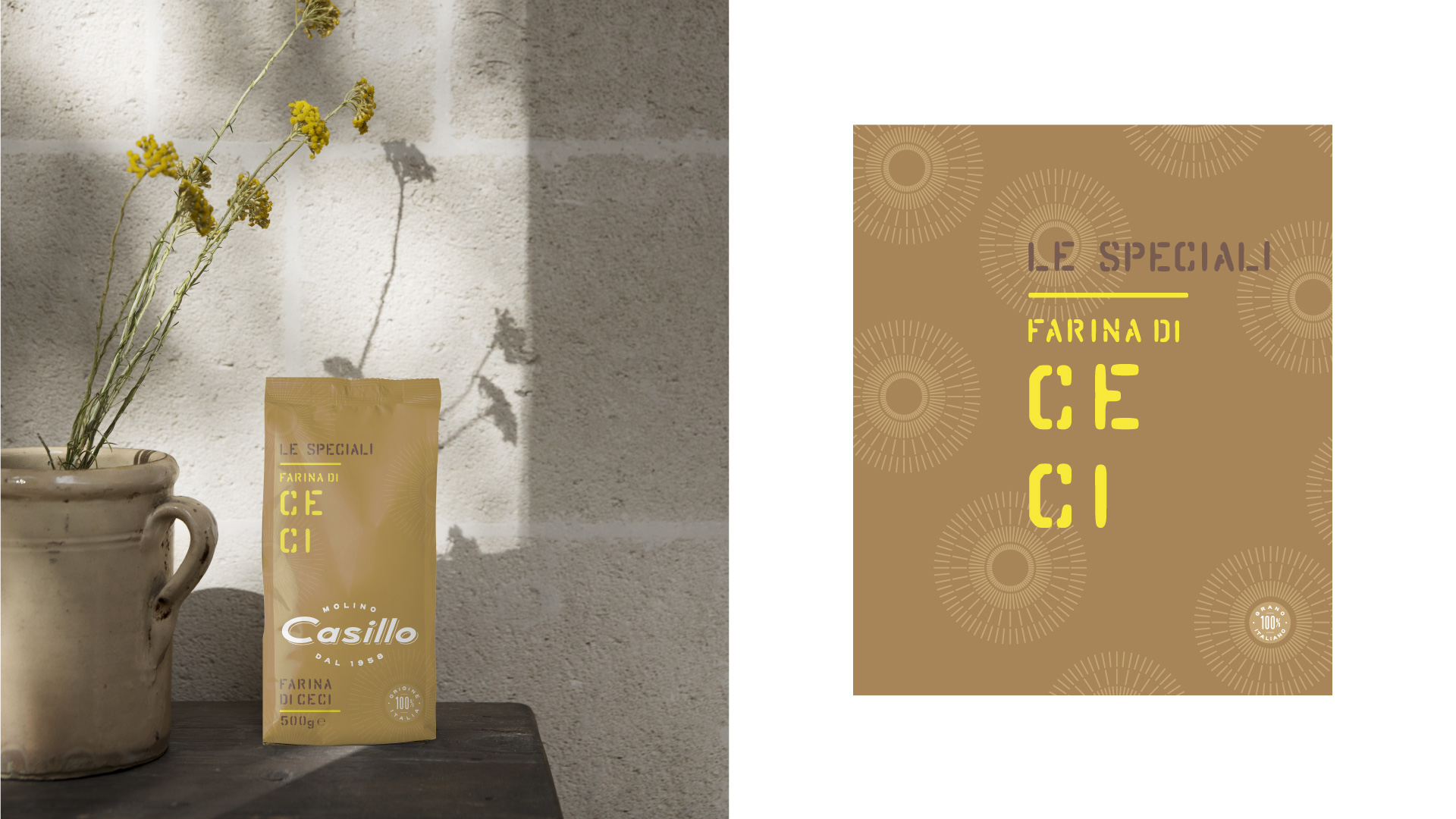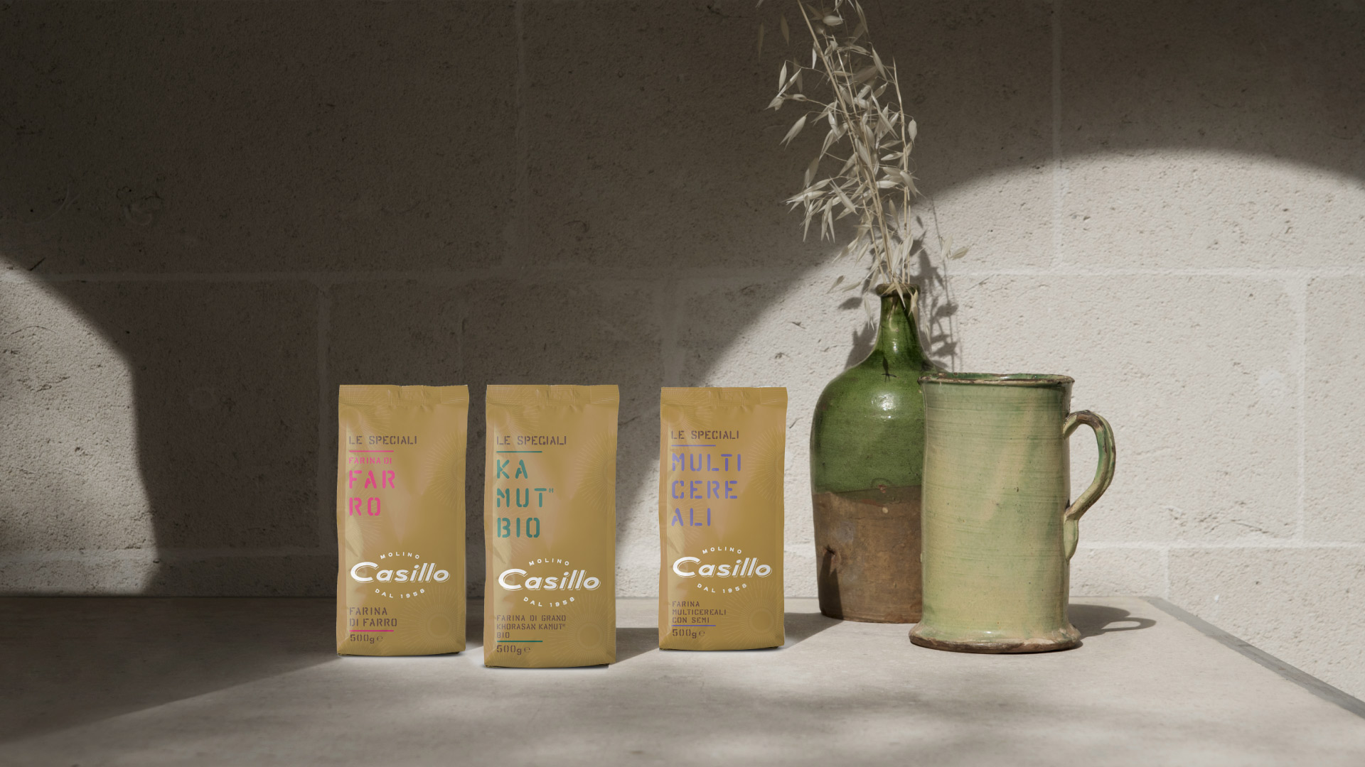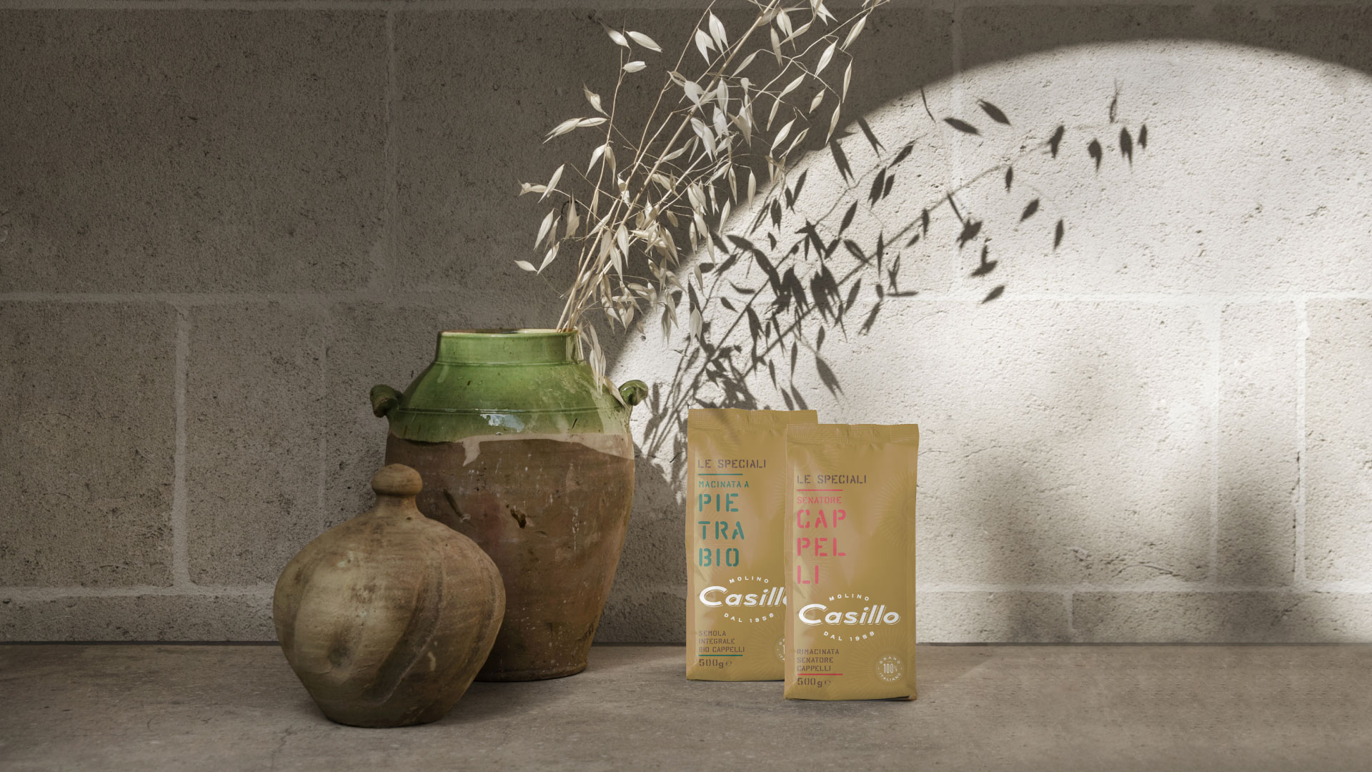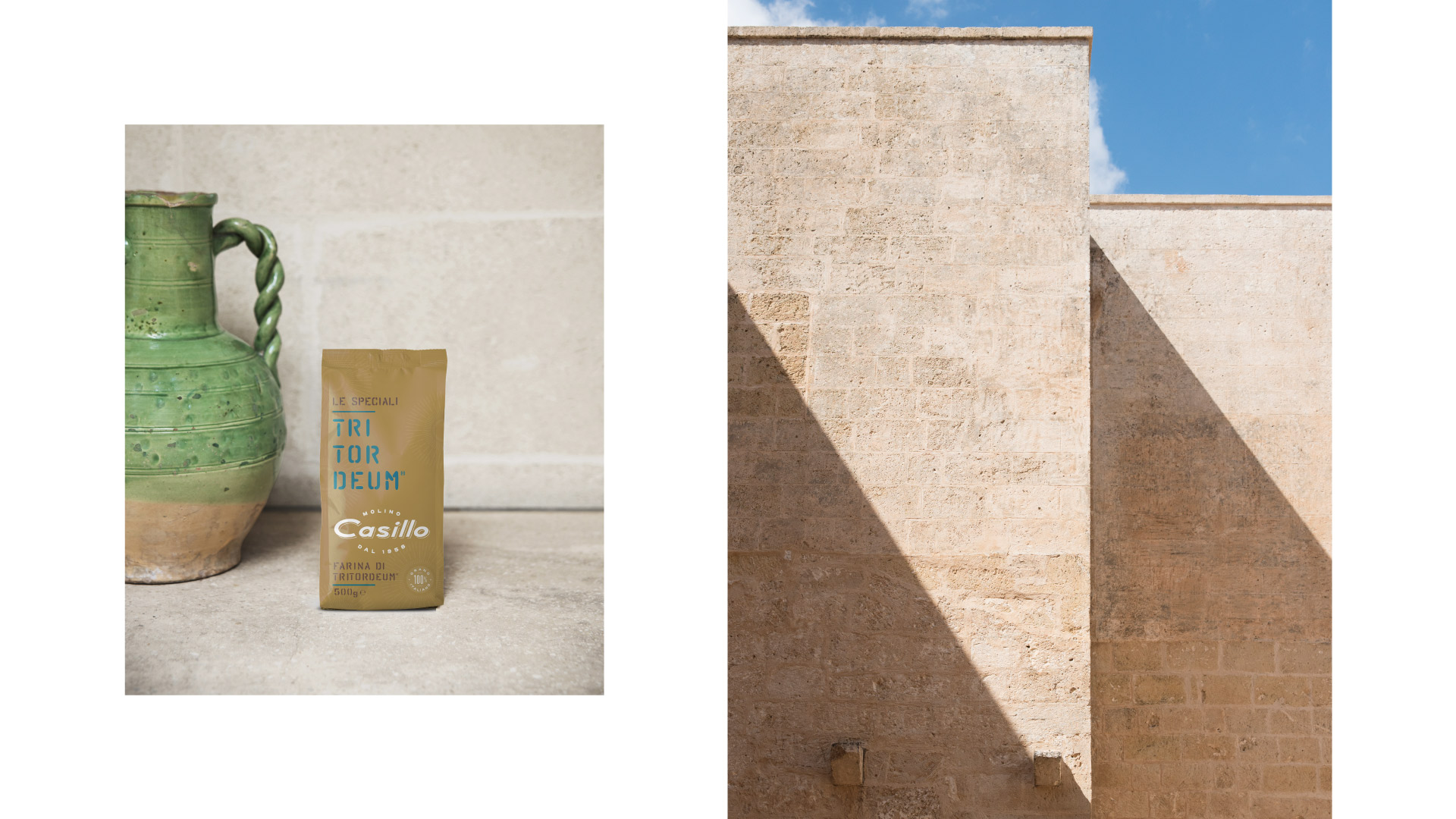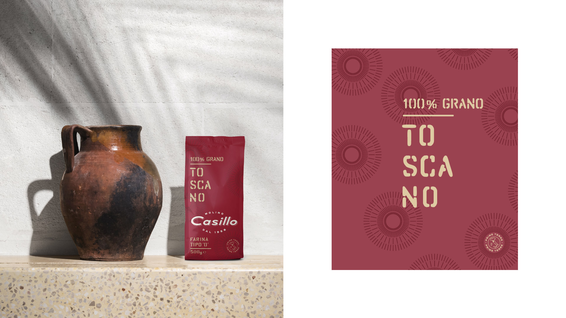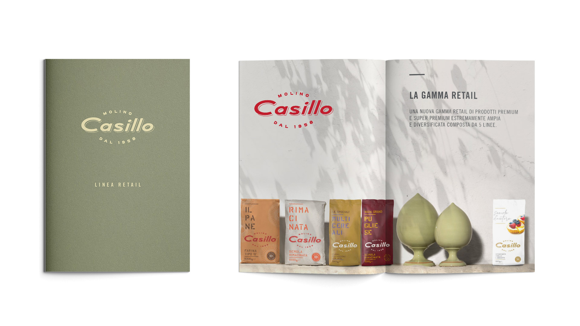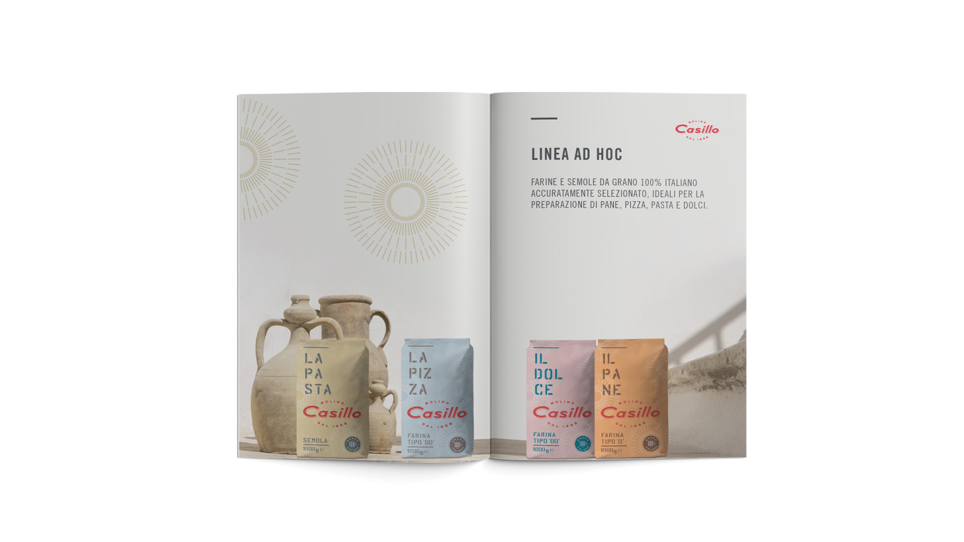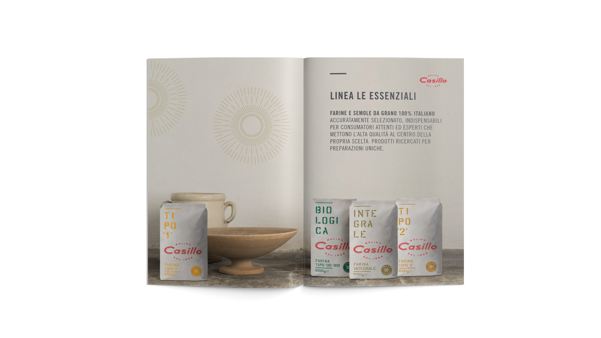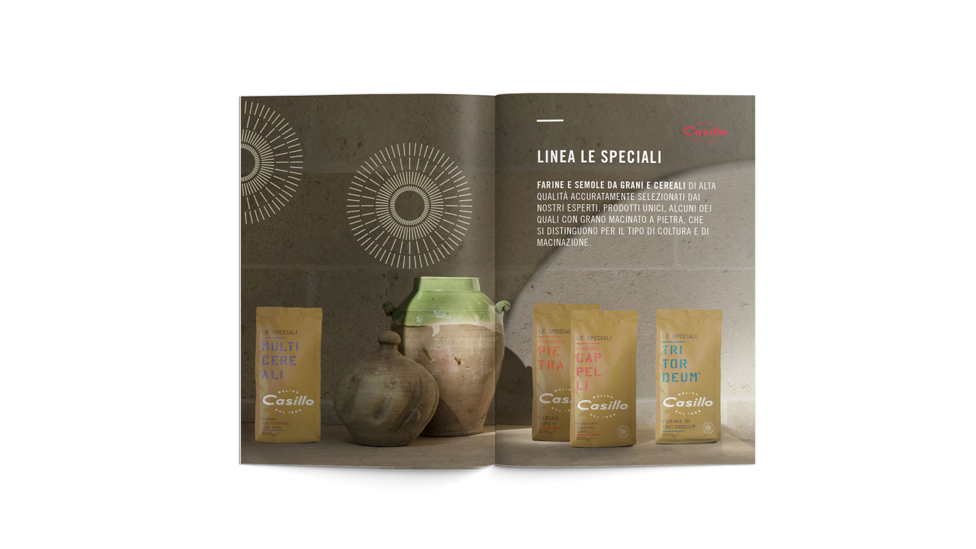
After a profound rebranding process, the agency’s art direction redesigned the product range destined to end clients, strategically reorganized into five families of premium and super-premium flours and semolina. Angelini Design’s creative concept had the primary goal of making the intended use of each type of flour clear from the first look at the packaging. Graphic design emphasizes the brand with a palette of light and pastel hues, while style solutions – such as the names spelled out vertically – are meant to stand out on the shelf, to set the brand apart from competitors and their usual imagery.
Lettering inspired by stencils evokes a wholesome world of tradition, tying in with the intense social media activity that allows Angelini Design to tell consumers about the history of Molino Casillo; the narrative continues on the back of the pack, with details about the ancient – and newly popular and appreciated – art of making and using flour.
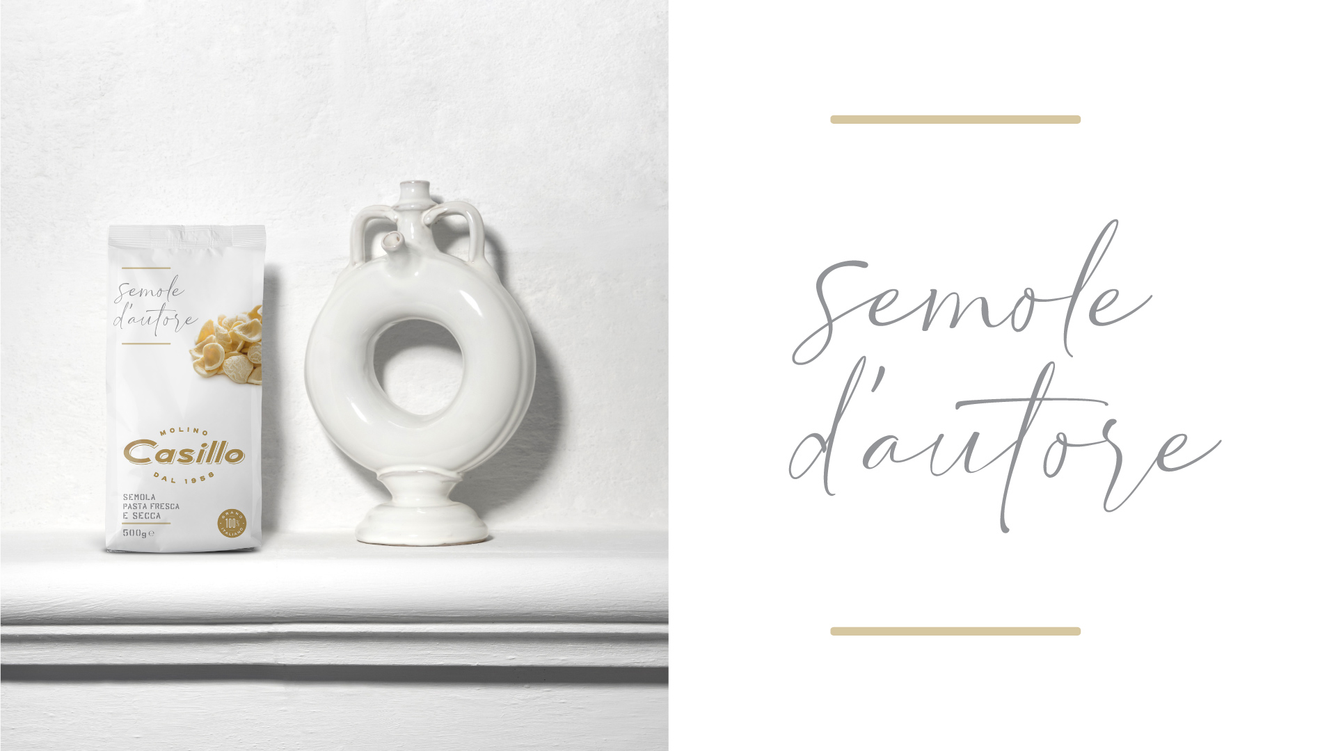
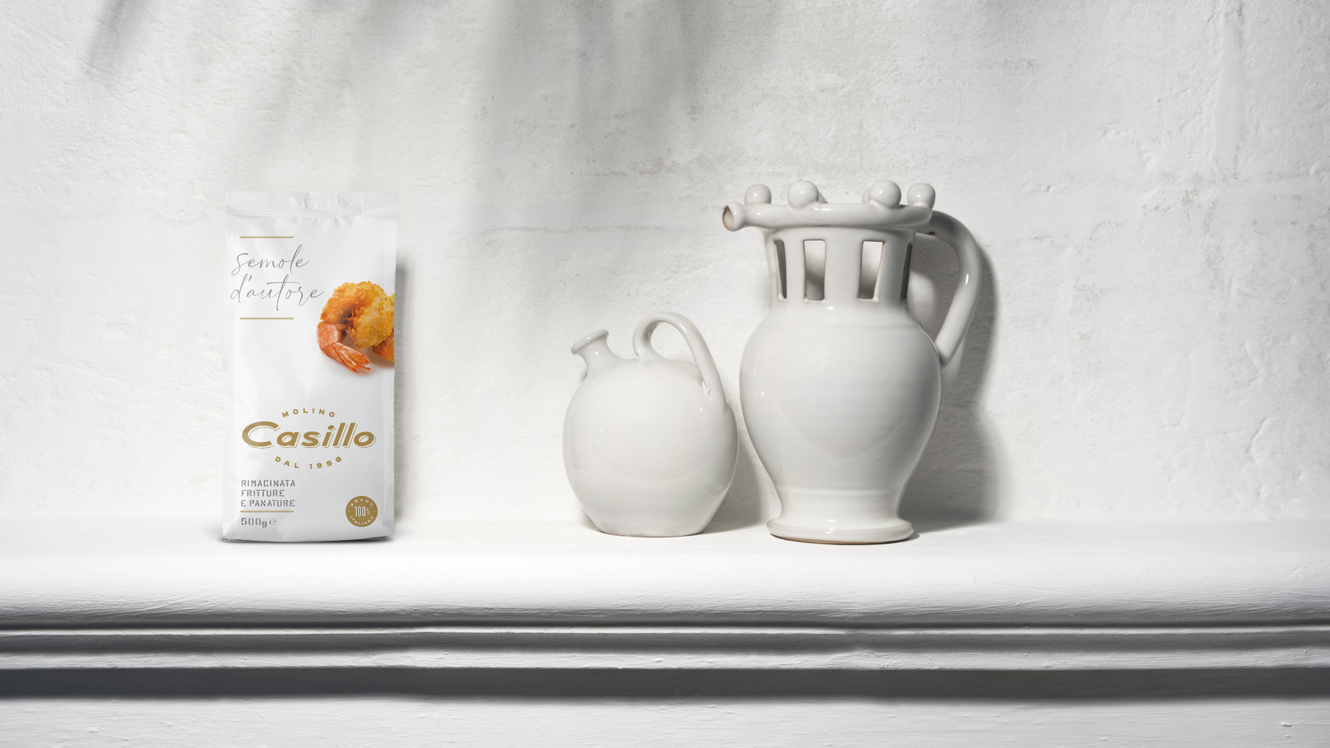
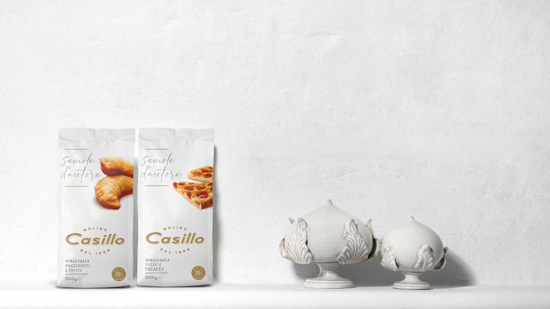
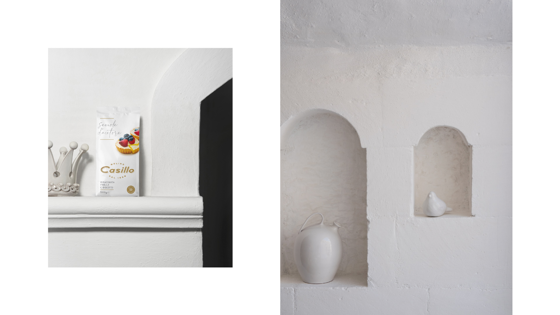
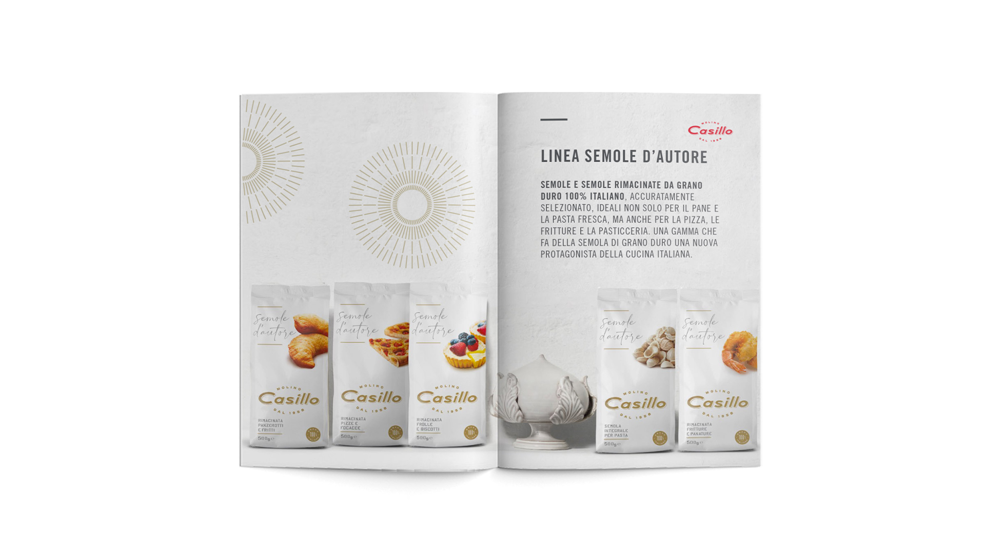
The “Semole d’autore” product family was reserved a different design, with the name written almost like an autograph. This highlights the products’ premium quality, which Molino Casillo’s experts specifically fine-tuned to discover new and specific uses of durum wheat flour in consumers’ own kitchens.
Striving to become ever closer to end-clients, all products are available both in supermarkets and on Molino Casillo’s own e-commerce store, which was also designed by Angelini Design.
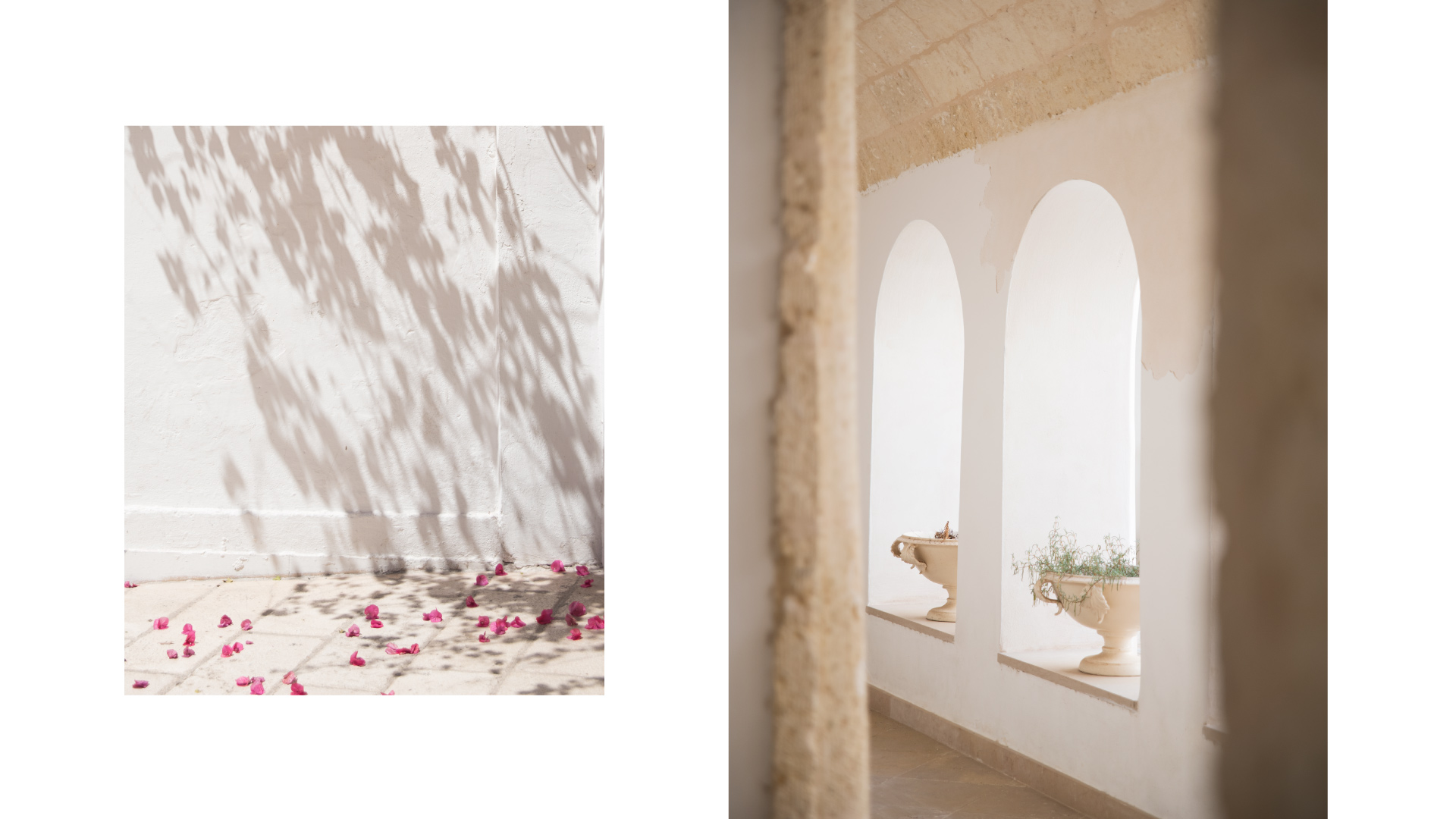
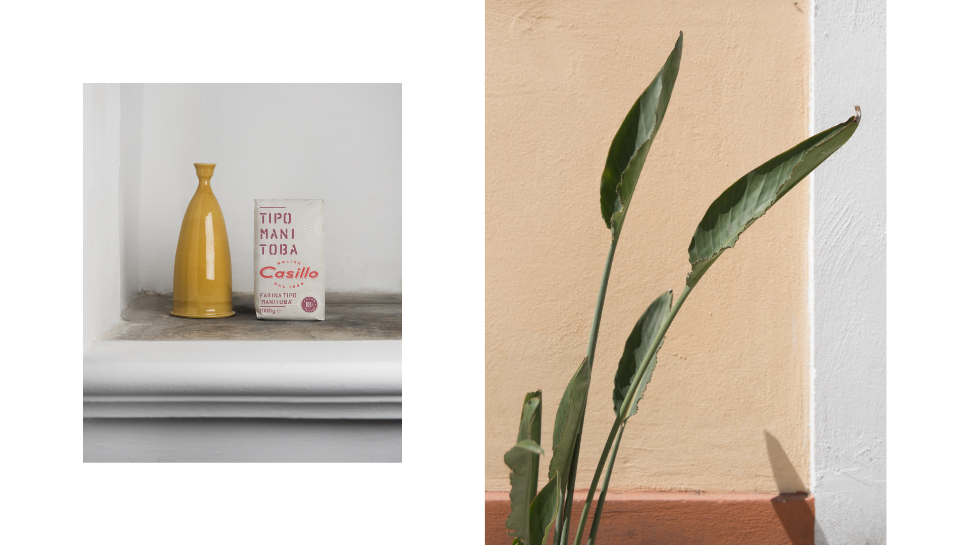
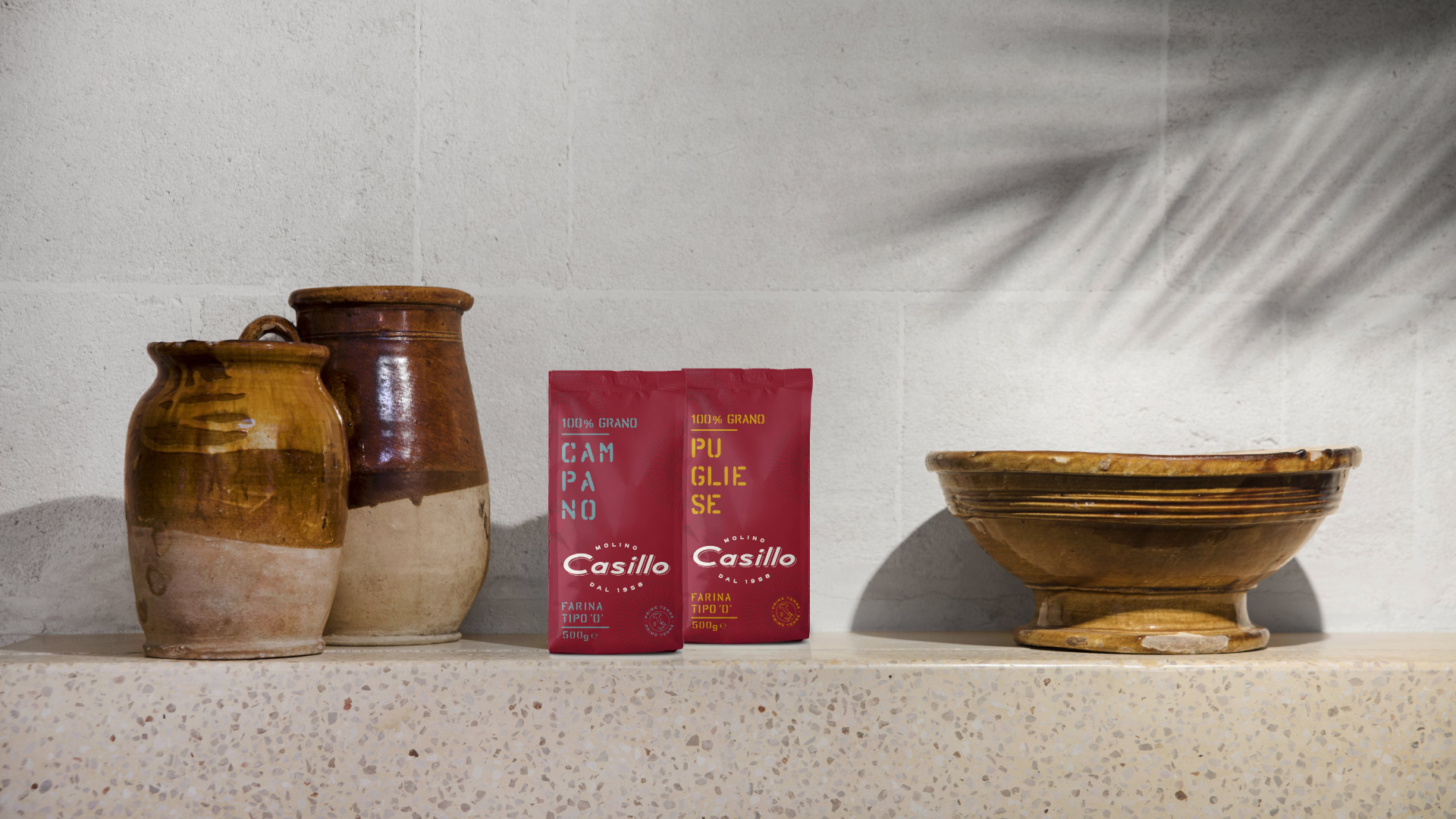
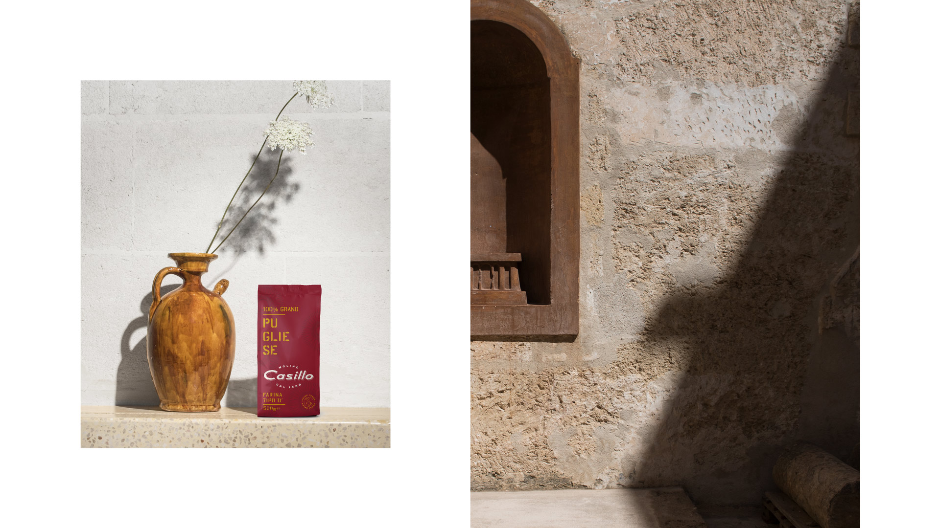
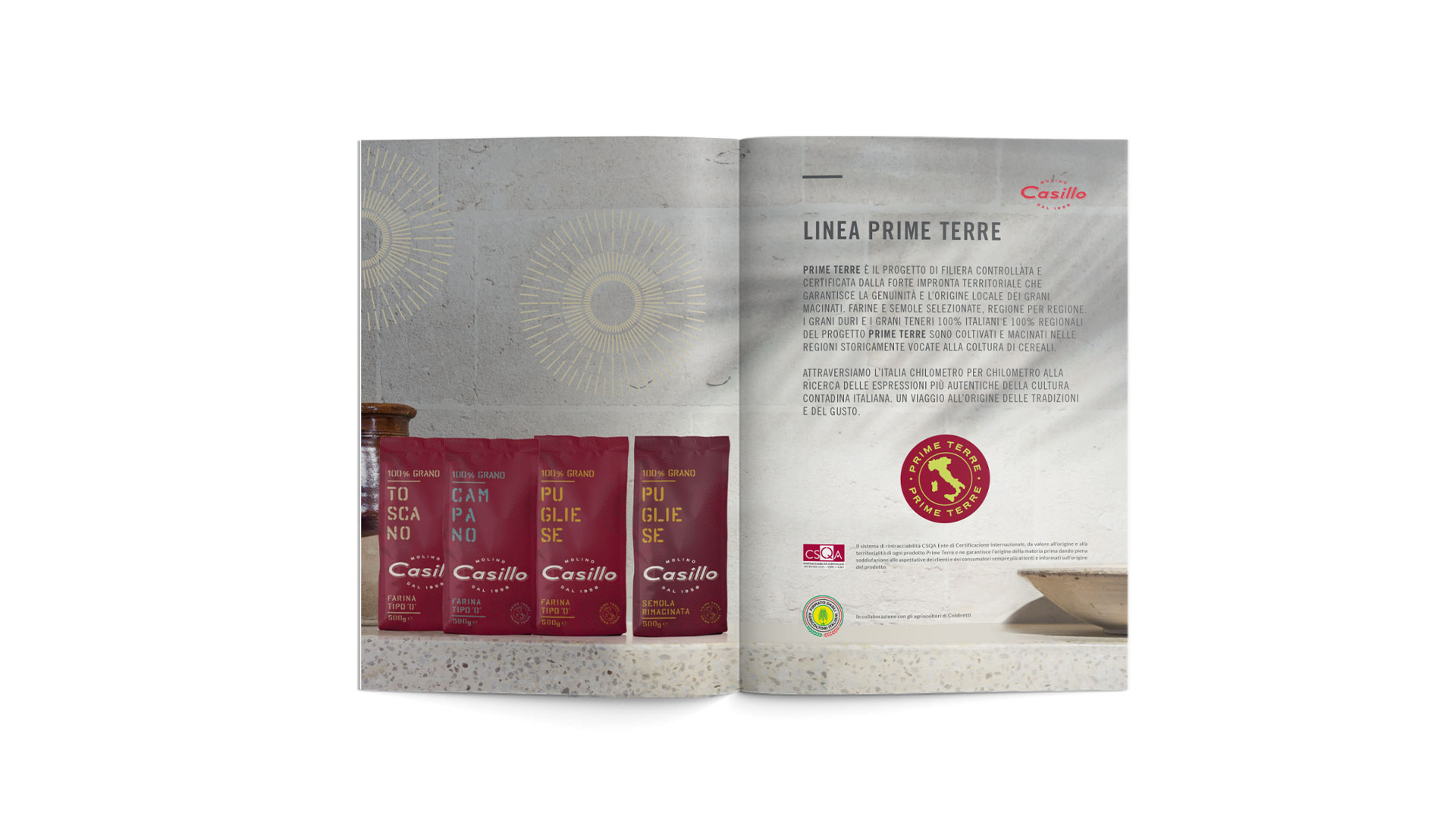
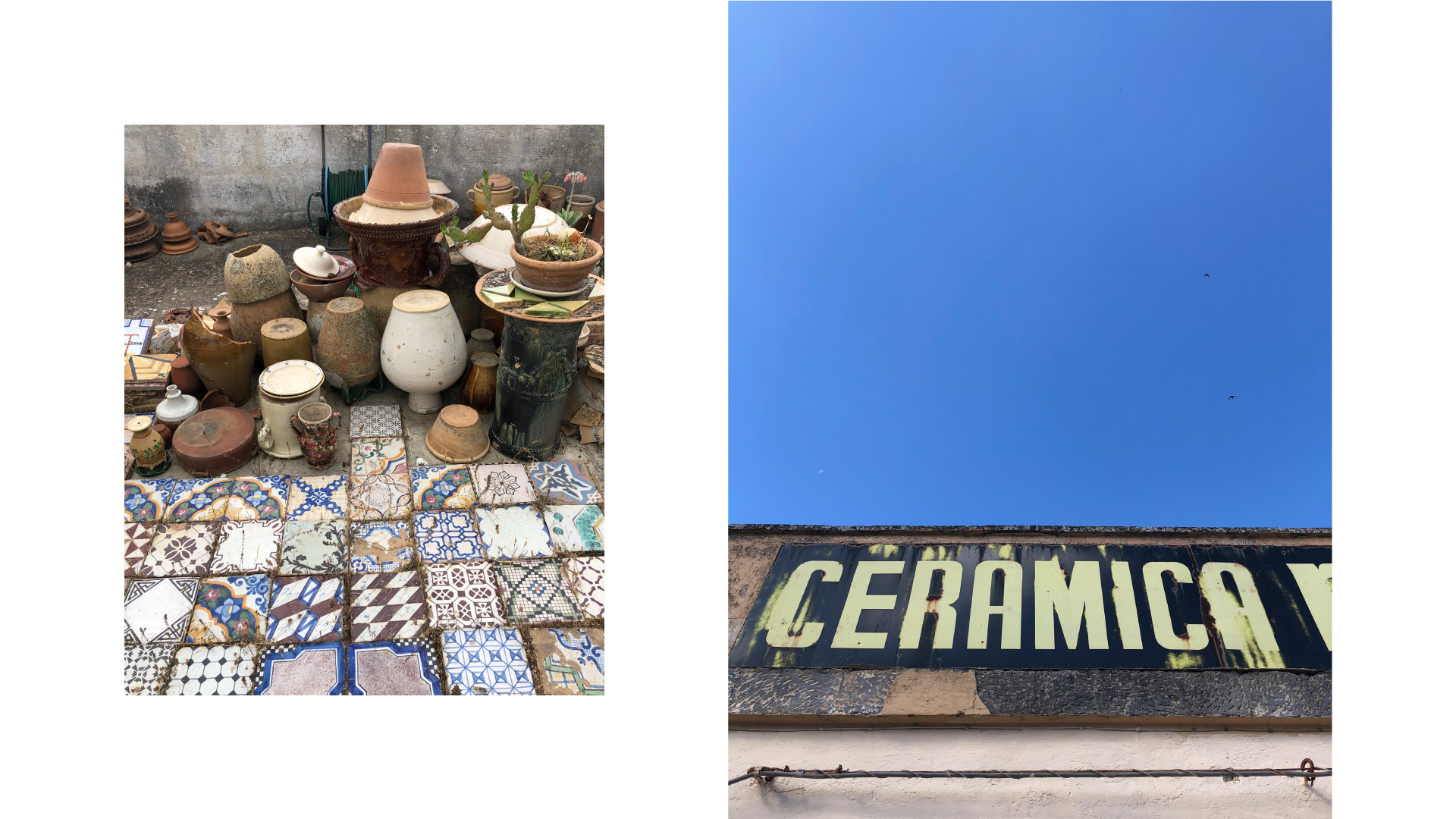
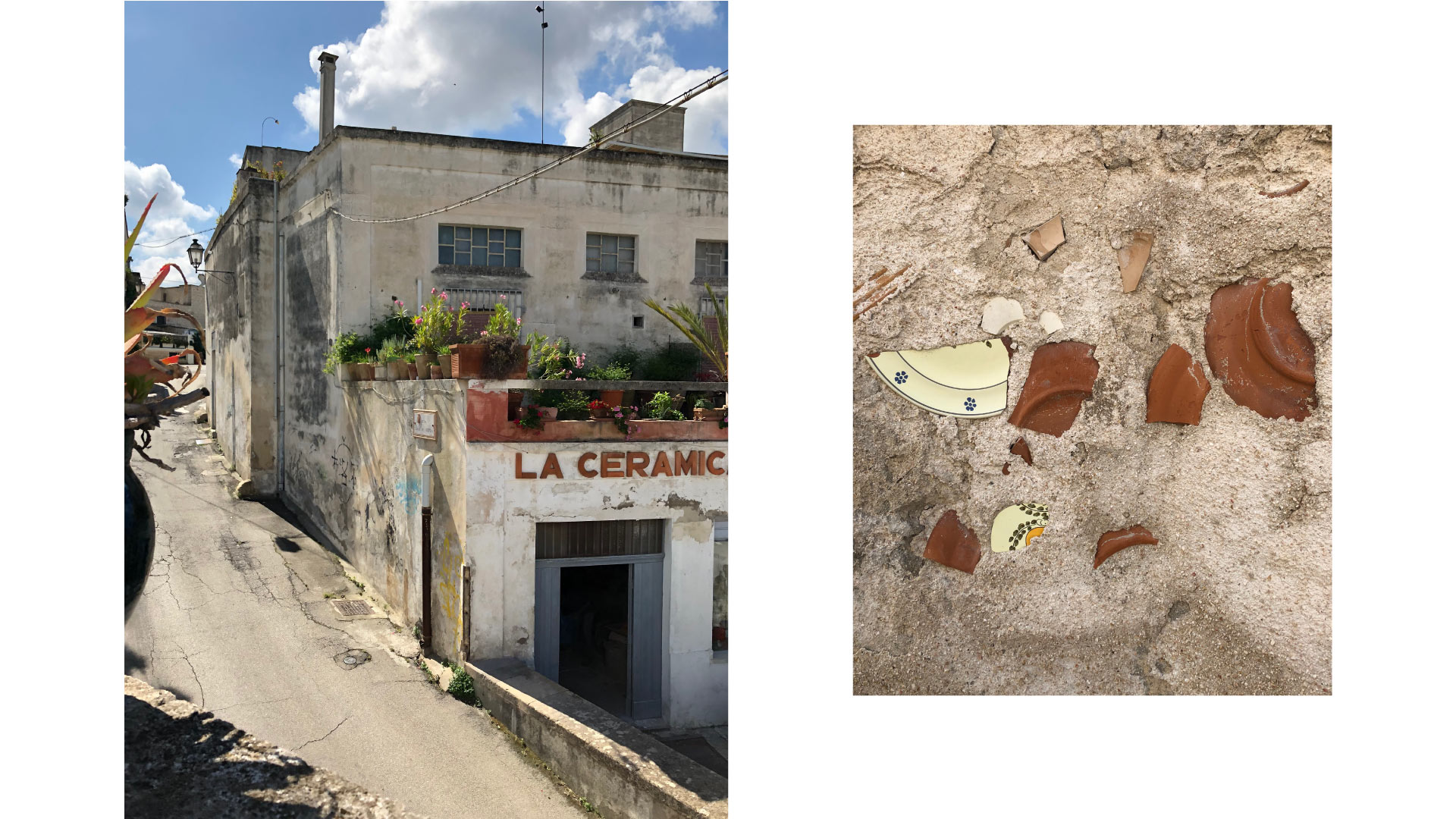
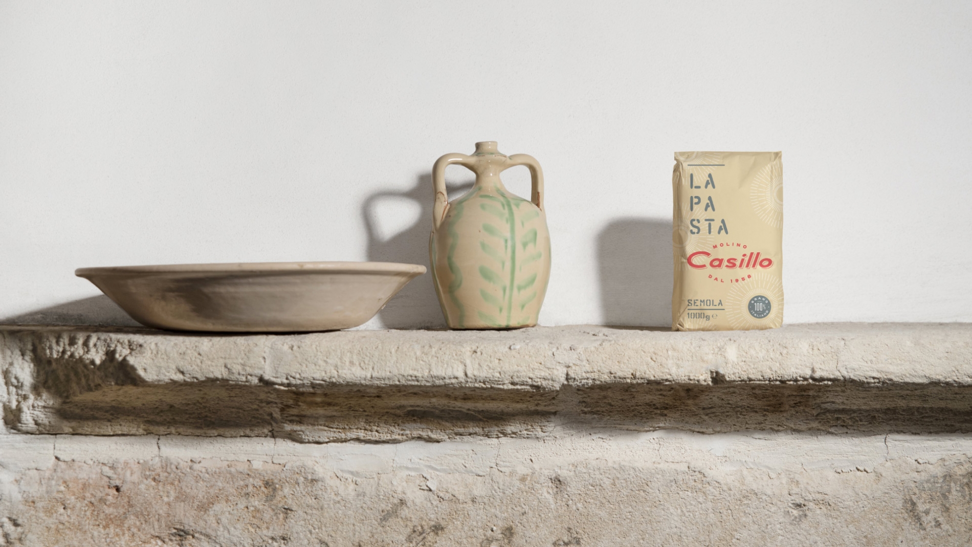
The rosettes on the packaging are a reference to the bright sun of Apulia, where the company was founded, and a strong bond to the local territory is the concept behind the photo shooting the agency carried out to present the product lines. In fact we decided to step away from the stereotypes of domestic spaces that are typically used for the consumer market, and instead emphasized the particular nature of the product through its origin. Packs of flour were set next to Grottaglie ceramics, as an aesthetic reference to the traditional know-how of artisans and in dialog with the graphic design’s minimalistic look. Each pack has its own setting: ‘Prime Terre’ flours, for example, derive from a long tradition and are identified by a predominantly red palette, so they were paired with more ancient ceramic pieces that almost look raw, and are full of history.
The photo shooting, just like the entire packaging system, is able to speak a language that is tied to the past and to tradition, yet starts a conversation with the present and contemporaneity. A perfect visual synthesis of what Molino Casillo is doing every day: reinterpreting consumers’ preferences, as they become increasingly aware and demanding, with the know-how of a company that has been at the side of the best professionals in the field, since its foundation in 1958.