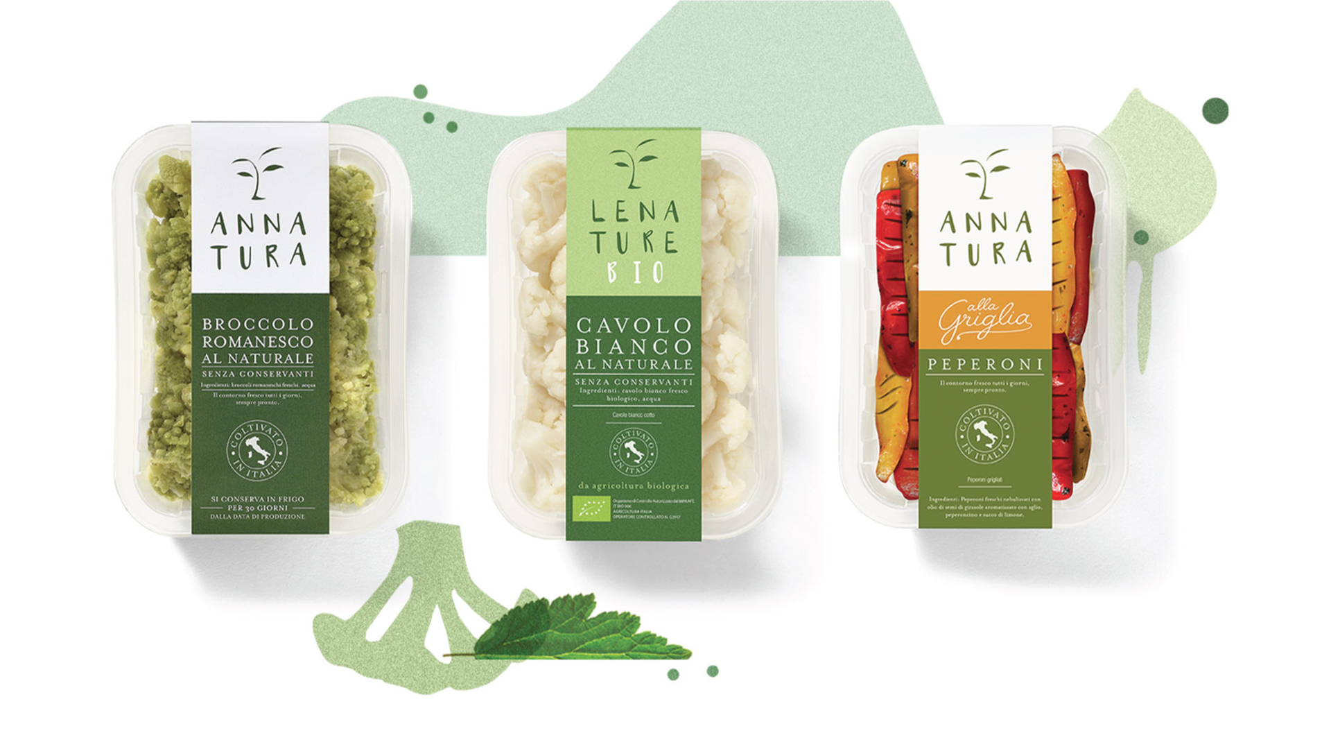
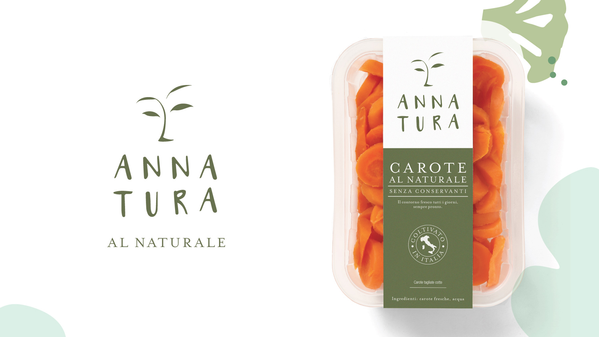
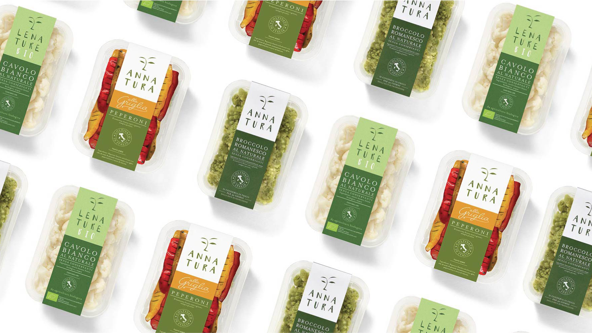
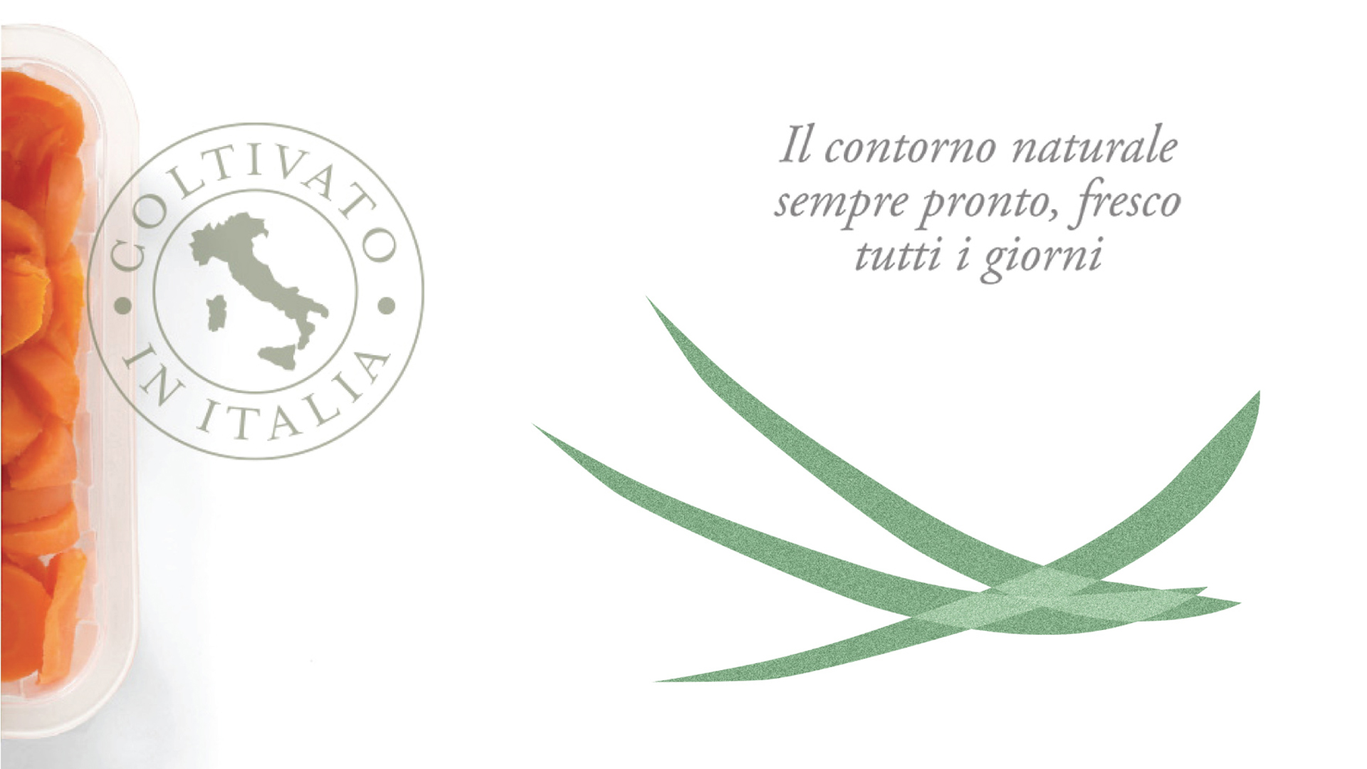
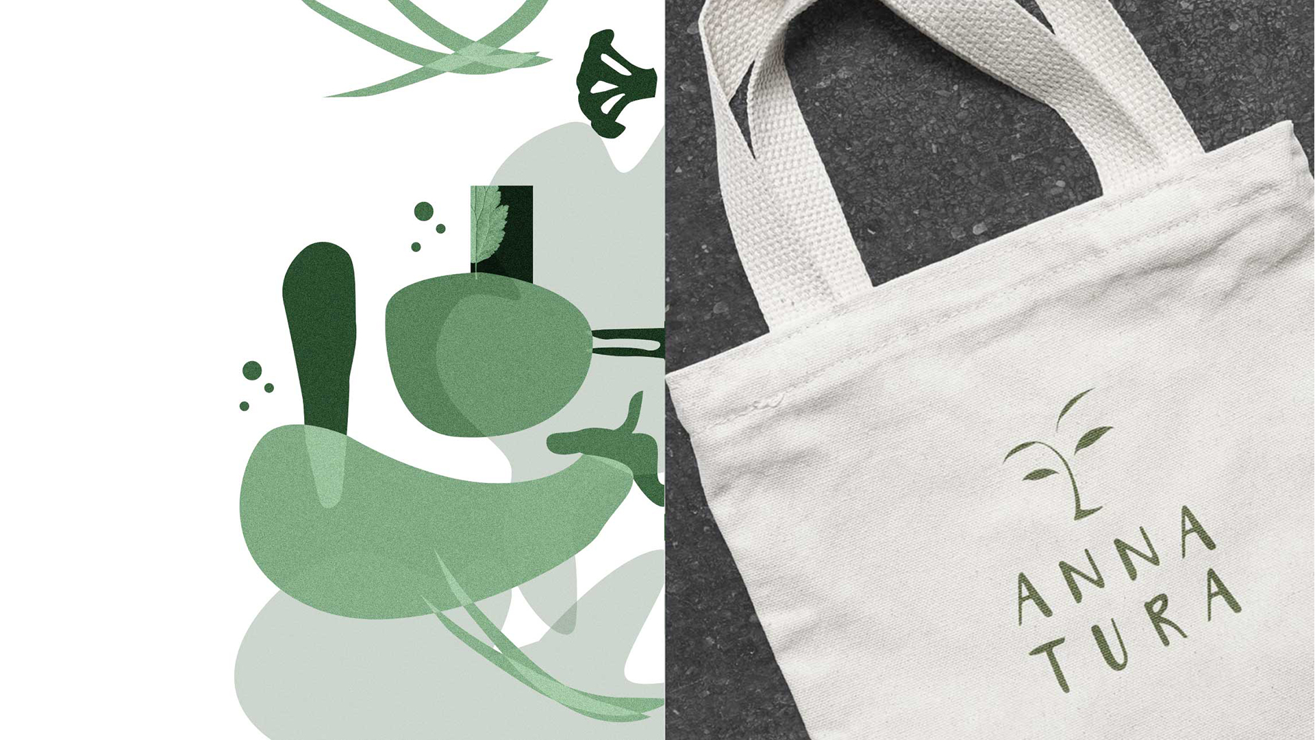
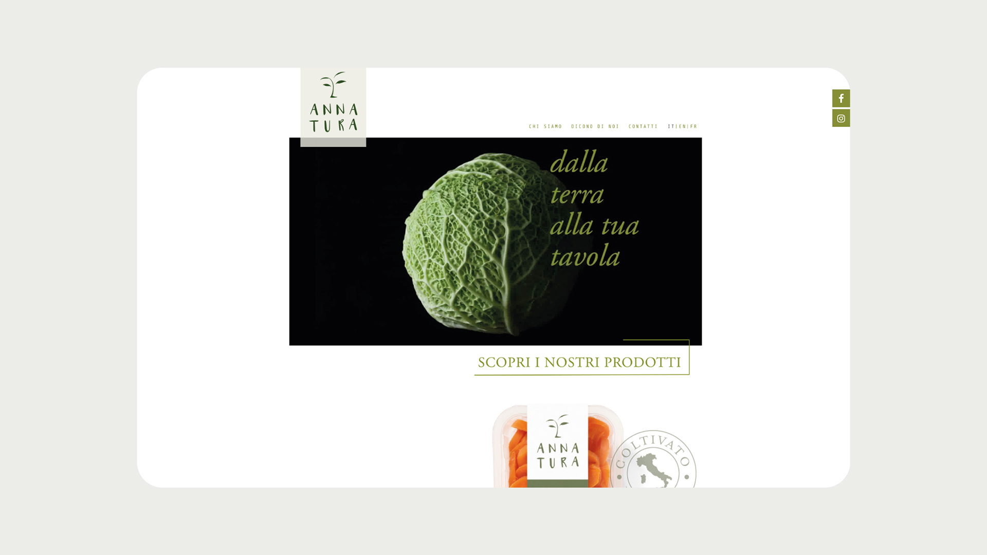
The agency strived to convey the concept of freshness, for a range of products that go directly from field to table, with an innovative packaging that is original and contemporary. Wholesomeness is at the core of the brand’s image: “Annatura, the true face of nature” clearly declares the natural quality of the products, while the logo – an artistic interpretation of a woman’s face, in a light and distinctive hand-drawn style – contributes to a strong connection between the brand and nature. Thus, Annatura becomes a lifestyle choice for well-informed and modern consumers, who care about products’ whole value chain and want to eat healthy, high-quality food. Angelini Design’s communication strategy enhances the product’s quality and reinforces brand awareness. To this end, the agency created dedicated social media engagement tools, with content designed especially to express the company’s philosophy.
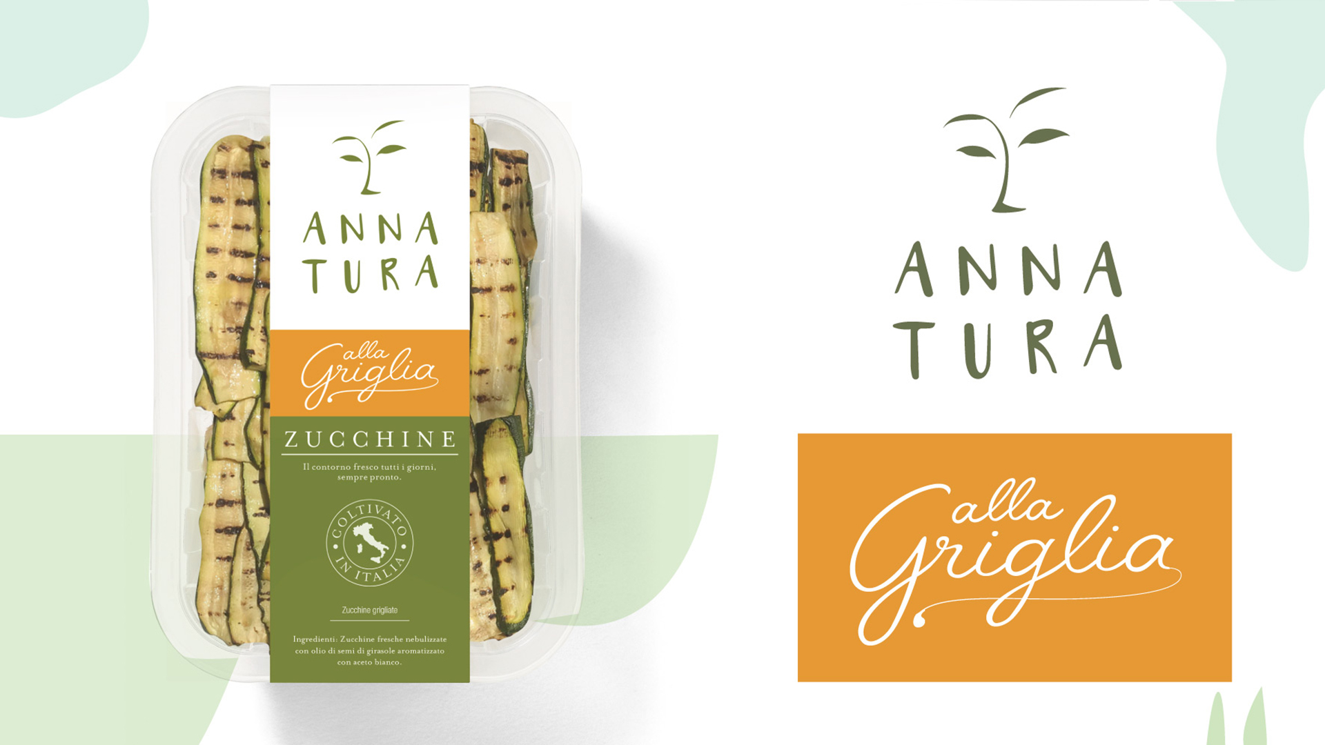
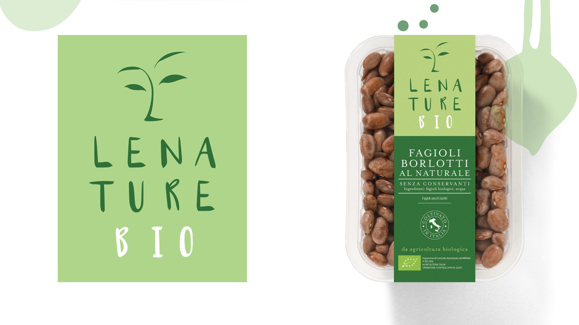
Angelini Design also collaborated with the client on new product ranges: one dedicated to organic products and one for grilled options. The extension required a revision of the brand architecture, to reorganize the various product families and maintain the brand essence intact. Defining the names for the various ranges, fine-tuning the layout, selecting the right color palette and creating a custom typography were the tools the agency used to strengthen the role Annatura plays in its competitive market.

