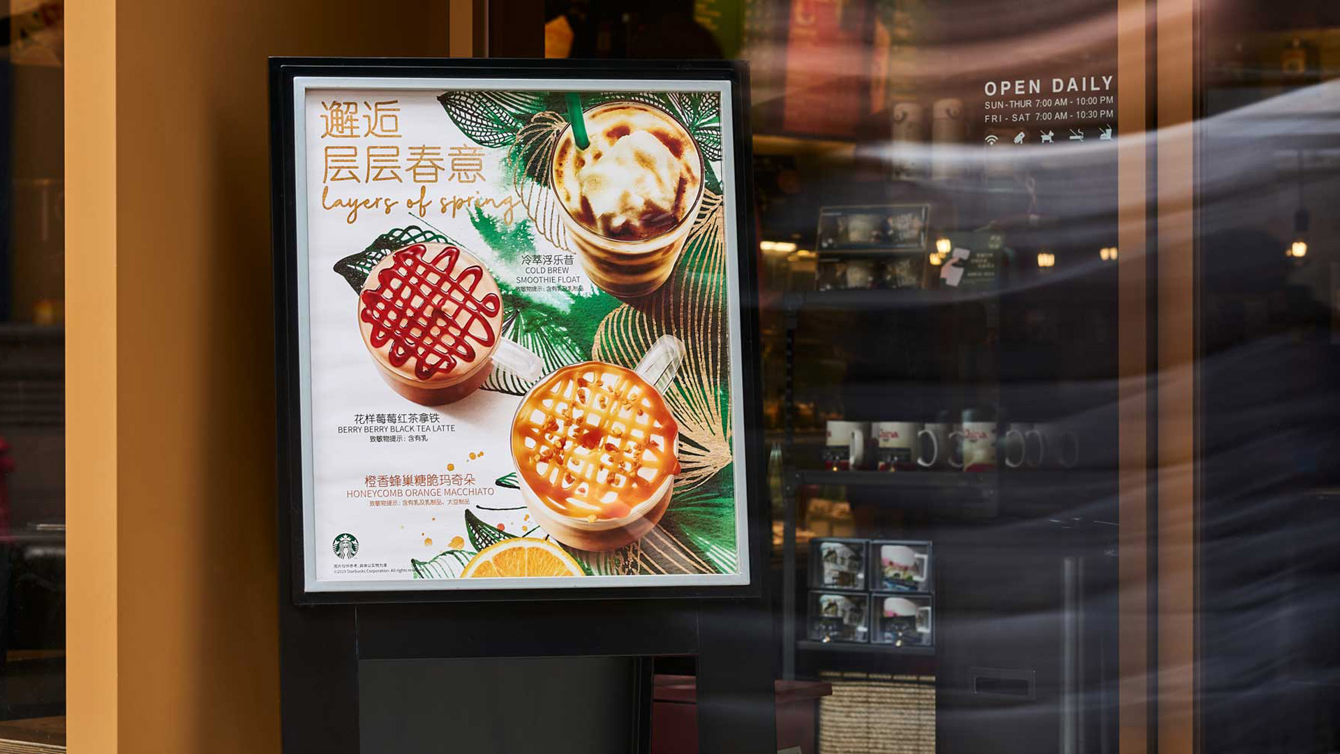
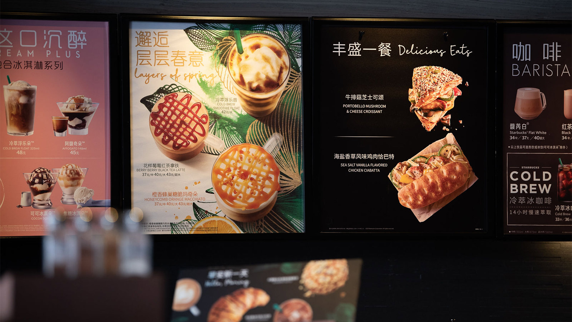
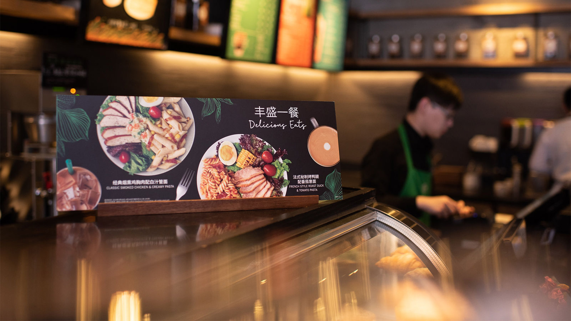
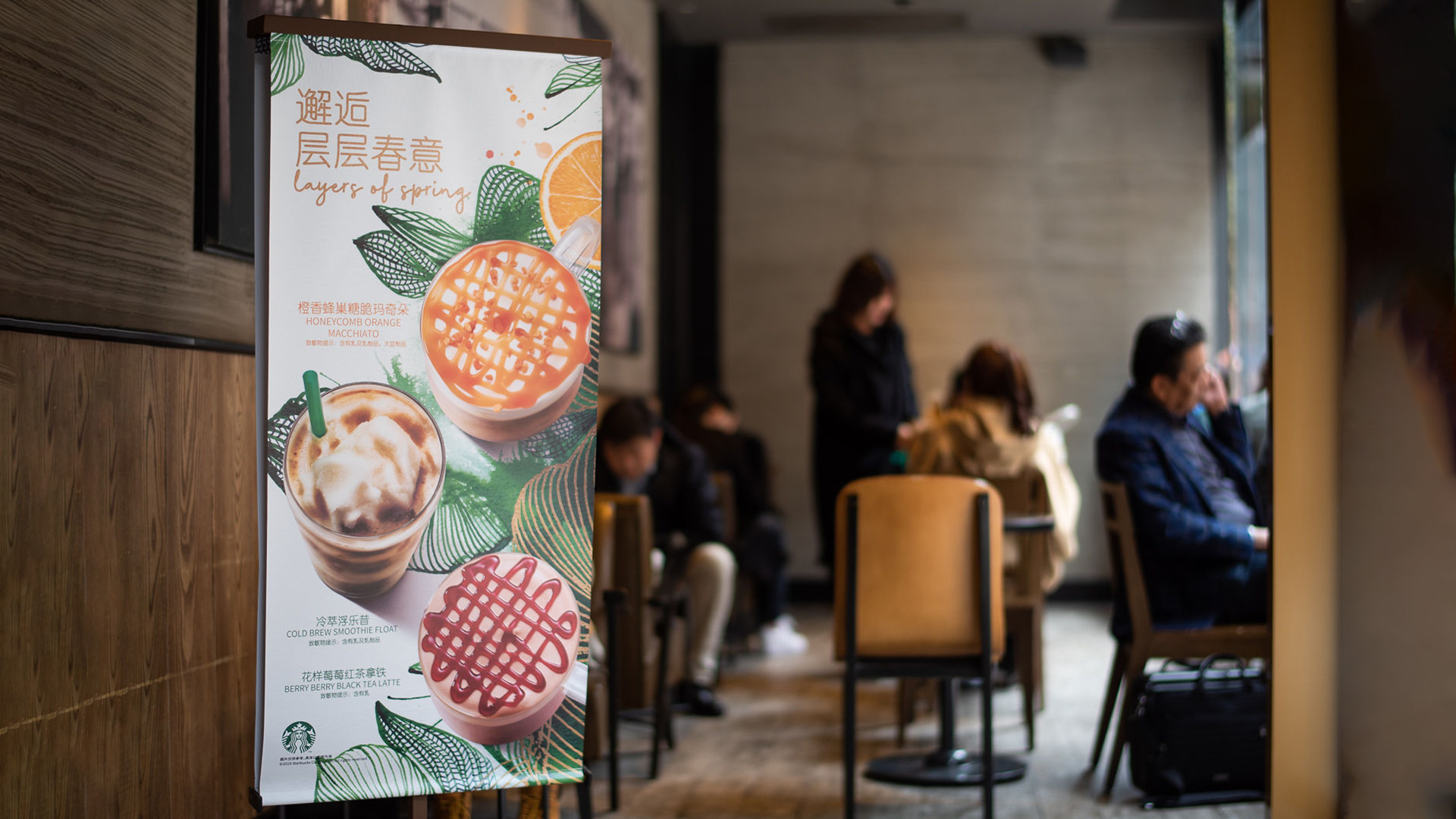
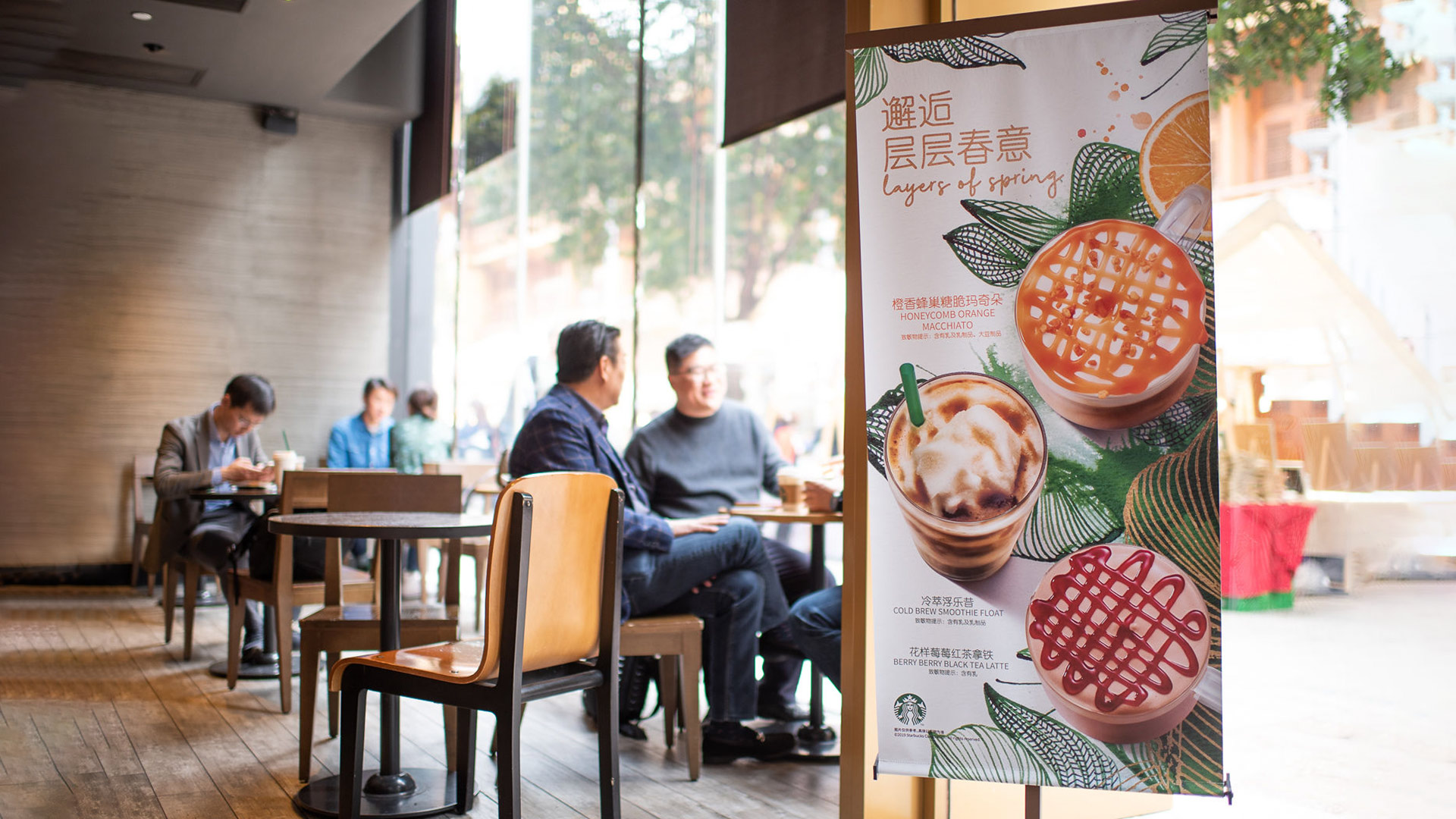
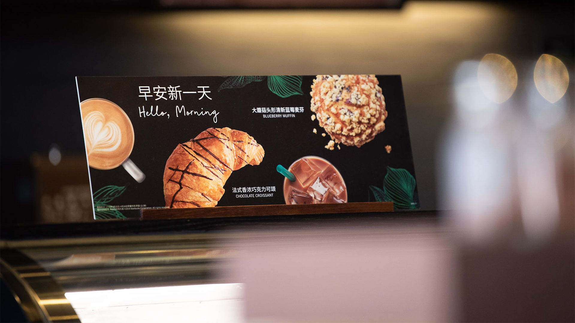
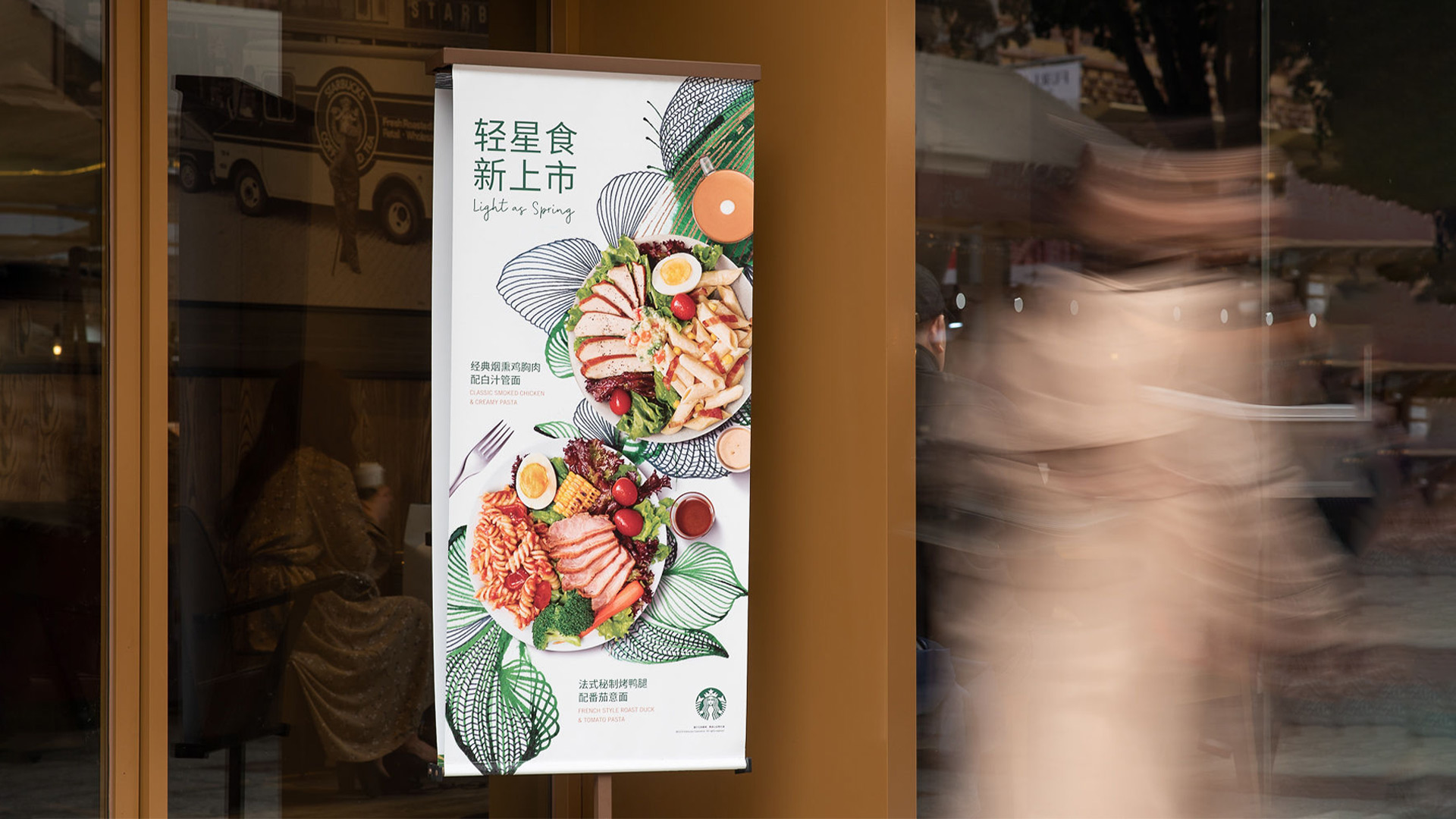
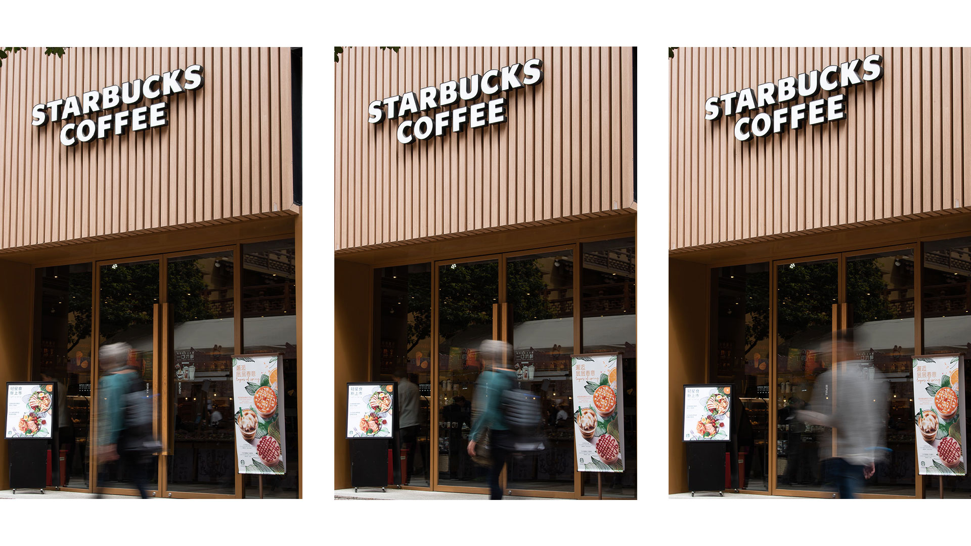
Inspired by one of Patel’s paintings, Angelini Design developed a design that conveys a positive and fresh mood, which is perfect to showcase the American coffeehouse chain’s products.
The visual features floral and plant imagery in a primary color palette that includes a variety of green tones, framed by neutral hues such as white, black and gold. The font selected for copy respects the project’s linear graphics, while maintaining a lively and contemporary visual impact.
Drawn with refined, light, yet high-impact lines, the vegetable elements are represented with a minimalistic aesthetic, to form a backdrop for the products Starbucks is rolling out for the most lively season of the year. The elegance of the illustrations, used throughout communication materials, effectively conveys the freshness of the seasonal ingredients used for the food and drinks created by Starbucks, to bring all the pleasant vibes of Spring to its clients.


