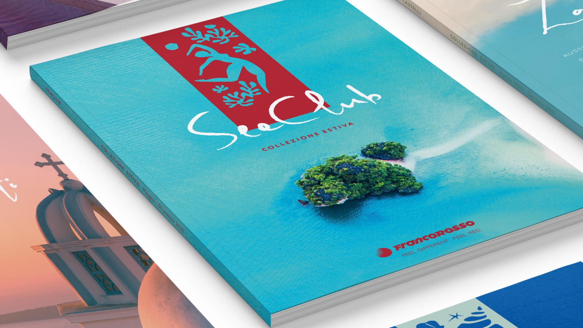
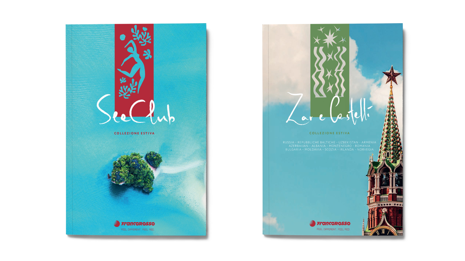
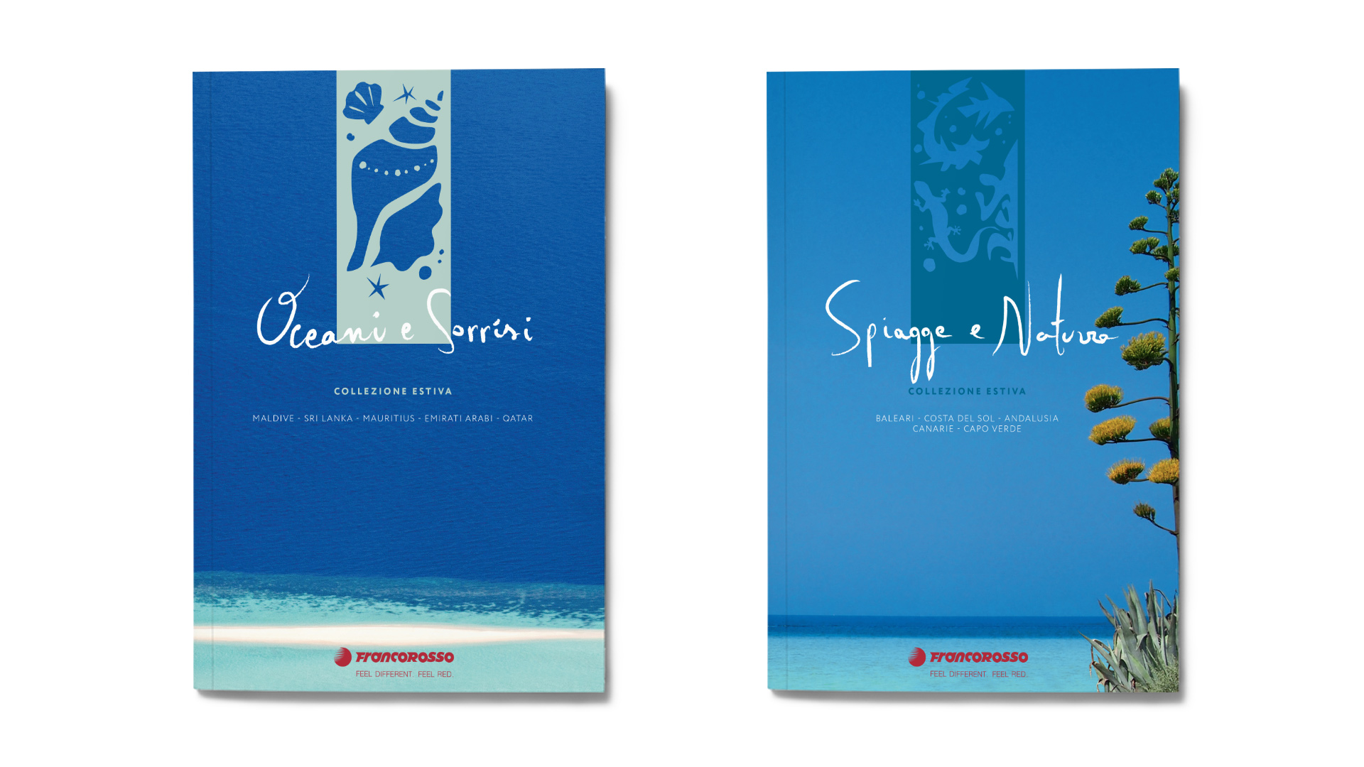
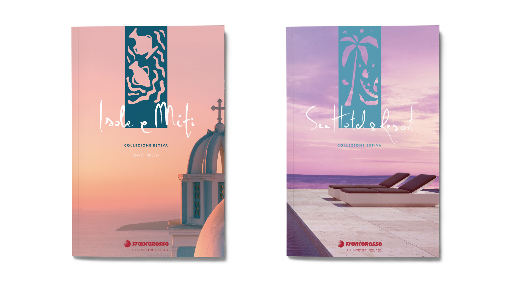
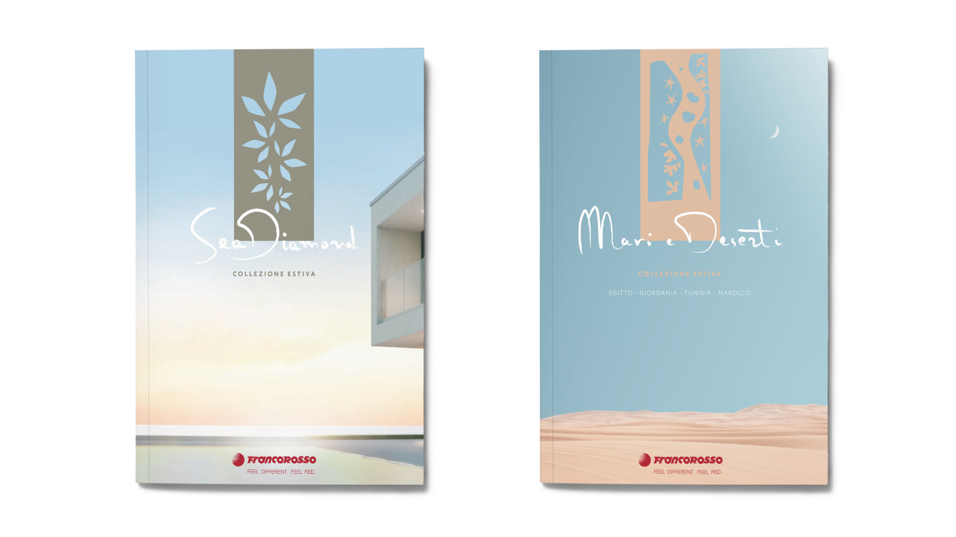
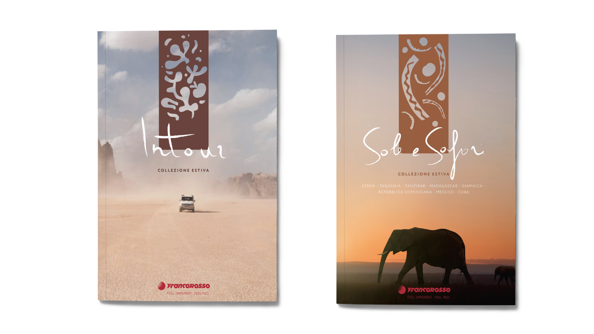
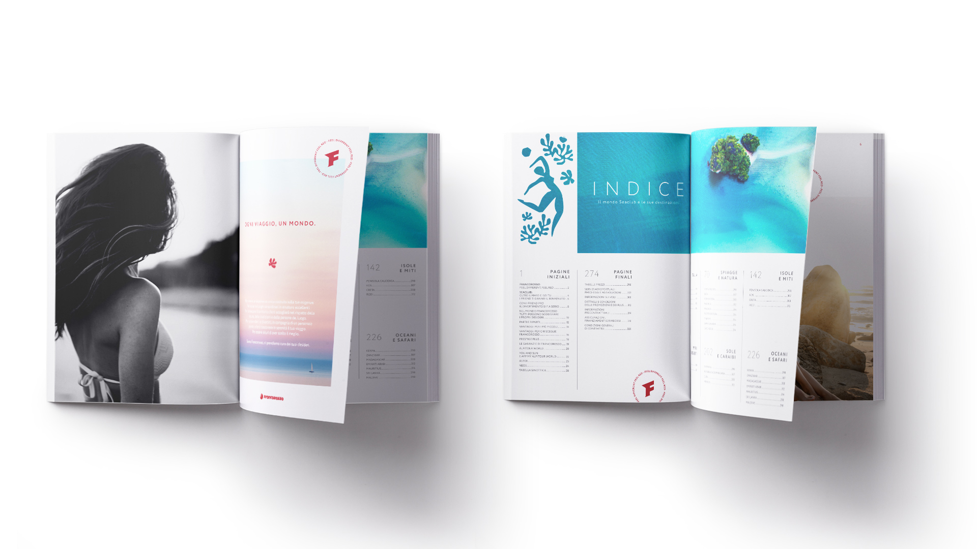
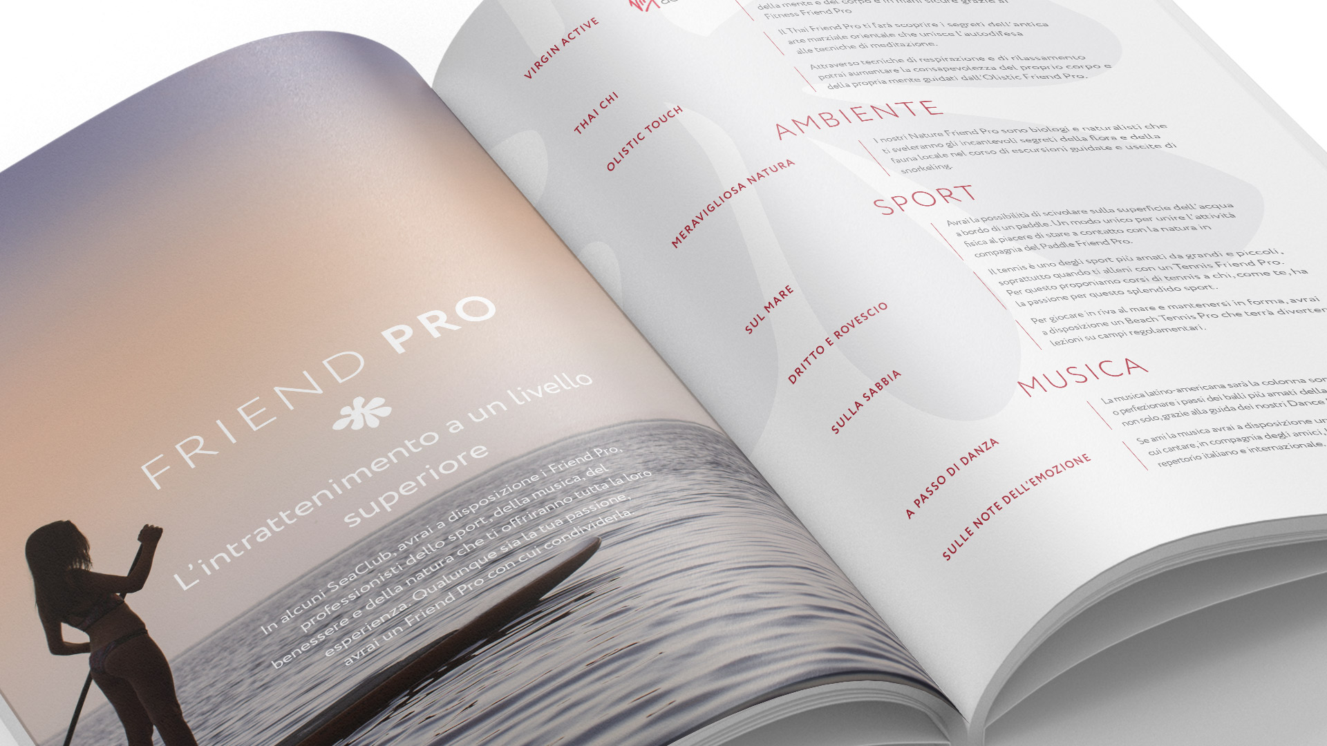
In 2020, Angelini Design was entrusted with creating a new graphic format for the catalog collections. The agency overhauled the existing layouts and provided painstaking art direction to select the right imagery for a clean, aspirational and evocative style. The color palette of the photographs, which envelop the front and back cover, makes the catalogs immediately recognizable and allows them to stand out as easy-to-use tools.
Labels with customized graphic elements were designed for the covers, to echo the cultural imagery of different travel destinations. As nature is always central in the Francorosso experience, these simplified symbols recall the beauty of different environments with an aesthetic inspired by Fauvism. The titles of the catalogs are elevated by custom calligraphy typography, while the “Feel different, feel red” tagline surrounds – like a stamp – the iconic “F”, representing and certifying the exclusive travel experience offered by Francorosso.
The agency also worked on rationalizing and simplifying product line logos, and on naming the new “Sea Club Style” cluster, which includes premium level products and was also given a revised logo – within the overall normalization effort that also lead to a set of guidelines.
The tour operator’s goal was to increase the family feeling amongst its brands and make them more recognizable in the context of a highly competitive market, while always upholding the elegant style that has always been Francorosso’s trademark.


