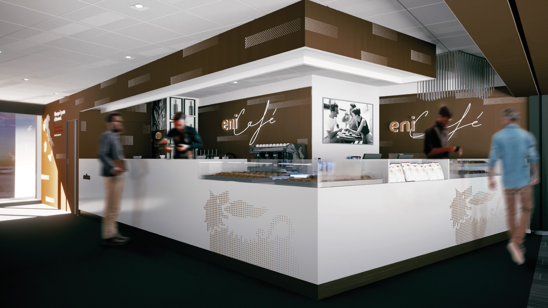
With this revolutionary change in mind, Angelini Design has developed the complete rebranding of Eni Café, from the redesign of their logo to the restyling of their entire retail format throughout Europe, including decorative elements, signage, and menus. The rebranding concept is centered on the Italian identity of Eni Café and the premium quality of the products on offer.
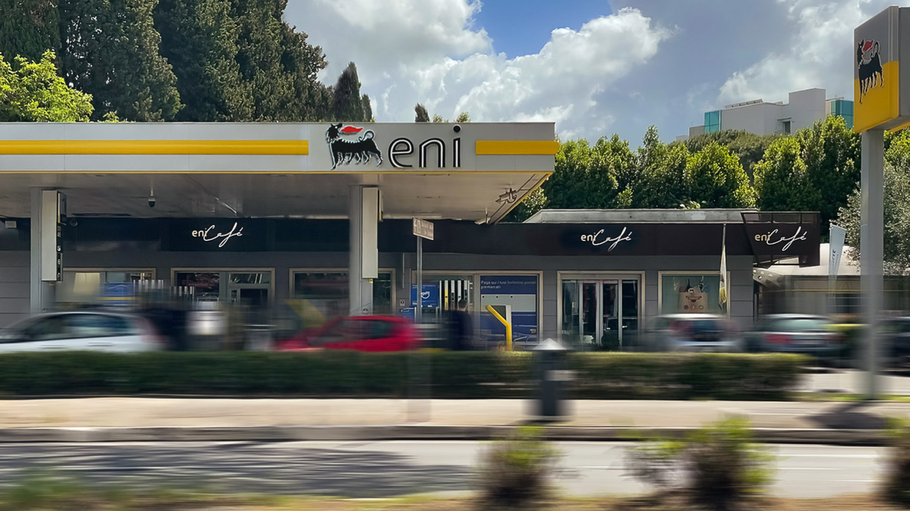
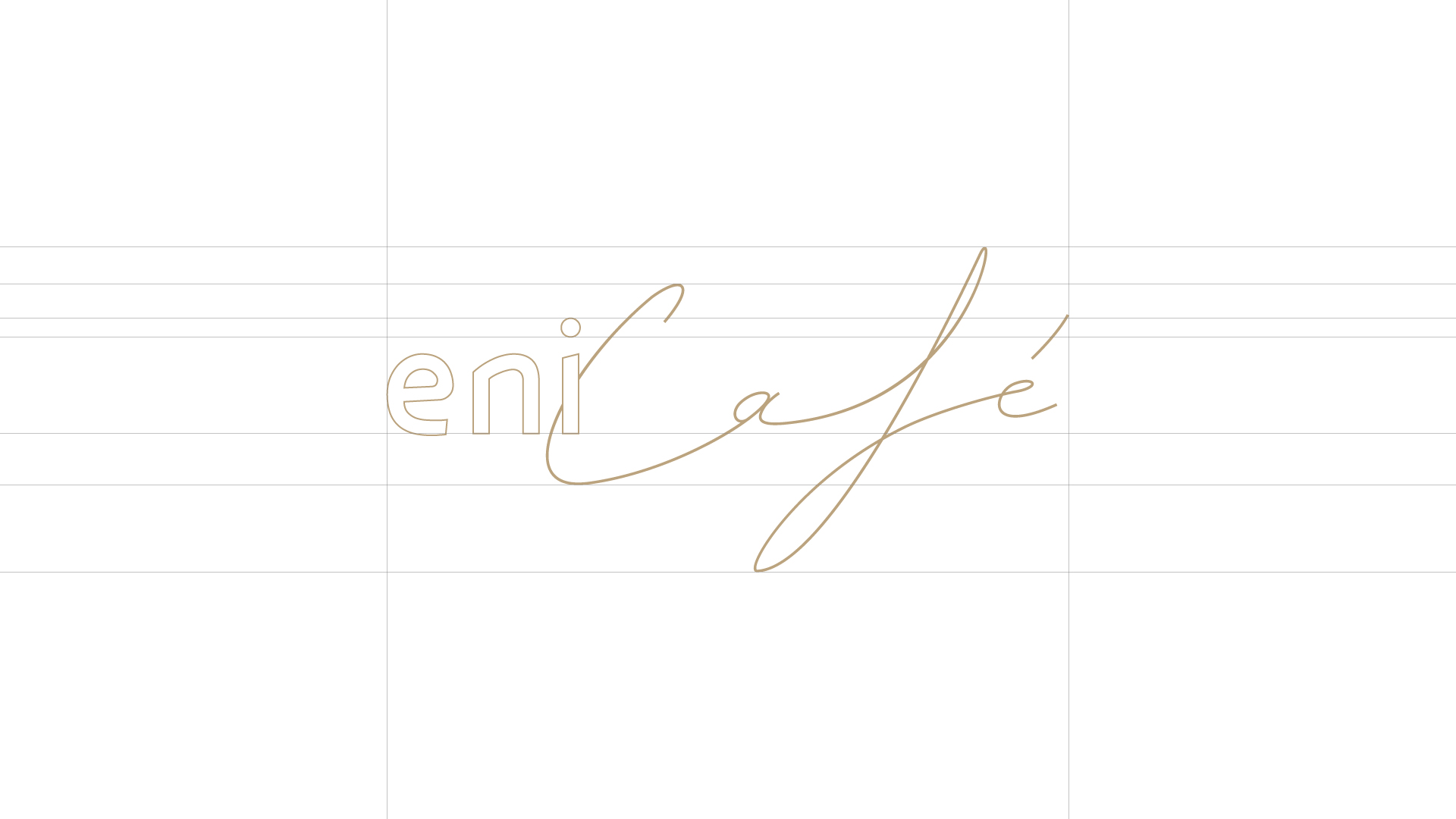
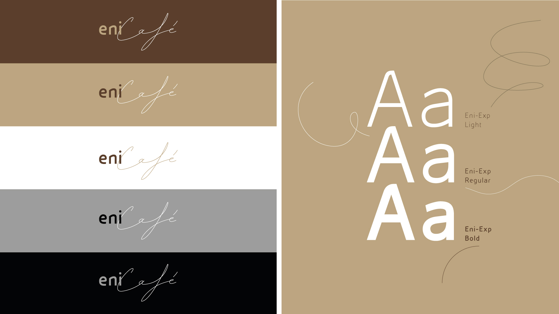
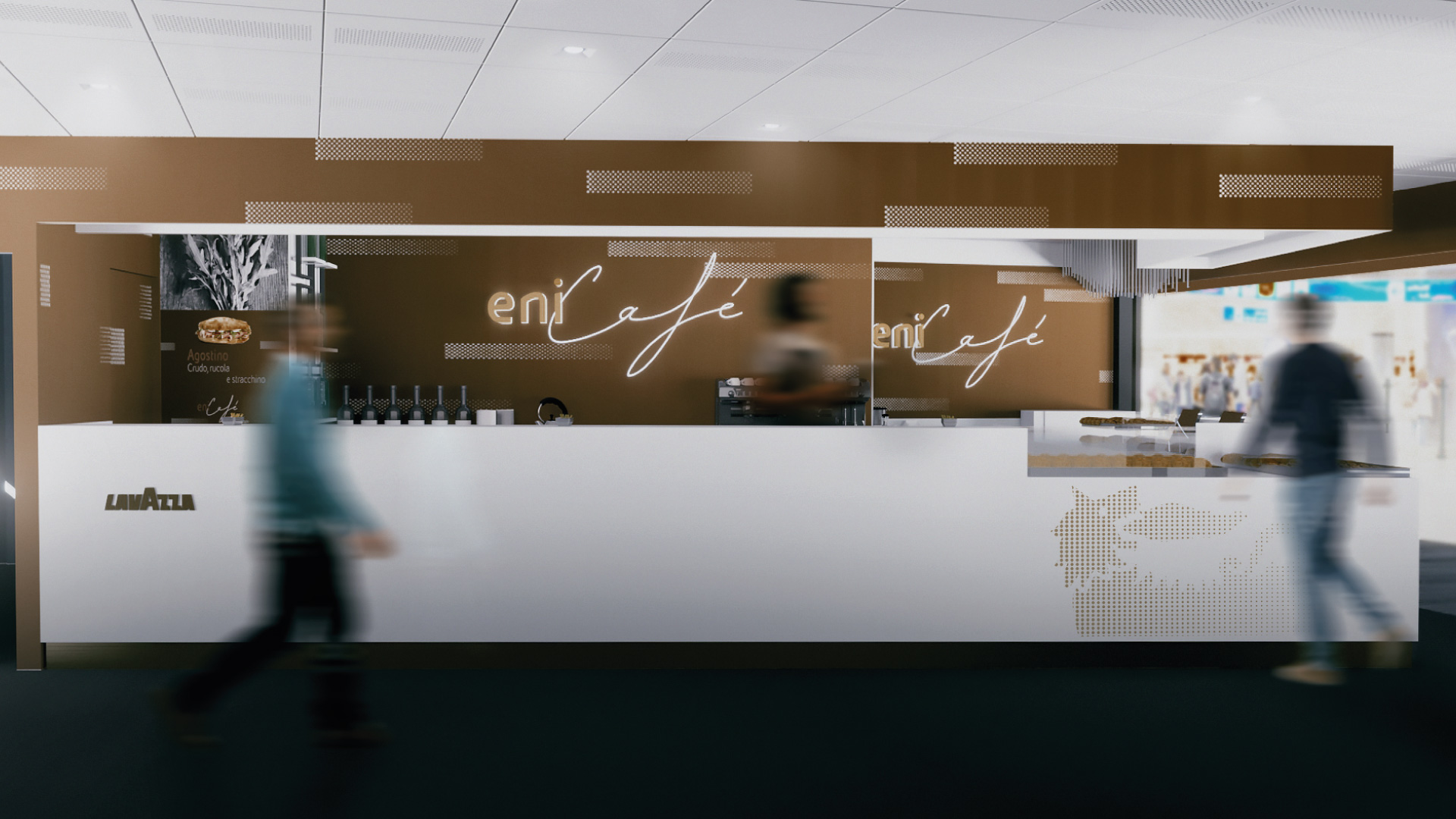
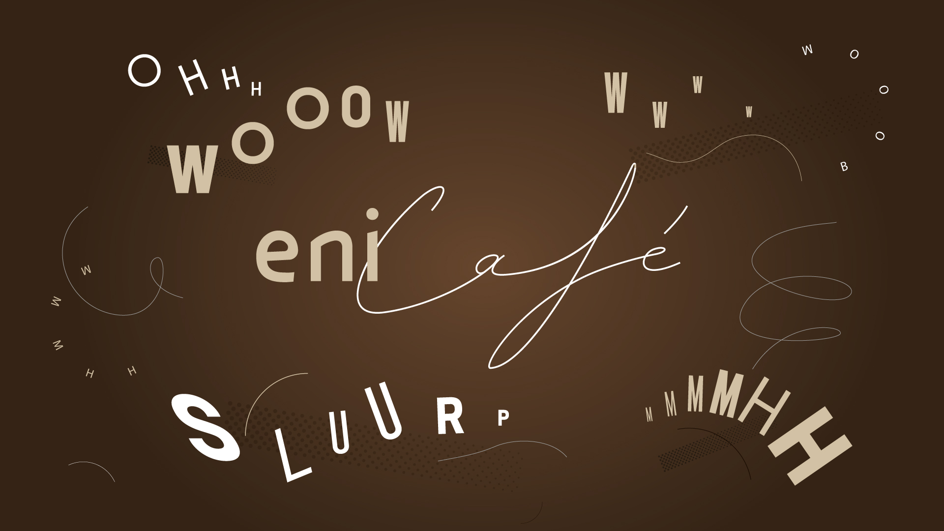
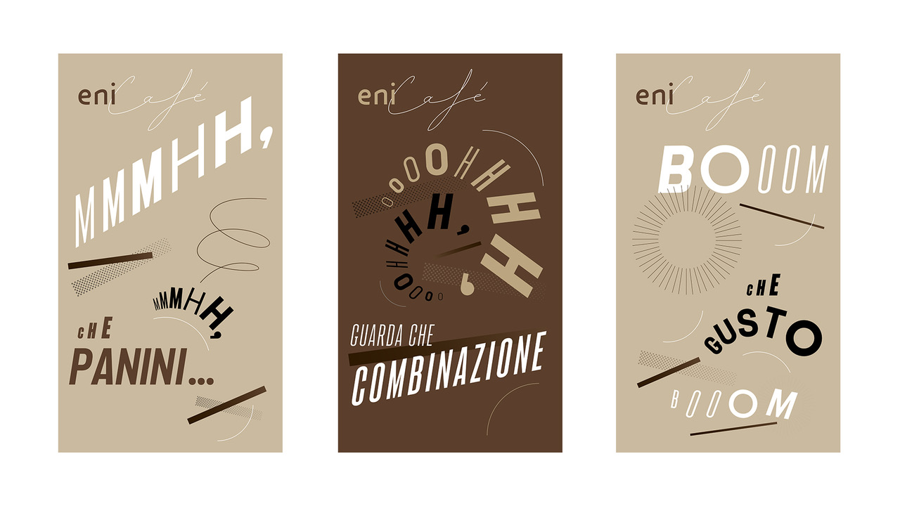
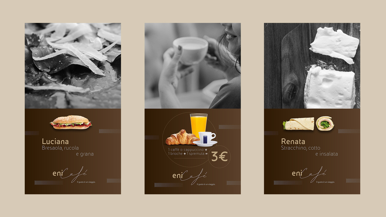
All of the elements of the rebranding are visible in the new flagship store at Fiumicino Airport, in Rome. The new Eni Café logo abandons the imagery associated with an energy company, taking on an elegant, lighter flavor with “steamy” lettering, evocative of the coffee itself. The recurring theme of movement can be seen in the detail of a light grey dotted pattern against a rich chocolate-brown, subtly recalling tire tracks, along with Eni’s legacy. This color scheme reinforces the gourmet nature of the products with the stark contrast providing cleanliness in the design. The communicative visuals in the posters, influenced by Futurist art, are dynamic and playful, utilizing both upper and lower case lettering in the typography. Images from the menu are set on light, spacious backgrounds, with text that is fun, lively, and easy to read. Eni Café’s new look is distinctive and recognizable, supporting the brand’s concept of the bar being the ideal location for a quality break.