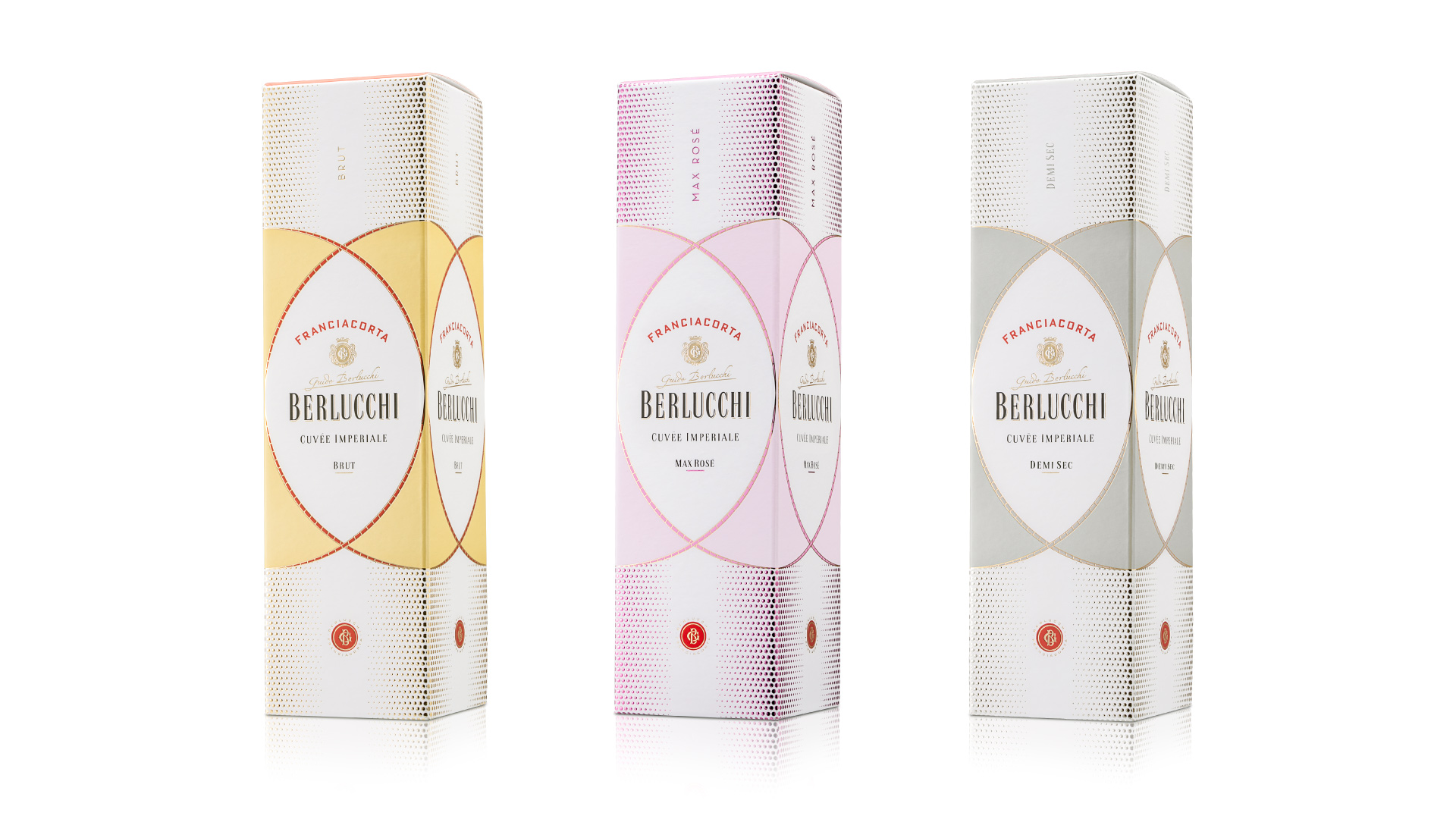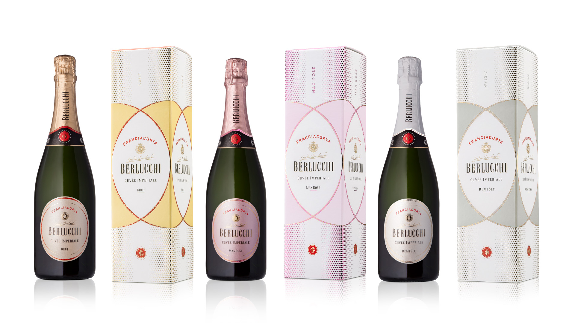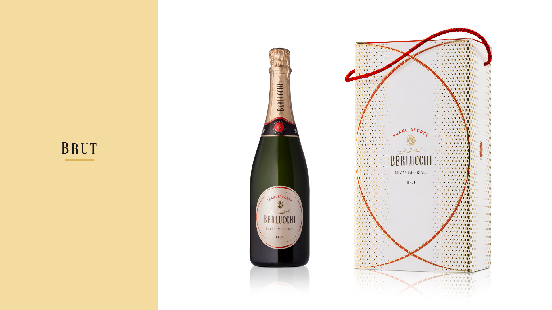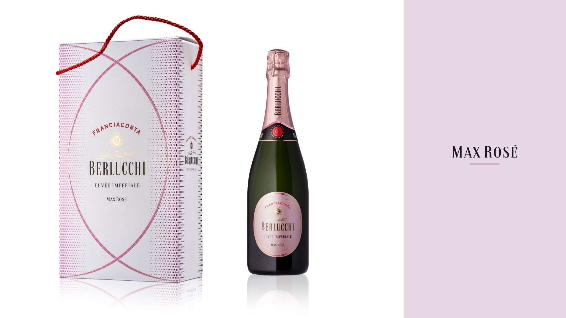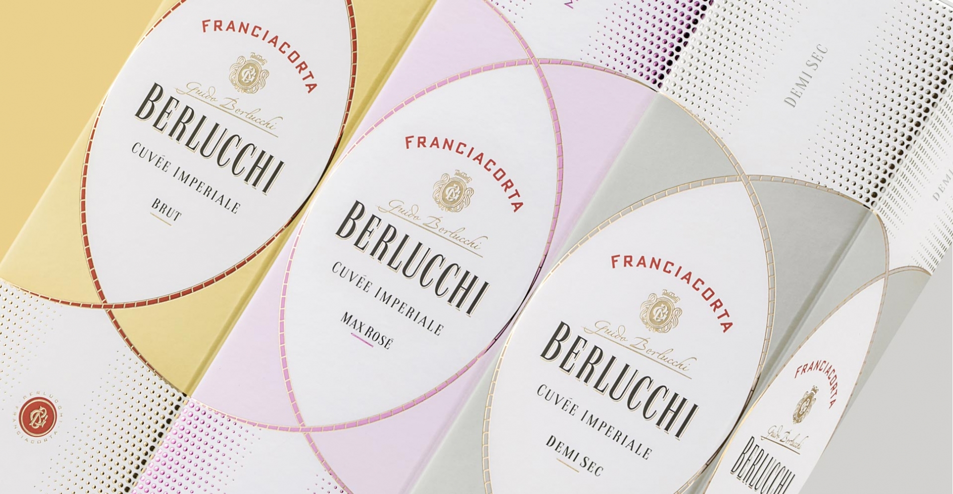
To reposition the Cuvée Imperiale range on the market and restore the brand’s premium identity, the agency developed a new packaging design to convey Berlucchi’s special features: elegance, innovation and tradition were the key concepts to define an iconic and outstanding visual language for the three products in the range – Brut, Max Rosé and Demi Sec.
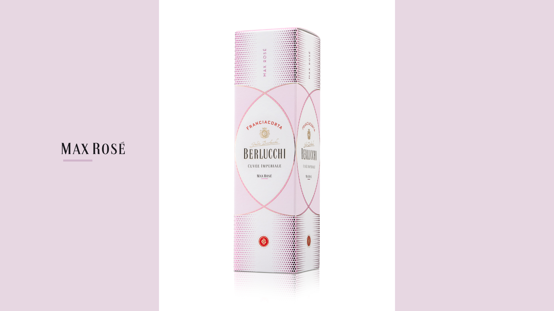
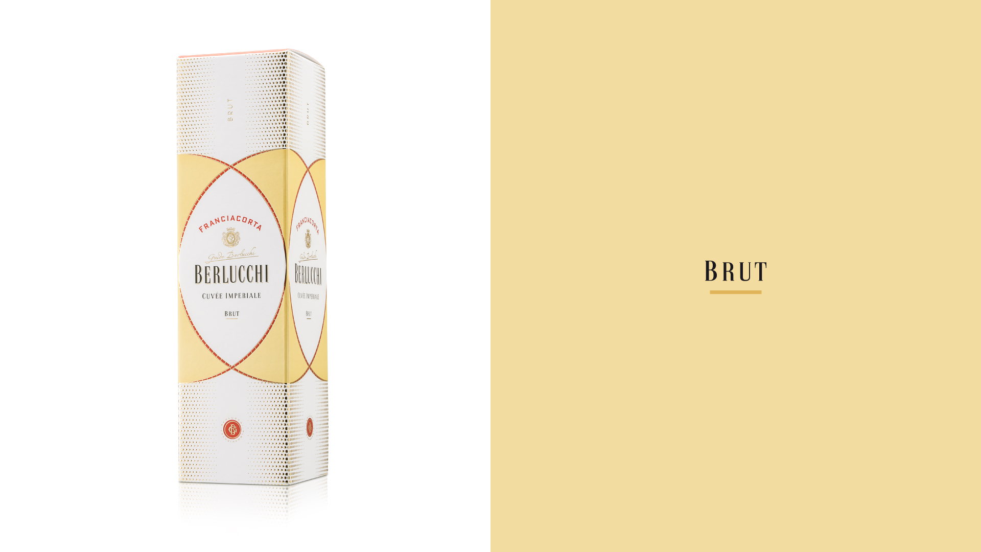
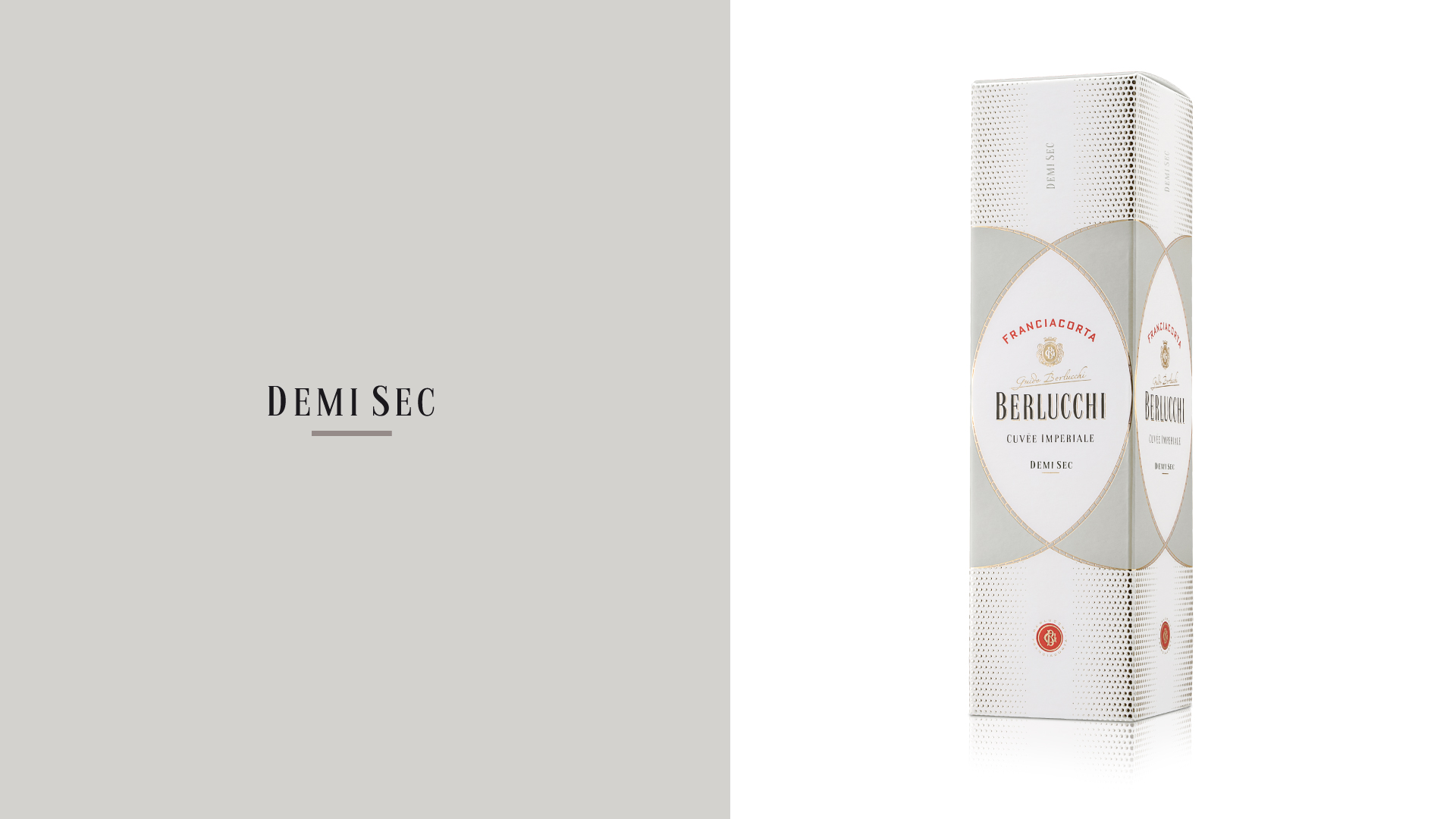
The look created by Angelini Design is based on circular shapes that overlap to compose an oval, in which the trademark stands out with the word Franciacorta, the product name and Guido Berlucchi’s signature, under a gold-foil monogram. The refined visual impact is further enriched by the embossed texture that resembles the wine’s bead. Each product features a signature main color (yellow gold for Brut, pink for Max Rosé and gray for Demi Sec) paired with the ivory white used across the range.
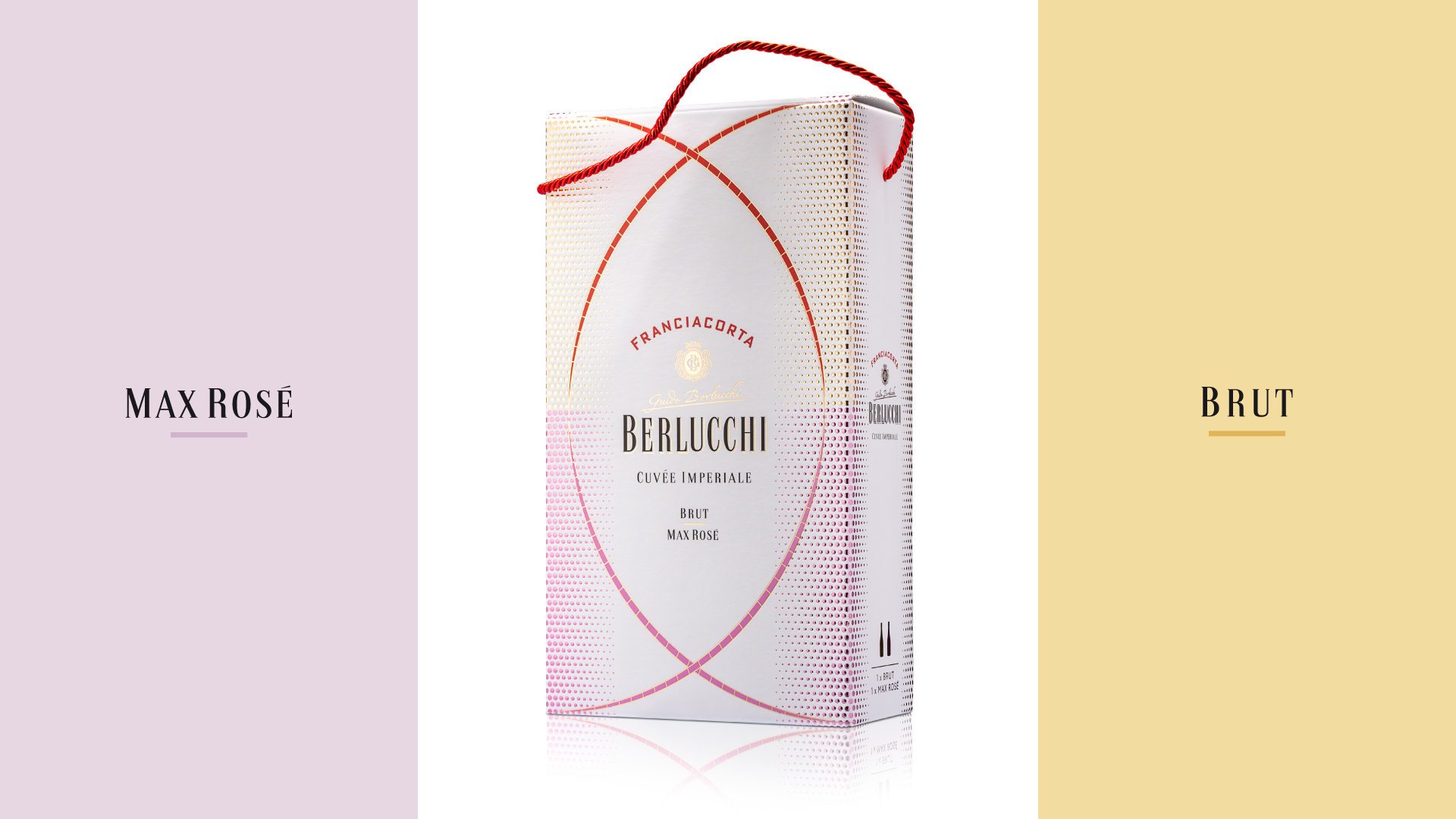
Aiming to offer the visual cohesiveness that can make the product immediately recognizable, the packaging was designed so the lines on the front of the boxes form complete circles when placed side by side on store shelves. The typeface selected for the project ties in with the essential shapes of the visuals, helping to communicated Berlucchi’s unique nature with a refined and contemporary aesthetic.