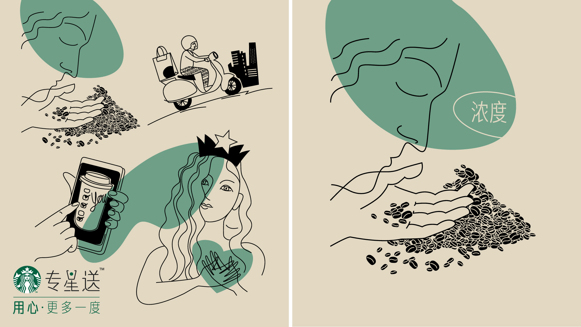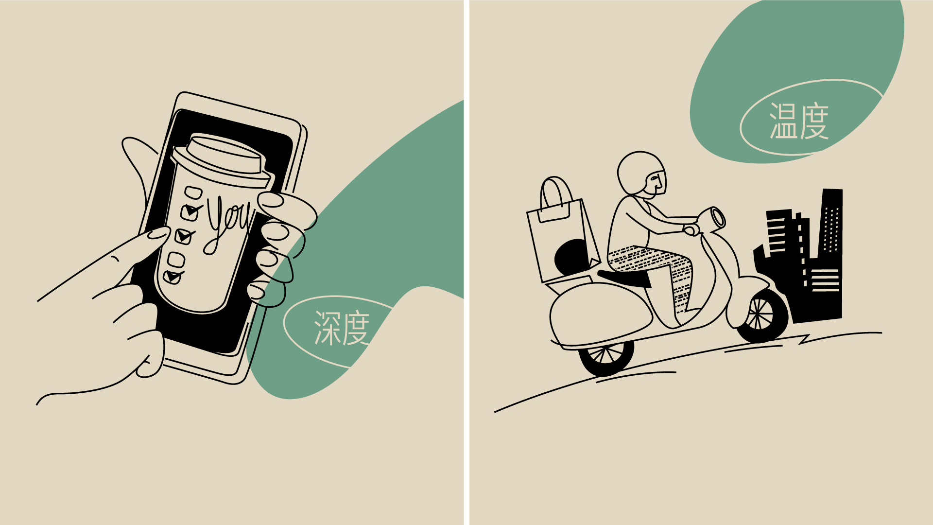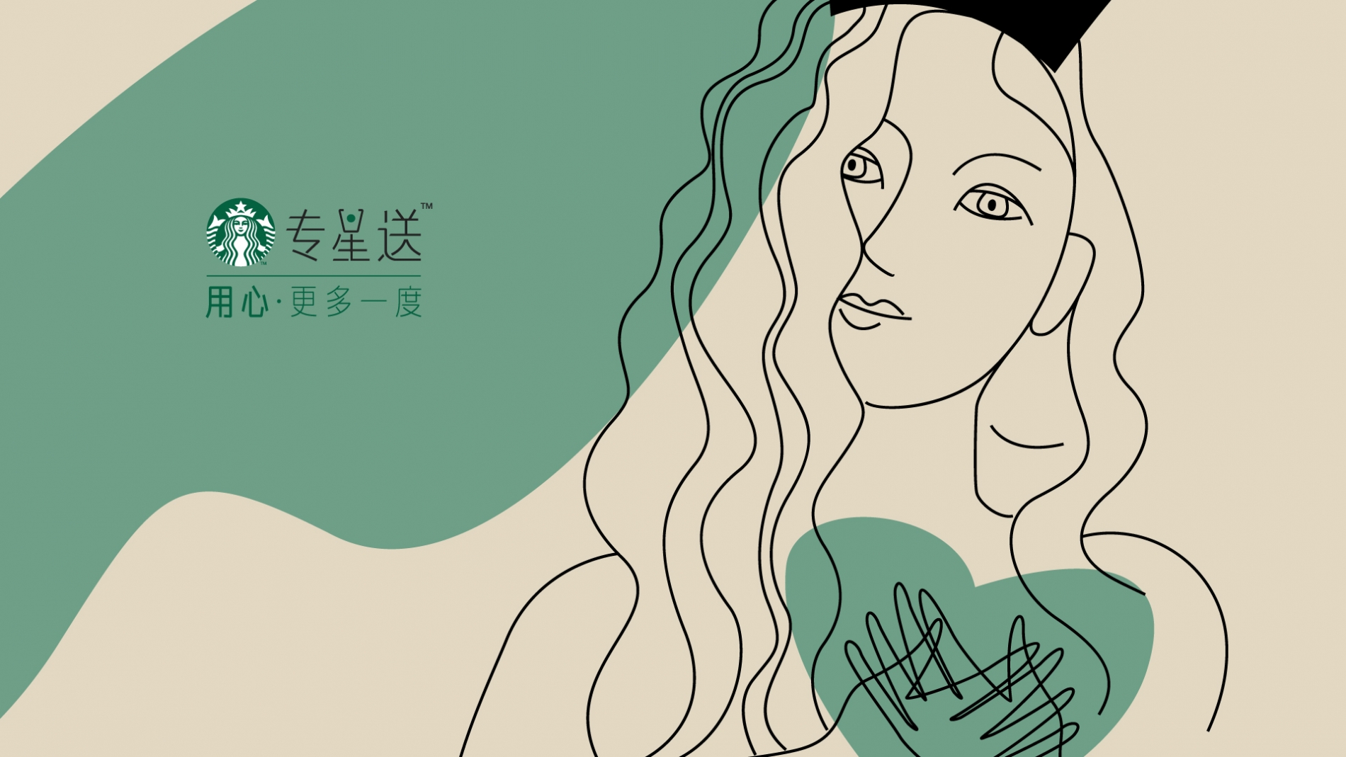
To communicate the benefits of this new Starbucks service – product quality, easy orders, quick delivery, excitement – Angelini Design created two visuals with a strong iconic vibe, using white and green as the dominant colors. The first visual features illustrations that pair warm and emotional tone with a minimalistic stroke: on a cream background, black outlines are enriched by rounded green shapes, adding softness to the overall layout.
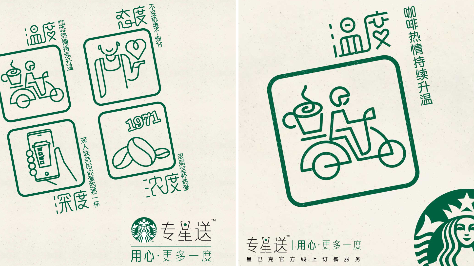
The second visual is more adherent to typical digital canons, with its refined and simple illustrations. Each image has a contemporary and urban feel, and is enclosed in a square to resemble touchscreen icons. The Starbucks logo is placed prominently at the edge of the visual, as if to "sign" it. These assets contributed to creating the new visual code for the Starbucks delivery service.
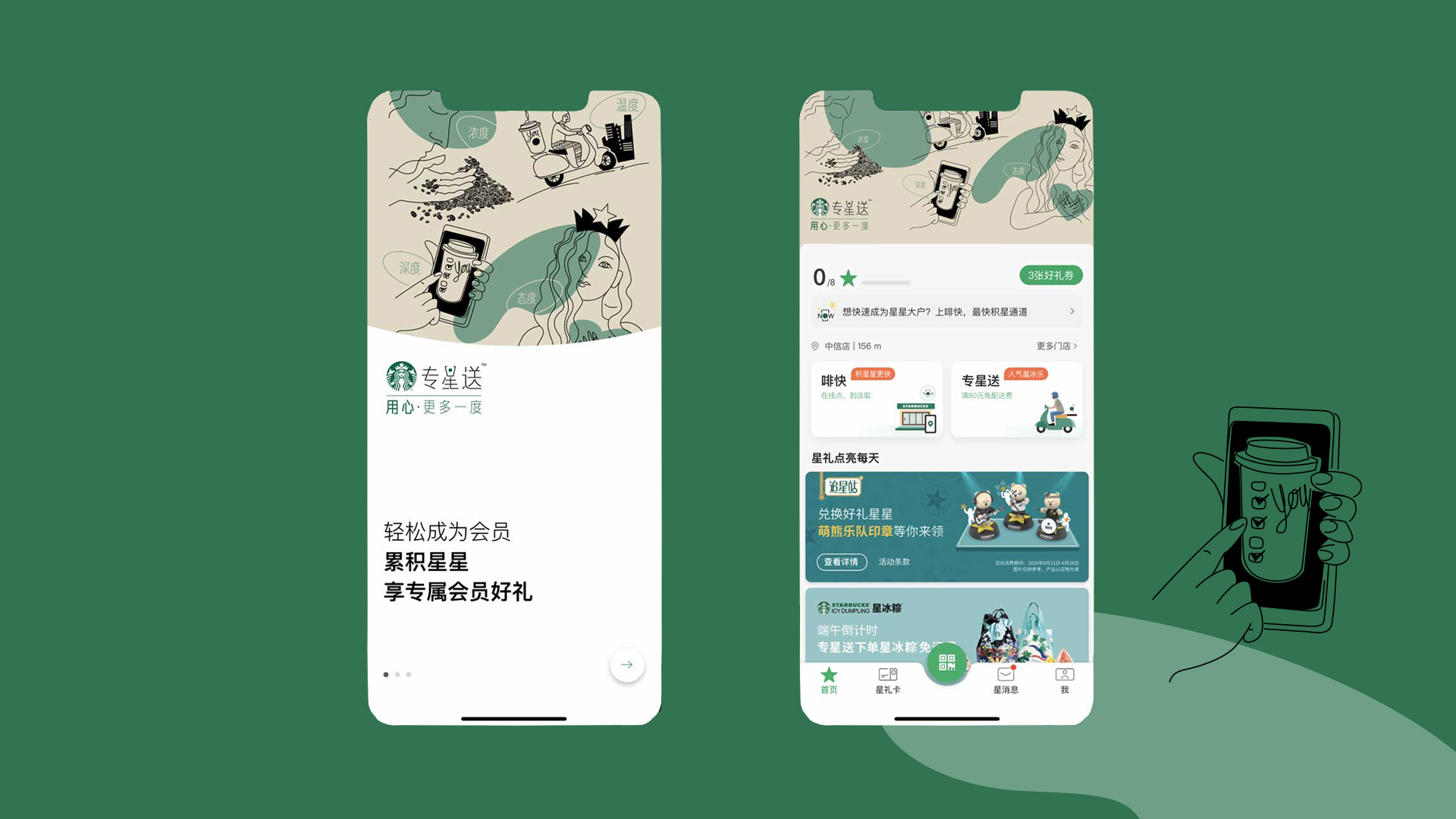
Both visuals were used throughout communication points on digital channels, and effectively convey online the range and quality of Starbucks products and services, also thanks to the claim in both Chinese and English – 用心更多一度, More benefits with passion.