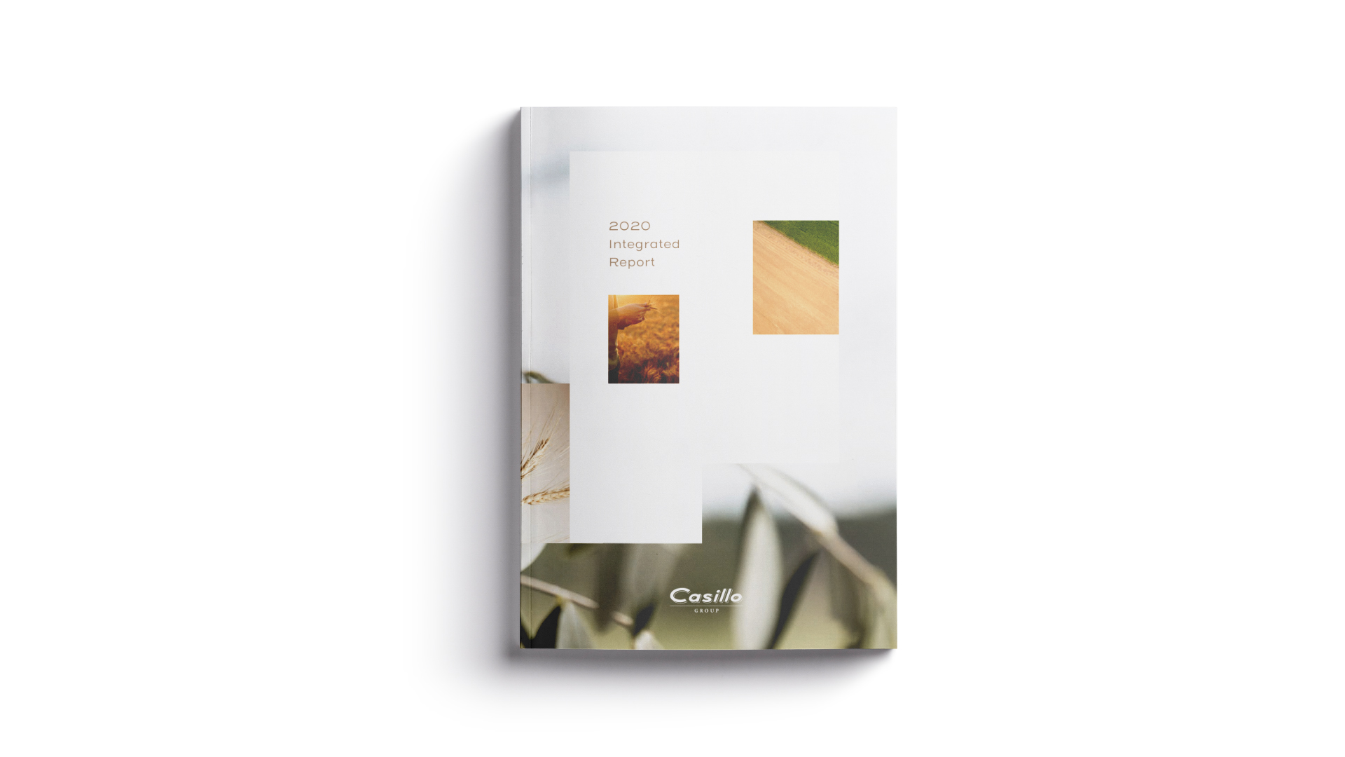
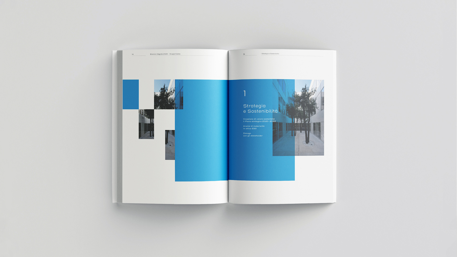
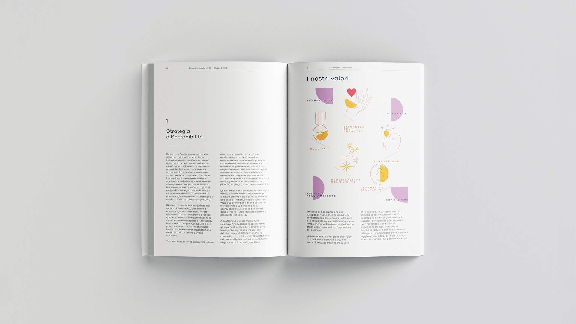
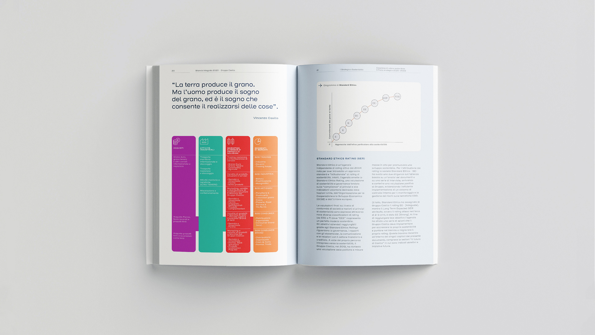
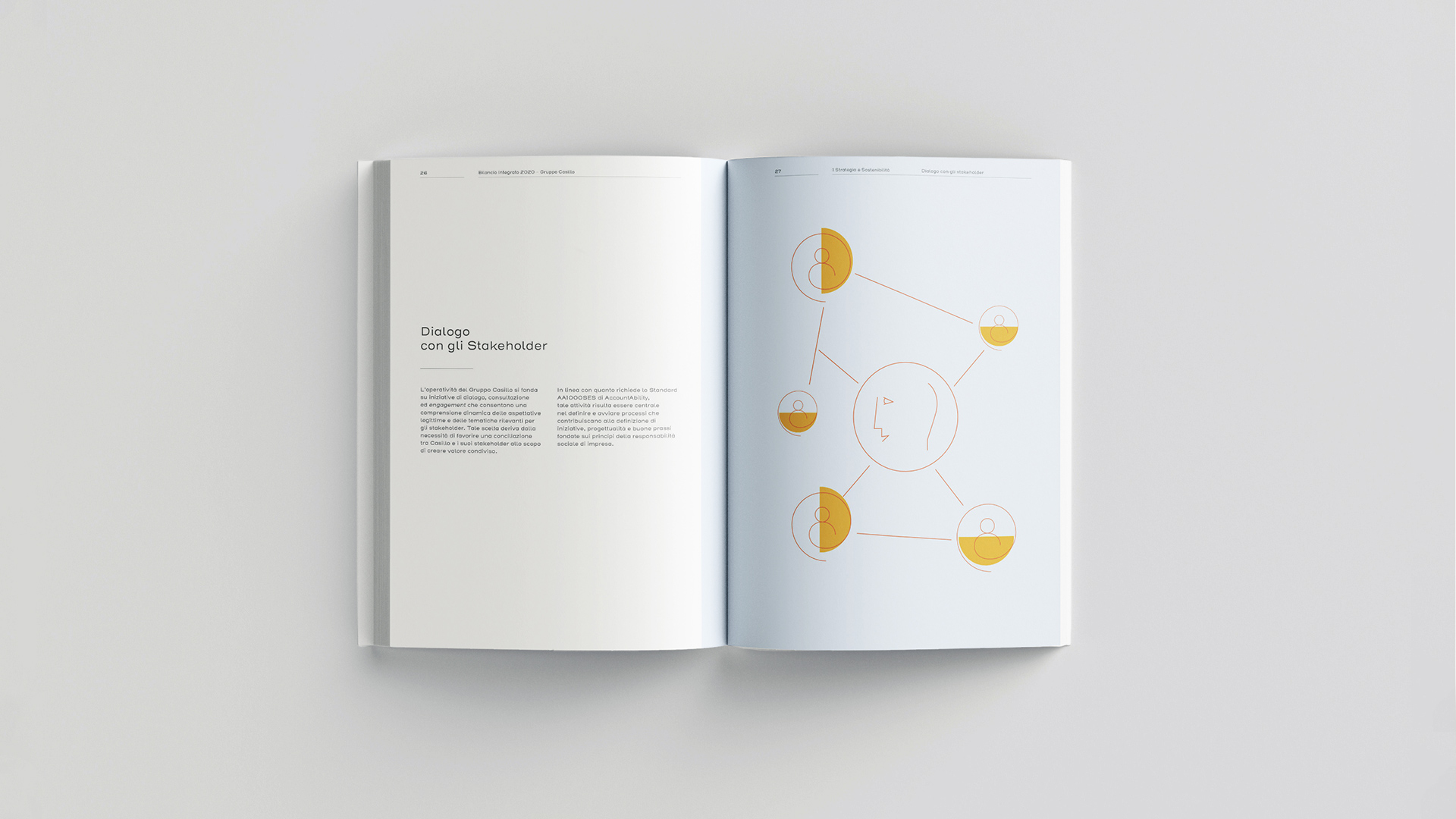
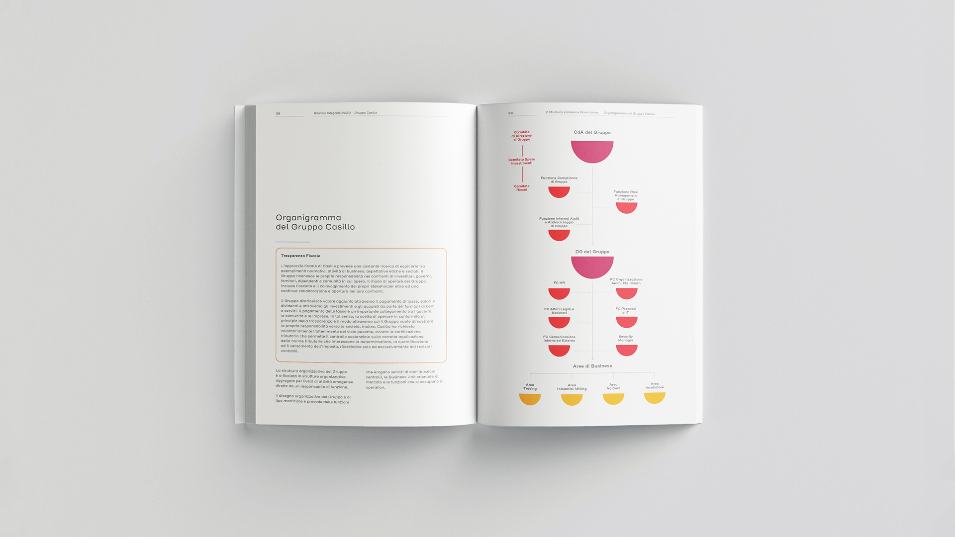
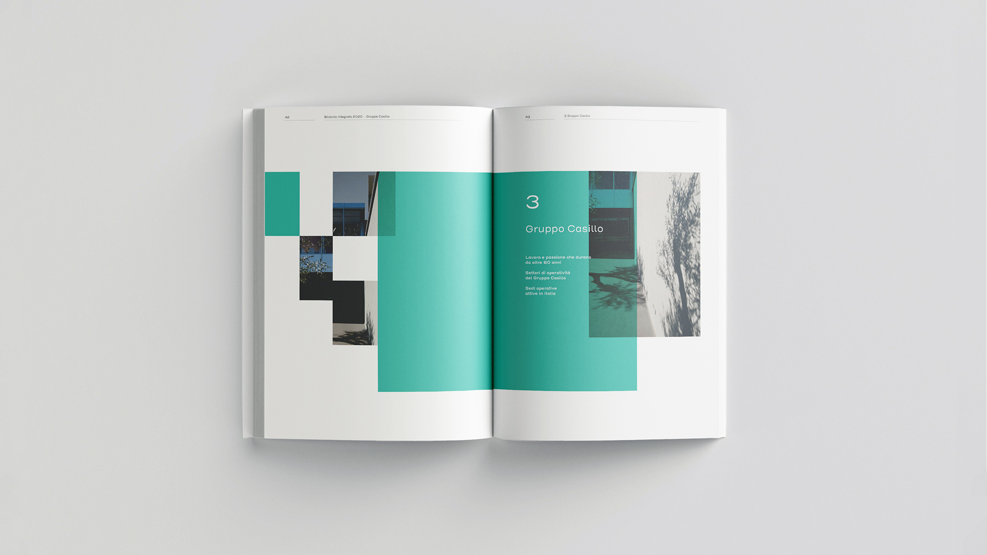
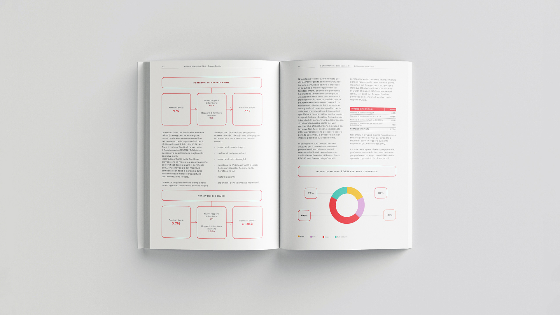
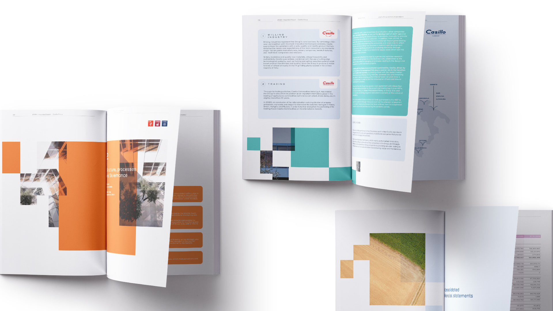
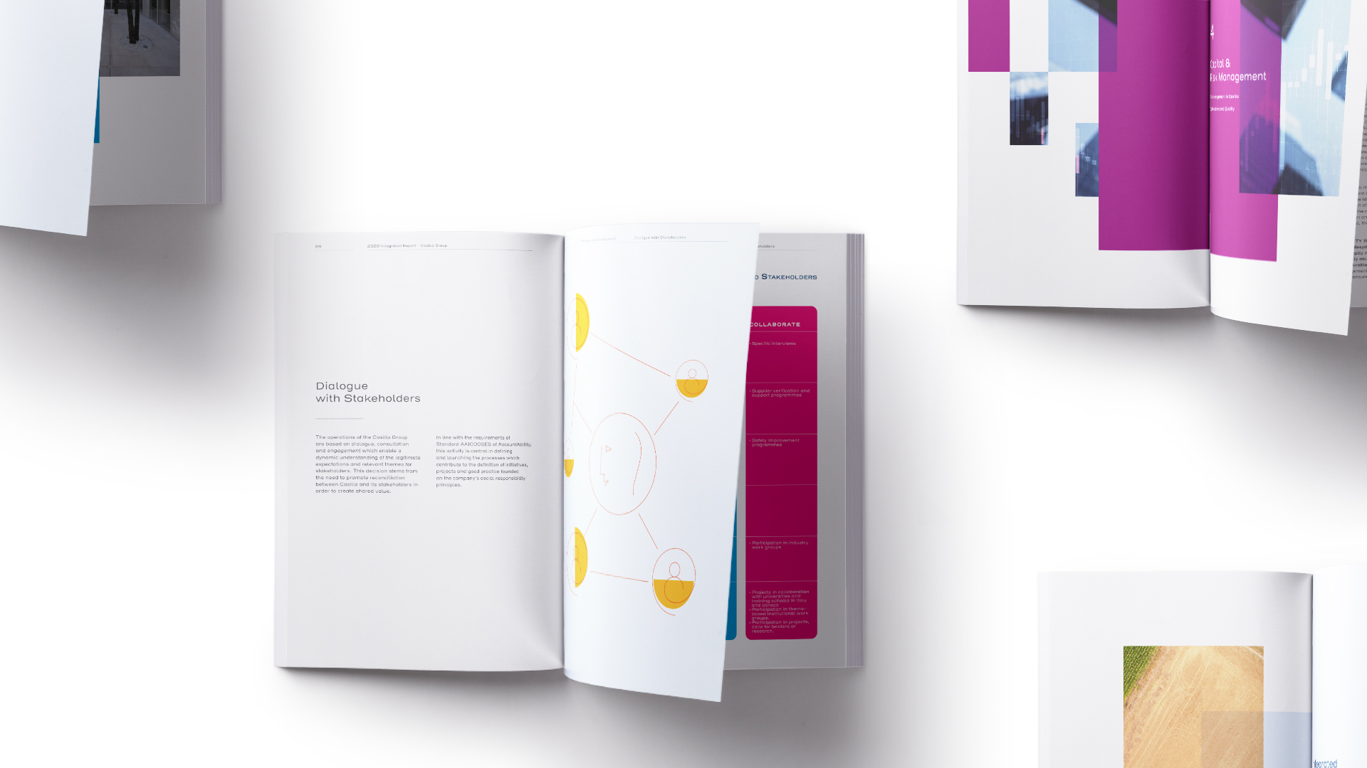
Angelini Design's creative concept for the format focuses on balance: that of the many elements that make up the Casillo Group and balance within the composition of images and data. The report cover art features abstract shapes inspired by the innovative mobiles of American sculptor Alexander Calder, who highlighted the relationship between objects and their pivot points and how they interact to achieve equilibrium. These abstract shapes are reintroduced separately at the beginning of each chapter in the report, representing the many microcosms that make up the company's universe. The notion of many parts coming together as one works as a metaphor for teamwork and group administration.
For the palette, natural, cool colors were chosen, respecting the analytical tone of the document while referencing the Casillo Group's dedication to sustainable materials and products. The illustrations and photographic elements in the report fit together harmoniously with the text and the technical data, resulting in a document that is both visually appealing and easy to read.
The annual report is a valuable tool in communicating the Casillo Group's shift in identity from a trading company to a leader in the food sector. The visual strategy that Angelina Design has created celebrates and supports this.

